Standout Features:
- Single-letter monogram
- Spiral logo design
- Visually striking brand name initial
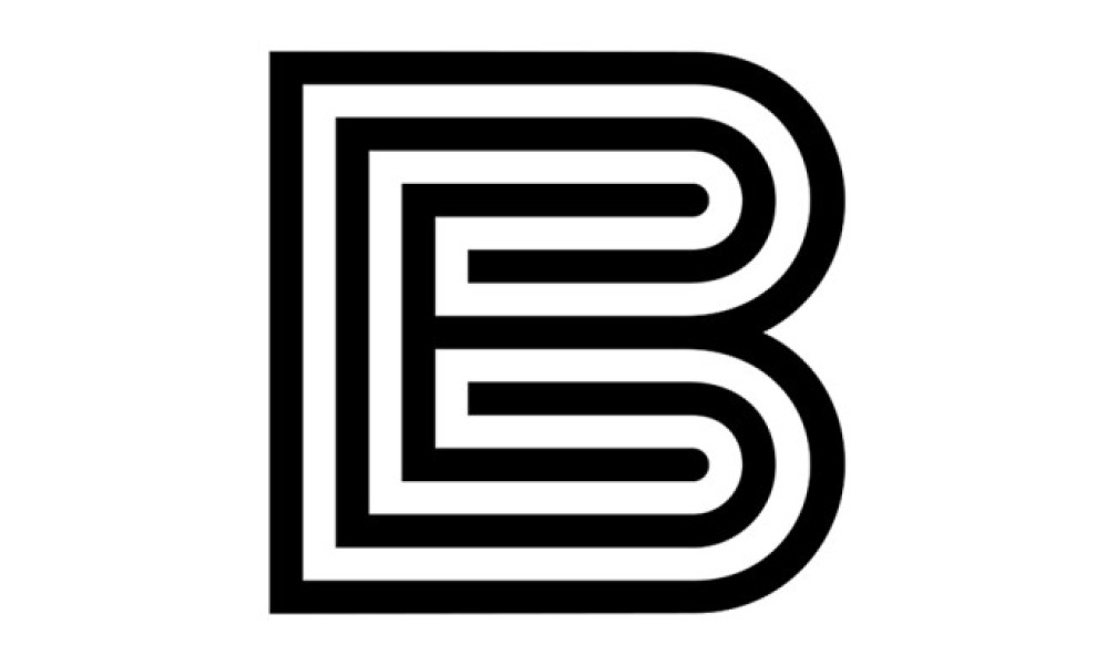
Do you want to execute a simple yet sophisticated monogram logo design? Take notes from Bjorn Berglund’s logo creation for Bartolo Entertainment (BE).
BE is a talent management company aiming to provide opportunities for young and aspirational musicians and artists wishing to unleash their creative potential. This logo design encapsulates that mission and identity so well – with just one letter.
The letter “B” takes the spotlight in this logo. No other distractions! It’s been stylized with spiraling outlines that go inward, adding flavor to the symbol. And as you stare long into the illustration, you’ll see that the shapes slowly form the letter “E” right at the very core.
This is an excellent example of turning a logo from a mere illustration into an interactive experience. It proves that even with a static image, you can still create an illusion of movement!