Team Behind the Design
Logo Design Analysis
When I review logo designs for professional services, I look for a blend of sophistication and adaptability.
The new identity for Michele Plachter Design is a great example of this principle.
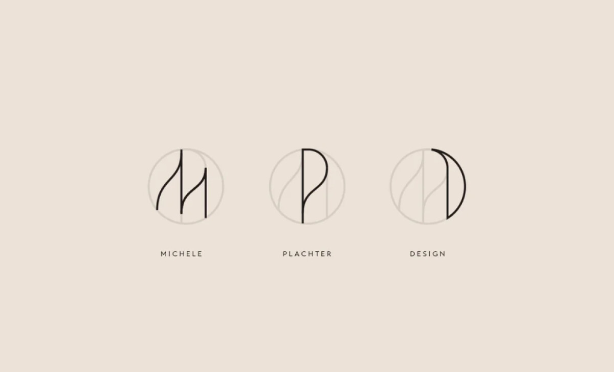
- Logo System: I think the abstraction of the initials M, P, and D into geometric linework is a strong choice that bridges traditional elegance with modern minimalism.
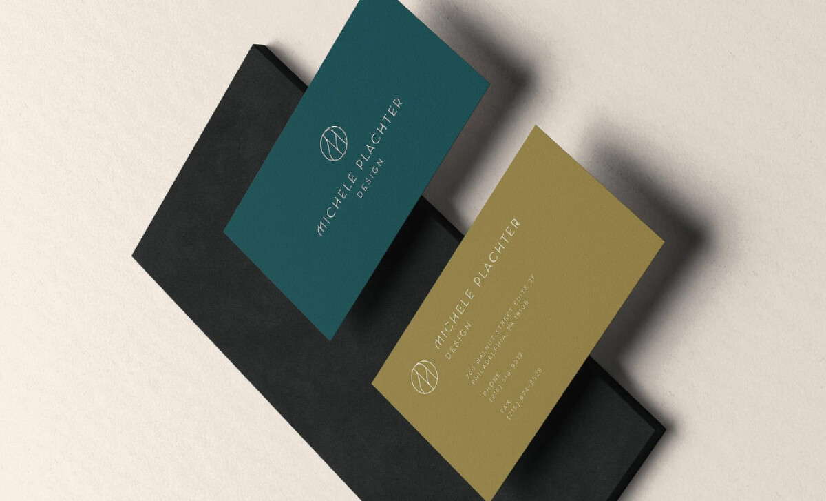
- Color Palette: The beige neutrals are paired with a rich teal and muted gold. This color choice mirrors the firm’s philosophy of using subtle foundations with bold details.
- Typography and Layouts: The tall serif fonts are a key feature. They are balanced with sans-serif accents for clarity. This approach evokes an editorial sophistication that aligns with high-end design publications.
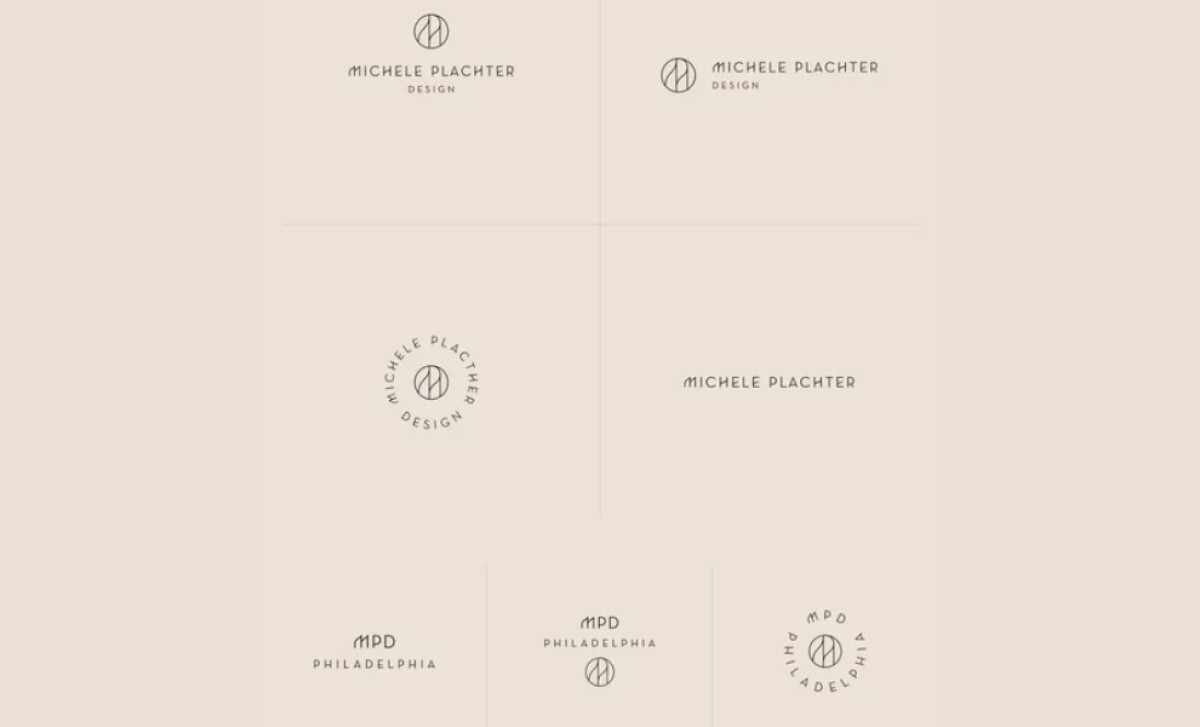
- Versatile Identity System: Multiple lockups, like wordmarks and circular seals, provide consistency. This ensures the brand can accommodate diverse uses across many contexts.
What Brands & Agencies Can Learn from Michele Plachter Design
This project offers several key insights for branding any high-end service.
1. Build a Flexible Logo System
A single logo is often not enough for a modern brand. Develop a system with multiple lockups, like a primary wordmark and a secondary monogram. This ensures your identity remains consistent and effective everywhere.
2. Let Your Palette Tell a Story
Your color choices can do more than look good; they can reflect your business philosophy, like using a neutral base with bold accents to show a specific approach.
3. Use Type to Position Your Brand
The style of your typography sends a clear message to your audience. An elegant serif font, for example, can immediately position a brand within the luxury market.
About DesignRush Featured Designs
At DesignRush, we spotlight brand identities that define industries. Michele Plachter Design’s new branding shows how refined monograms, editorial typography, and jewel-tone accents can elevate a design firm’s positioning.
Standout projects like this advance to our Monthly Design Awards, where they gain recognition as benchmarks in creative excellence.
Check out more standout work across categories:
- Best Logo Designs
- Best Website Designs
- Best App Designs
- Best Print Designs
- Best Packaging Designs
- Best Video Designs
For a full list of design agencies and related services, see our Agency Directory.
