Standout Features:
- Shield-inspired logo icon
- A dark and vibrant color combo
- Wide typeface
Bertoglio Advogados is a law firm that seeks to satisfy clients with legal solutions performed with technical excellence and utmost clarity and objectivity.
As industry leaders, they wanted a logo that reflects their excellent service quality and unparalleled expertise, which Alison Fedel delivered!
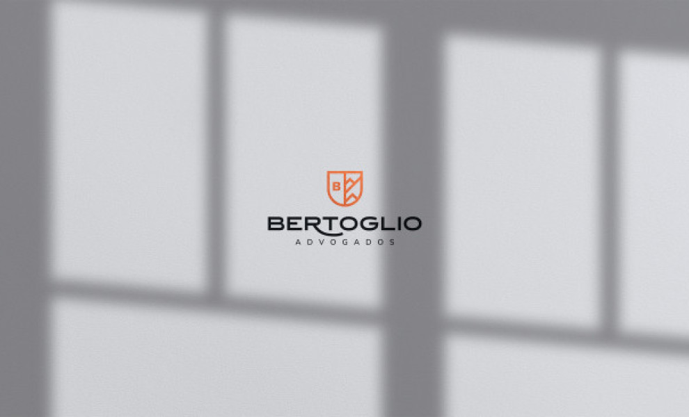
The designer used a two-fold symbol in the shape of a shield. In heraldry, this represents honor and honesty. For Bertoglio, this reflects security, trust, and protection – the qualities clients look for in legal counsel.
Inside the shield are two icons: the brand name’s initial on one side and an illustration of a mountain range on the other. Mountains are associated with qualities like stability, strength, resistance, and purity. Very fitting for what Bertoglio stands for!
And lastly, the expansive typography provides better readability while giving the brand a nice contemporary touch! (Check out the right fonts to incorporate into your brand typography here)

