Last Updated: 07/03/2024
Have you ever noticed how certain symbols exude security and assurance, promising to shelter you from life's uncertainties?
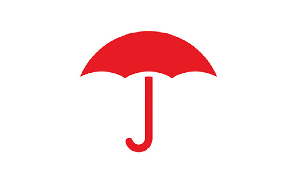
That's exactly what the Travelers Insurance logo, with its iconic red umbrella and bold typography, represents to millions worldwide. Beyond its striking design, this emblem embodies a deep commitment to quick action and safeguarding your assets and peace of mind.
Allow us to shed some light on the logo's origins, evolution, design, and significance as we discuss its elements and why it has remained a globally recognizable symbol of care and protection over the years.
Travelers' Iconic Logo Origins
The company’s iconic visual identity first appeared in a newspaper advertisement in 1870s and was modified for an official logo a whole century later, in the 1970s.
The first logo featured a square composition with the red umbrella enclosed, accompanied by the company's motto "Maybe we can help." The serif font used during this period was elegant and sophisticated, conveying a sense of tradition and seriousness.
In the 1980s, the logo underwent a redesign, positioning the umbrella icon after the company name in a timeless and confident font resembling Marathon Serial Heavy. This typeface, characterized by thick lines and distinctive serifs, exudes a sense of enduring strength. Alongside this change, the motto was updated to "You're better off under the Umbrella," presented in a lighter font beneath the nameplate.
The logo was updated again in 2007, with a shorter nameplate and the emblem positioned to the right. The umbrella sported a more contemporary and simplistic look in attention-grabbing red.
The wordmark also underwent a complete redesign, maintaining black lettering but switching to a bold, modern sans-serif font. This redesign aimed to rejuvenate the company's market presence and highlight its dedication to protection and innovation.
The Travelers Logo Is an Evocative Symbol of Protection and Boldness
The Travelers logo is iconic with its umbrella cover in a signature red hue that represents strength and energy — and most importantly — action. The umbrella symbol is perfect for an insurance company symbolizing the shelter from the storm in case of life’s unexpected disasters.
Simply put, iconic logos like this elevate brand awareness. In The Travelers’ case, potential customers see a symbol that is instantly recognizable and that has the powerful meaning of getting people out of trouble when a disaster strikes.
Any of the specialized logo designers could tell you that ventures dealing in legal and finance verticals need brand awareness like fish need water. One cannot place a physical insurance product on any shelf at a store; people cannot see the product around their city.
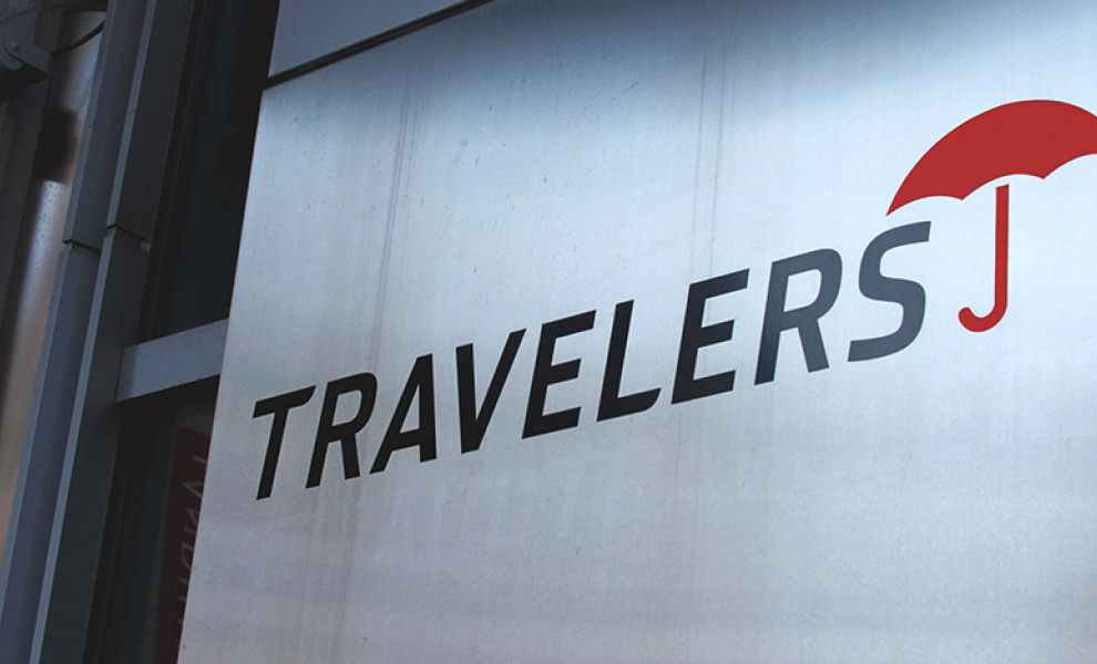
In the final version of the logo, the font used is a modified sans serif called Interstate. The black represents power, boldness, authority, and sophistication. Interstate, with its wide spacing, prospering in display advertisements, makes for optimal signage. When one looks at the Travelers logo, they can envision the company’s clients protected from a torrential downpour.
The Traveler's evocative logo embodies the company’s rich history. It is a masterful display of brand recognition and brand awareness, and most importantly, the logo embodies the company’s commitment to quick action and the protection of you and your loved ones.