Two things make the Detroit Pistons unusual in NBA branding history. They are worth getting out of the way upfront, because the rest of the story makes no sense without them.
First, this is the only NBA team named after a literal industrial part. Not a metaphor, not a mascot, not a vibe. A piston. The thing that moves up and down inside a car engine.
Owner Fred Zollner ran a piston manufacturing company in Fort Wayne, Indiana when he founded the team in 1941 as the Fort Wayne Zollner Pistons.
The earliest logos took that literally, with a basketball player whose entire body was built out of automotive parts. Try to imagine the Lakers leaning that hard into a literal lake.
Second, this is a franchise that keeps coming home. The Pistons spent the late 1990s and early 2000s trying to be a horse on fire, then quietly walked the entire experiment back. The logo they unveiled in 2017 is almost identical in structure to the one they used between 1979 and 1996. The whole story is about restraint, regret, and return.
Plenty of NBA logo design histories follow a clean line forward. Detroit's traces a loop.
Ten logo updates in 85 years. The franchise has been telling the same story in slightly different fonts the entire time.
1941–1948: The Mechanic Man
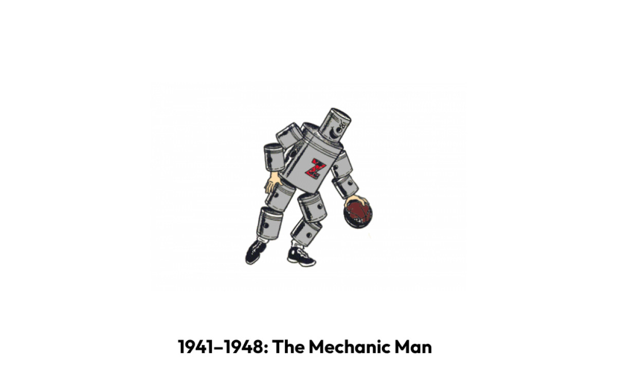
The Fort Wayne Zollner Pistons got their first logo in 1941. Owner Fred Zollner ran a piston manufacturing company, and the mark followed the brief literally.
A funny gray and black "mechanic" man with a brown basketball had a bold red letter "Z" on his chest and looked like a comics hero. No lettering or framing, just a ball, and sneakers.
It was strange, specific, and unmistakable. No other team in major American sports has ever leaned this hard into the industry behind its name.
1948–1957: A Redrawn Piston-Man
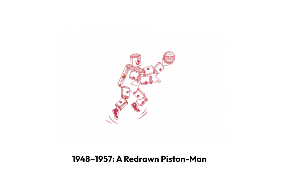
The logo was redrawn in a new white and red color palette in 1948. The image of an auto-parts man became more dynamic and fun, evoking a sense of energy, enthusiasm, and passion for basketball.
This emblem stayed with the club until its relocation to Michigan.
The character stayed, but the energy shifted. The franchise was still leaning hard on the literal piston metaphor, just with more motion in the drawing.
1957–1971: The First Circle
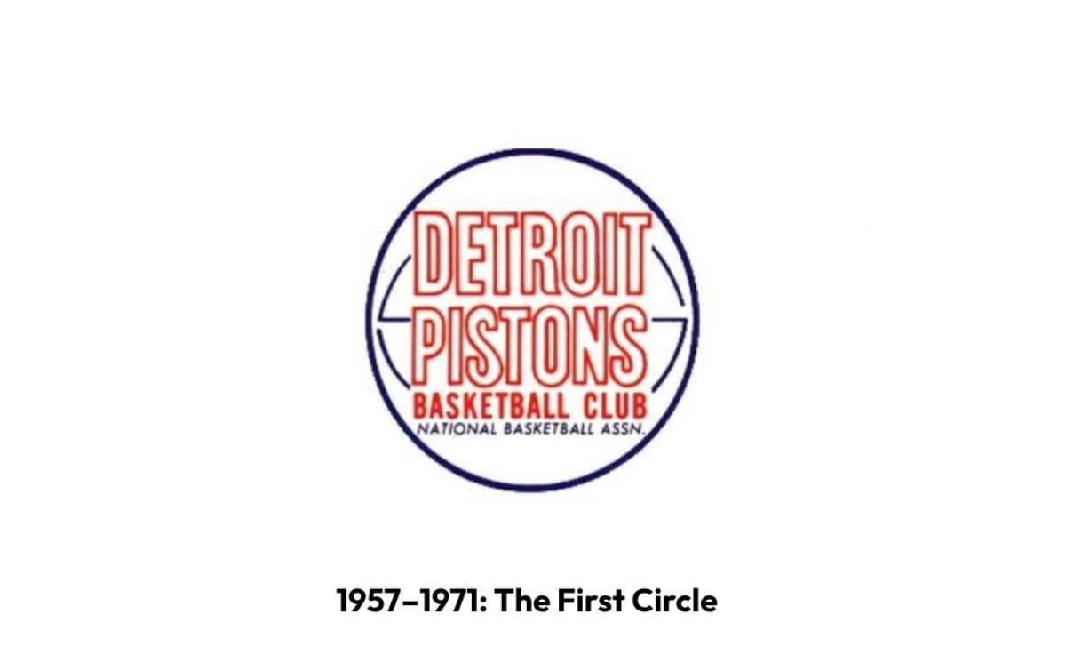
The franchise moved to Detroit in 1957. The piston-man was retired.
After the name of the club was changed to Detroit Pistons, the new logo was introduced in 1957. It was a simple and light circular badge, where the outlined Sans-serif inscription was placed in a white basketball with blue details and outline.
The "Basketball Club" lettering was written in solid red under the main logotype, using a simple Sans-serif font.
The shape of the franchise's visual identity was set here. Everything that followed would be a variation on the circle and the ball.
1971–1975: A Cleaner Composition
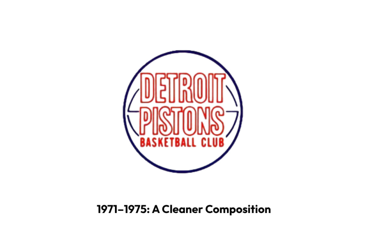
In 1971 the bottom line of the emblem's lettering was removed from the logo, making it cleaner and more professional.
It was the dark blue italicized "National Basketball Assn." which was gone, everything else stayed in its places until 1975.
A small change, but it set the pattern. The Pistons would keep editing the same circle for decades.
1975–1979: A Palette Shift
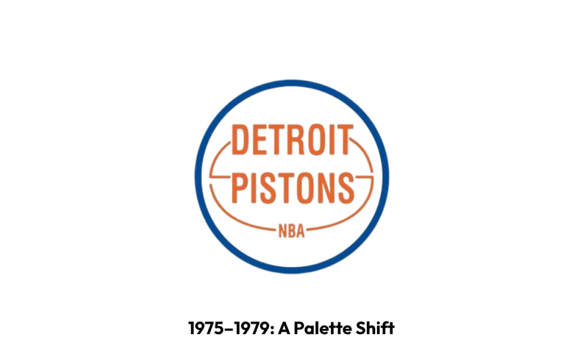
The color palette of the logo got switched to blue color white and light brown in 1975. The outlined letters became solid now and the "Basketball Club" line was replaced by the "NBA," executed in the same style, but using smaller letters.
The shade of blue became a bit lighter, which could be noticed only on the emboldened frame of the logo.
Quiet changes. Nothing radical. The brand was being tightened, not reinvented.
1979–1996: The Bad Boys Logo
In 1979, the franchise landed on the look that would define it.
The predecessor of the logo we all can see today was introduced by the club in 1979. It was the same circular composition, but with its color palette and lines refined.
Now the red basketball was enclosed in a thick blue frame and had its details executed in white, as well as the modified "Detroit Pistons" inscription in a cleaner and more modern Sans-serif typeface.
This was the logo through the Bad Boys era. Back-to-back championships in 1989 and 1990. Isiah Thomas, Bill Laimbeer, Dennis Rodman, Joe Dumars.
The mark became one of the most recognizable in the league, tied to a brand of physical, blue-collar basketball that fit the city.
If the franchise had stopped designing here, the story would be a short one. They did not stop.
1996–2001: The Horse and the Flames
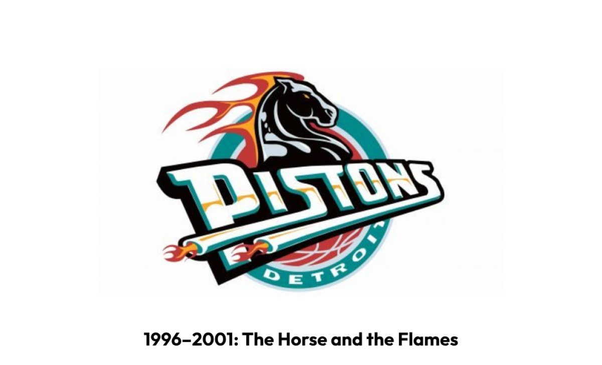
In 1996, the Pistons did what a lot of NBA teams were doing. They went cartoonish.
The logo from 1996 featured a new composition, it was a black horse placed above the stylized "Pistons" inscription in a fancy custom typeface with elongated lines, which had the fire on their ends.
The new color palette of the club's visual identity featured calm turquoise, red, white, and delicate yellow details.
The reasoning had a thread of logic. Horsepower was still about engines. Engines were still about Detroit. The Zollner story was in there somewhere. The execution landed somewhere else.
2001–2005: The First Walk Back
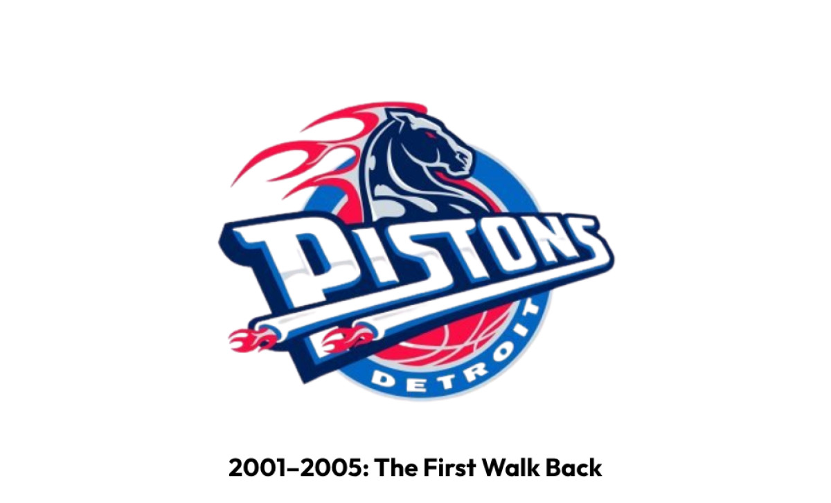
The image remained untouched, but the color palette was changed in 2001. The new main colors of the Detroit Pistons' visual identity became red, blue, and white again.
The letters also had a slightly visible light gray stripe coming through them horizontally.
The horse stayed. The teal did not. The Pistons won the 2004 championship under a logo that was already pointing back toward the version it had abandoned.
2005–2017: The Basketball Returns
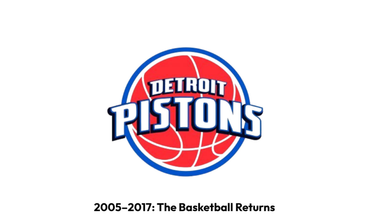
The horse came off in 2005.
The iconic basketball badge was back in 2005. Though it used the same blue, red and white color palette, it looked slightly different from the previous versions as got more white lines on its red body.
The "Pistons" inscription in a custom typeface got enlarged and arched on the ball, executed in white and outlined in intense blue.
The walk home was nearly complete. Just one more step to go.
2017–Today: Back to 1979
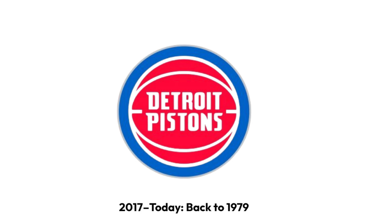
The logo design from 1979 was brought back by the club in 2017.
The only thing that was changed was the typeface of the white wordmark, which now featured smoother and sharper shapes of its Sans-serif letters, which started looking more progressive and strong than ever.
The latest refinement took place in 2017, in order to celebrate the moving of the club to a new stadium, the Little Caesars Arena.
At the unveiling, the team said: "The bold red, white and blue color scheme and basketball icon have withstood the test of time through the evolution of the franchise and the city."
It took twenty-one years for the Pistons to make the round trip back to the Bad Boys mark.
What's in the Current Detroit Pistons Logo
Good logo design makes every element justify its existence. The 2017 mark passes that test, partly because the franchise had already tested every alternative and rejected most of them.
Look at what made the cut:
- Red basketball: the only constant since 1957. The horse era could not kill it.
- Royal blue ring: lifted straight from the 1979 mark. The same circle that watched Isiah Thomas win two championships.
- Custom sans-serif wordmark: narrowed contours and diagonal cuts of the characters' bars, drawn specifically for this team and no other.
- Chrome accents: the last visible trace of the Zollner heritage in the design, and a quiet one. Pistons used to be the whole logo. Now they are a finish.
- Palette: Royal blue, red, chrome, navy blue, and white. The Bad Boys colors, with a small adjustment.
What this logo really is, when you look closely, is an apology. The franchise tried something bold in 1996 and learned that bold is not the same thing as identity. By 2017, the design team was not making a statement. They were quietly admitting that the house was fine before someone tore down the walls.
What's Coming: The Rumored Rebrand
In early 2026, mockups and concept work for another Pistons rebrand began circulating across design communities and fan accounts.
Franchises rarely engage outside logo design agencies unless they want the new mark to look unmistakably different from what came before.
Most of the popular fan redesigns want the teal back. Some pair it with the old horse. Others build new automotive references on top.
The franchise tested this appetite in 2022 with a Return of the Teal Classic Edition uniform, a replica of the 1996 to 2001 road jerseys. The drop sold well enough that nobody has been able to put the conversation down since.
The Pistons have not confirmed anything. But after the team's breakout 2024 to 25 season and the rise of Cade Cunningham as a franchise cornerstone, the question keeps coming up.
Why now? Because winning teams get to rewrite their visual story. And because nostalgia for the teal era is finally old enough to feel like history instead of embarrassment.
Here is the part worth watching. The 2017 logo was designed for a team that needed to look like itself again. It worked because the Pistons had just spent two decades being someone else.
If the franchise rebrands now, with a real contender on the floor and a star at the wheel, the question is whether they remember what happened the last time they tried to be bold.
Restraint, regret, return. The Pistons have run this loop before. The next logo will tell us whether the franchise learned anything the first time.