Founded in 1897, Juventus Football Club S.p.A., colloquially known as Juve, is a professional Italian football club in Italy. Nicknamed Vecchia Signora ("the Old Lady"), the club on the international stage occupies the 4th position in Europe and the eighth in the world for most confederation titles won with eleven trophies. Earlier in 2017, the football club unveiled a new look, created by design agency Interbrand.
According to Interbrand chief strategy officer Manfredi Ricca, the football giant seeks to “sustain its own growth both economic and sports-wise and extend its influence over international markets, beyond football.” That’s why a new club crest was created, and with it, a new suite of visual expressions and a new means of communication.

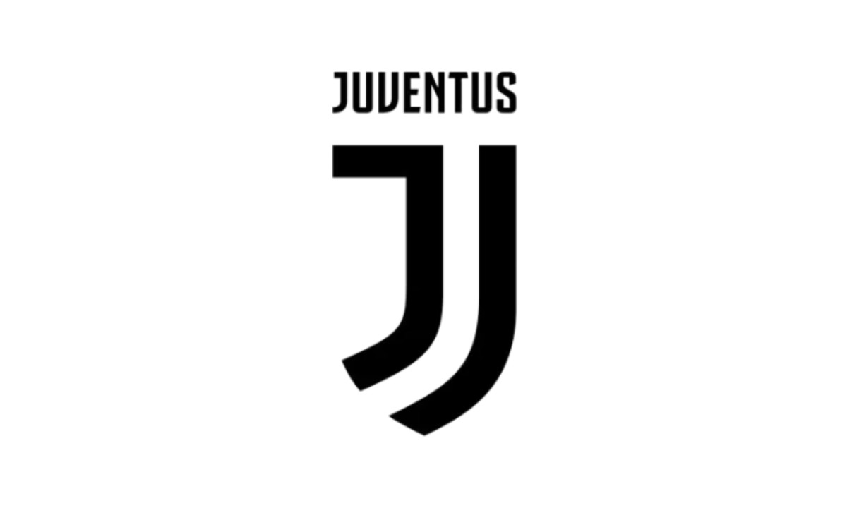
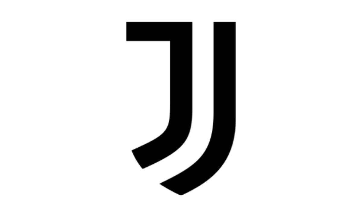
The new crest eschews most of the core graphic elements of the old crest including a bull, the symbol of Turin, where the club plays, a crown, and the oval badge that held the final lock-up. It has been replaced by a stylized J symbol referencing the black and white stripes that Juventus play in, and a Juventus wordmark set in a new bespoke typeface.
A quality that describes the new logo is fearlessness, and the logo banks on that by representing black and white -- as well as winning and losing -- while always striving for excellence. This visual and verbal tone of voice will imbue the character of the brand at Juventus’ academies, its community projects and other business ventures, according to Ricca.

The new Juventus logo is among many to join the flat logo trend, but in the case of the football giant it is a drastic change from its previous oval crest. While the club’s name was in a curved line using a bold black text, the name “Juventus” is now placed right above the stylized ‘J’ logo, in plain white lettering. The contrast it creates along with the white ‘J’ design is stunning, and the color scheme complements the design well.
The move is also very bold, because it required the club to tread the line between appealing to a local fan base and its expanding external global market. While Juventus has diverged from its crest, it still maintains its heritage by sticking to its black and white colors, assuming a classic and modern identity that is contemporarily relevant.
With exceptional use of design elements like color and contrast, the Juventus logo rebrand is a bold step forward, presenting a glimpse into what a truly global football club can look like. By distilling its history into a primary signifier, it has carved out a space for itself in the marketing world where black and white stripes and the letter ‘J’ are specific to the Juventus brand. With their new logo, the football club hopes to transform the letter ‘J’ into a visual icon known in the sports & leisure industry.
Evolution of the Juventus Logo
Juventus’ logo has gone through several transformations, evolving from a traditional football crest into one of the most recognizable minimalist identities in sports today.
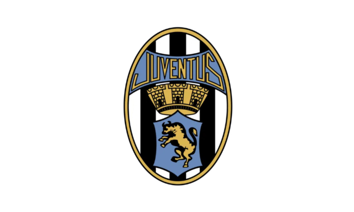
1905–1921: The Original Crest
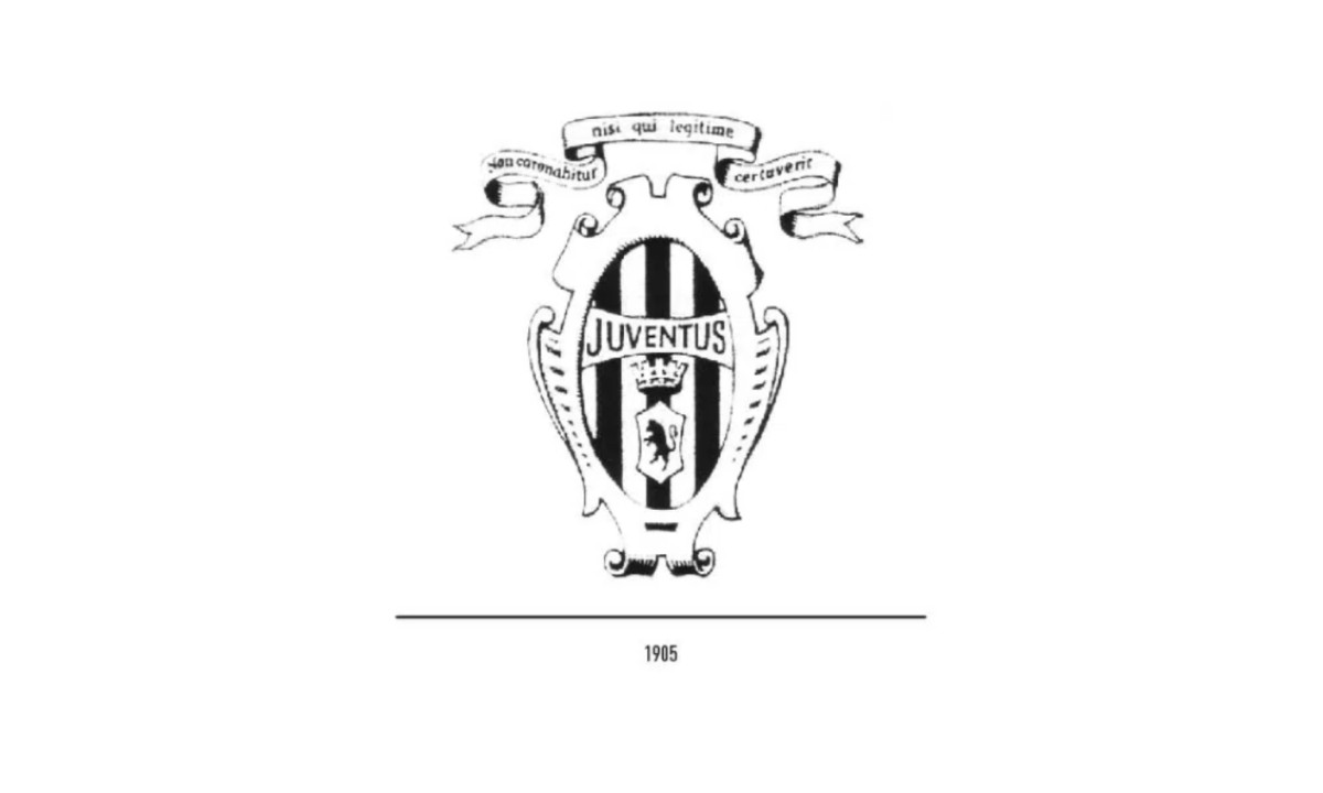
The first official Juventus logo featured an ornate oval crest built around black-and-white stripes — a direct reference to the club’s kit. At the center sat a shield with the Turin bull, topped with a crown.
The design reflected tradition, regional pride, and the visual language common in early European football identities.
1921–1929: Simplified Identity
In 1921, Juventus refined its crest by reducing decorative elements. The oval shape remained, but the composition became cleaner and more structured.
This update improved readability while keeping the club’s core identity intact. It marked an early step toward simplification.
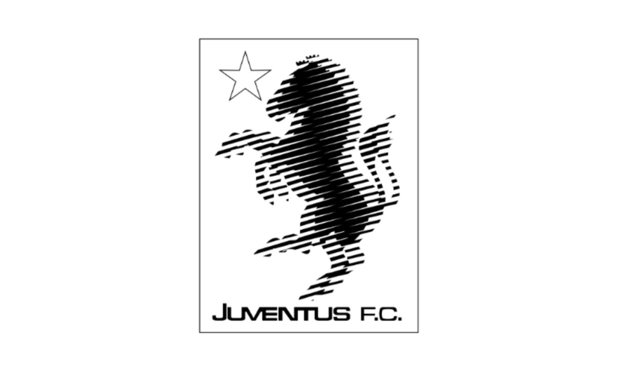
1929–1931: The Zebra Experiment
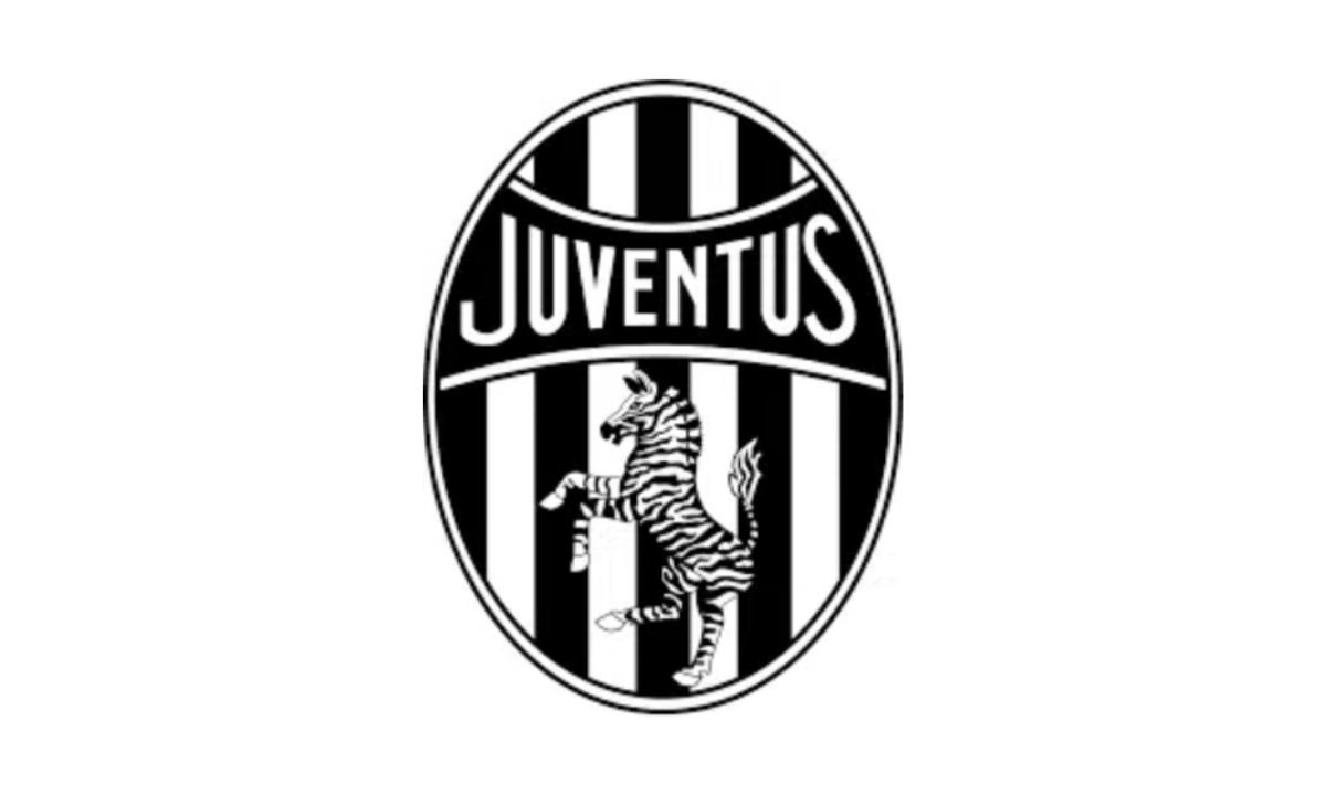
Between 1929 and 1931, Juventus introduced a logo featuring a zebra. The symbol referenced the team’s nickname and offered a more playful visual direction.
This version was short-lived. Still, it showed that the club was open to experimenting with its identity.
1931–1977: The Classic Era Crest
In 1931, Juventus returned to a more traditional crest. The oval badge reintroduced the bull, stripes, and a balanced layout.
This version defined the club’s identity for decades. It preserved heritage while gradually refining clarity and proportions.
1977–1989: Modern and Experimental Phase
In 1977, Juventus adopted a more modern and experimental approach. The logo featured a stylized zebra and a more geometric structure.
By the early 1980s, the design became even simpler. It reduced detail and focused on bold shapes and typography.
This phase hinted at a shift toward modern branding.
1989–2004: Return to Tradition
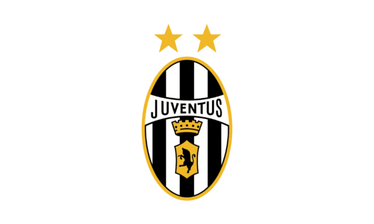
The 2004 update refined the existing crest with sharper lines and better contrast. Typography was improved and the overall structure became more polished.
This version was the last of Juventus’ traditional football-style crests before the major redesign.
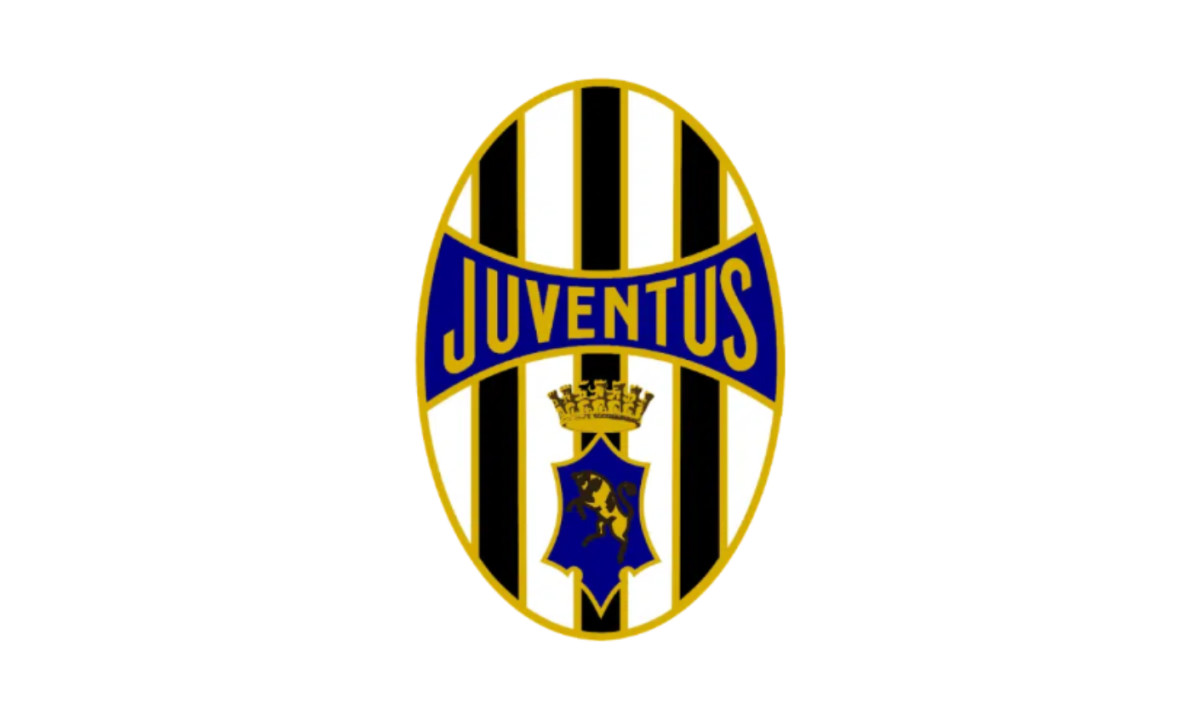
2004-2017: Redefined Traditional Crest
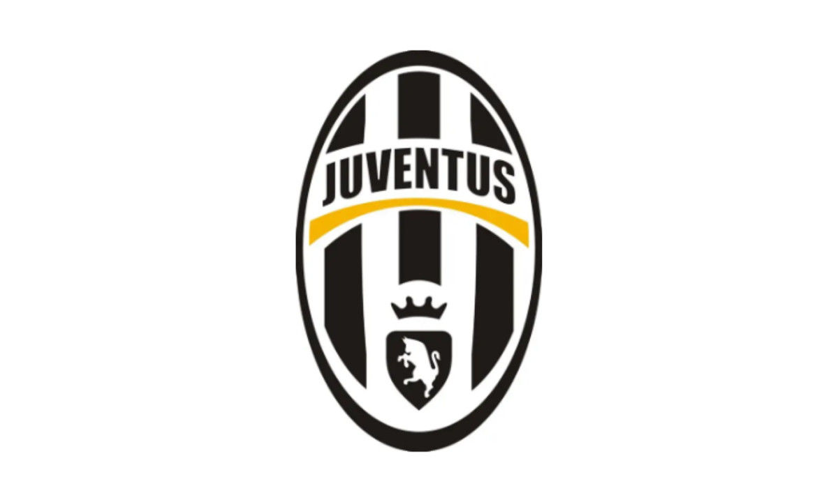
In 2004, Juventus updated its crest with a more polished and contemporary look. The oval structure remained, retaining the iconic black-and-white stripes, the Turin bull, and the crown, but the design adopted subtle 3D shading and cleaner spacing between elements
This version represents the final evolution of Juventus’ classic crest — bridging heritage and modernity just before the club’s radical minimalist shift in 2017.
2017–2020: The Minimalist Rebrand
In 2017, Juventus introduced a radically simplified logo designed by Interbrand.
The new mark replaced the traditional crest with a stylized “J.” The design referenced the club’s stripes while creating a clean and flexible identity.
This change marked a clear move toward global branding and digital scalability.
2020–Present: The “Just J” Era
By 2020, Juventus simplified the logo further by removing the wordmark.
The result is a standalone “J” symbol that works across digital platforms, merchandise, and global campaigns.
Why Juventus Rebranded in 2017
[Source: Juventus]
Juventus was unusually explicit about the business logic behind the redesign.
In its 2017 launch messaging, the club described the new identity as part of a broader transformation, not just a cosmetic update. Interbrand’s Manfredi Ricca said Juventus wanted to become a club capable of “transcend[ing] sport” and taking its spirit into “unexpected realms.”
Juventus itself presented the identity as part of a strategy to speak not only to core supporters, but also to wider global audiences through new experiences, culture, and design.
That positioning matters.
Traditional football crests are rich in symbolism, but they are also visually dense. For a club trying to operate across fashion collaborations, mobile interfaces, premium retail, and international brand partnerships, a simplified mark is easier to reproduce, animate, crop, embroider, and recognize at small sizes.
This is one reason the Juventus rebrand became a touchstone for “beyond sport” brand strategy.
From a design perspective, Juventus was effectively asking a bigger question: should a football club logo function only as a badge of heritage, or as a global brand asset?
Design Elements of the New Juventus Logo
The new Juventus logo is deceptively simple.
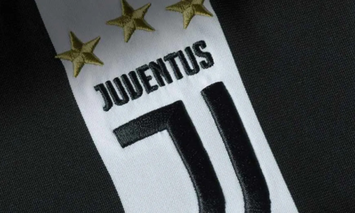
At first glance, it looks like a stylized “J.” But the geometry is doing more than one job. According to Juventus, the mark distills the black-and-white jersey stripes, the Scudetto silhouette associated with victory, and the club initial into one compressed sign.
This design works for several reasons.
First, the contrast is immediate. Black and white have always been central to Juventus’ identity, so the rebrand preserves a strong link to club heritage even while removing older crest components.
Second, the mark is structurally scalable. It reads on a stadium screen, a shirt badge, a phone icon, and a social profile in a way traditional crests often do not. That is a major advantage in a media environment where brands are increasingly encountered in tiny, fast-scrolling digital formats.
Third, the logo behaves more like a luxury or lifestyle brand monogram than a sports crest. That was a deliberate strategic move. The launch in Milan, and later visibility during Milan Design Week, reinforced that Juventus wanted to place itself closer to contemporary design and fashion culture, not just football culture.
How the Logo Reflects Modern Branding Trends

TURIN, ITALY - OCTOBER 19: Cristiano Ronaldo of Juventus looks on prior to the Serie A match between Juventus and Bologna FC on October 19, 2019 in Turin, Italy. (Photo by Etsuo Hara/Getty Images)
[Source: Bleacher Report]
The Juventus logo is one of the clearest sports examples of three major branding trends: minimalism, digital-first scalability, and symbolic compression.
Minimalism was already reshaping brand identity in the 2010s, as companies simplified logos for responsive websites, apps, product packaging, and social media. Juventus brought that logic into elite football. The redesign removed ornate detail and pushed toward a cleaner, flatter, more modular system.
It also reflects digital-first thinking. On modern platforms, logos are rarely seen in their full ceremonial form. They are cropped into circles, displayed as avatars, used as favicon-like icons, or overlaid onto video and merchandise. A simplified monogram is easier to deploy consistently across those contexts than a traditional crest with multiple internal symbols and borders.
Most importantly, the logo shows how modern branding values reduction. The strongest marks often encode multiple ideas into a single shape. Juventus’ icon does exactly that: jersey, trophy shape, initial, and attitude, all in one sign. Whether someone likes the aesthetics or not, that is a high-efficiency brand design.
Public Reaction: Why the Logo Divided Fans and Designers
The new logo sparked immediate backlash and debate.
ESPN reported strong criticism on Twitter after the launch, including jokes, side-by-side comparisons with the old crest, and confusion over the symbol’s meaning. The Drum also noted widespread criticism from fans and commentators, while City A.M. described the social response as mixed.
At the same time, the redesign also attracted praise from branding and design observers who saw it as bold rather than reckless. Goal called it “a bold step forward,” while design-focused commentary on Medium argued the mark was built for the realities of modern brand communication across multiple channels.
Even Juventus acknowledged the scale of the conversation. In its own retrospective in 2017, the club said the new logo became a “topic of worldwide conversation,” with supporters participating through the hashtag #2beJUVENTUS before the mark even formally came into full use on July 1.
That split reaction is part of what made the rebrand significant. Great sports logos are usually judged emotionally first and strategically later. Juventus accepted short-term resistance in exchange for long-term distinctiveness.
Juventus Was Branding Beyond Sports
The most interesting thing about the Juventus logo is that it was never only about football.
The redesign signaled a shift from club-as-team to club-as-brand platform. That matters because modern football clubs do business through sponsorships, licensing, product sales, events, media, academies, tourism, and cultural partnerships — not just matchday identity.
Juventus’ investor materials explicitly frame commercial revenue as a key pillar of the business alongside audiovisual rights and other revenues.
That makes the simplified logo easier to understand. A traditional crest is ideal for signaling history. A symbol like Juventus’ “J” is better for building a flexible commercial ecosystem.
This is also why the mark feels closer to fashion branding than conventional sports branding. It is designed to be worn, printed, animated, licensed, and recognized globally with minimal explanation.
In practical terms, that opens more room for merchandising, collaborations, and premium positioning.
Brand Value, Revenue, and Scale
A logo alone does not create financial growth, but identity systems can support a broader commercial strategy.
Forbes valued Juventus at $2.2 billion in 2025, up from $2.1 billion in 2024 on its team valuation page. Separately, Deloitte’s Football Money League 2026 notes that commercial revenue has become increasingly central to football business models overall, with merchandising, sponsorship, and diversified venue use driving growth across top clubs.
Juventus’ own reporting has long emphasized the need to expand commercial revenue and international leadership. In its 2018 annual report, the club said it needed to “significantly increase commercial revenue” to consolidate national and international leadership.
So, while it would be too simplistic to claim the logo alone increased club value, the rebrand clearly fit a larger strategy aimed at making Juventus more commercially legible to global audiences, sponsors, and consumers.
Final Take: Why the Juventus Logo Still Stands Out
The Juventus logo redesign remains one of the most significant branding shifts in modern sports.
By moving away from a traditional crest and embracing minimalism, the club redefined how a football identity can function in a global, digital-first world.
While the change initially divided fans, it ultimately positioned Juventus as more than just a team but a modern, scalable brand.
For more inspiration, explore other NBA logo design evolution or browse the best sports logo designs to see how branding continues to evolve across industries.