Standout Features:
- Bull-and-bear lettermark
- Bold typography
- High-contrast visual impact
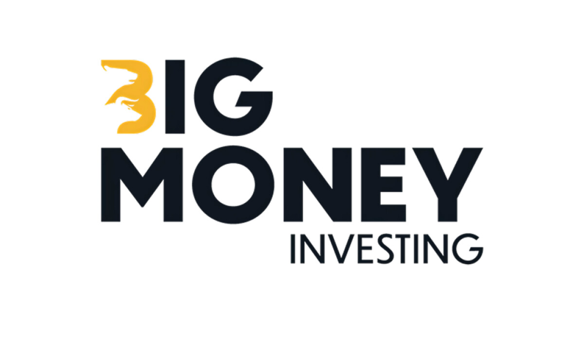
Campeones en Ads packs a punch with their branding for Big Money Investing. This financial identity doesn’t hide behind subtlety — it charges ahead with visual power and smart symbolism, perfect for a brand that positions itself as aggressive and unapologetically ambitious.
The showstopper is the “B” monogram. Look closely and you’ll see a bullish upper silhouette and bearish lower shape seamlessly integrated into the golden stroke. It’s a visual representation of market forces (bulls and bears) tucked into a single letter. The shape is minimal yet layered with financial symbolism, making it perfect for fast recall.
The bold sans-serif wordmark balances weight with modernity. "BIG MONEY" is assertive without being ornamental, while the “INVESTING” subtext brings focus back to the brand’s core function with a clean, narrow font.
The restrained palette, black and gold, reinforces the feeling of financial power and clarity like that of brands in the banking and finance industry. Nothing is wasted here. Every stroke speaks with authority.


