Standout Features:
- Stylized leaf symbol and evocative brand name
- Clean and modern typography
- Versatile and adaptable color palette and application
How do you represent the nurturing of talent and the cultivation of strong professional relationships? Trueffle has answered this for Bloom Recruiting with a logo that communicates the brand’s dedication to fostering growth for both employers and employees right from the recruitment process.
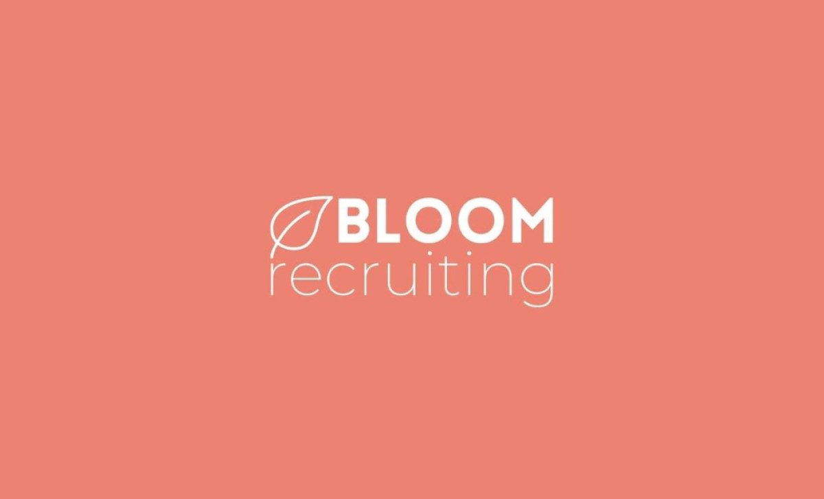
The agency cleverly pairs the Bloom Recruiting name with a stylized leaf symbol. It's designed with a thin outline, which lends it a delicate, elegant feel. Plus, it really ties in with the company's name and mission to help people grow, develop, and flourish in their dream jobs.
Another strong point of the logo is its clean, modern typography. The brand name "BLOOM" is presented in a bold, sans-serif typeface, which provides a confident foundation to the design. And to create a visual hierarchy, the word "recruiting" is written in a lighter, all-lowercase font. Alongside the leaf, the different line weights make for a balanced look.
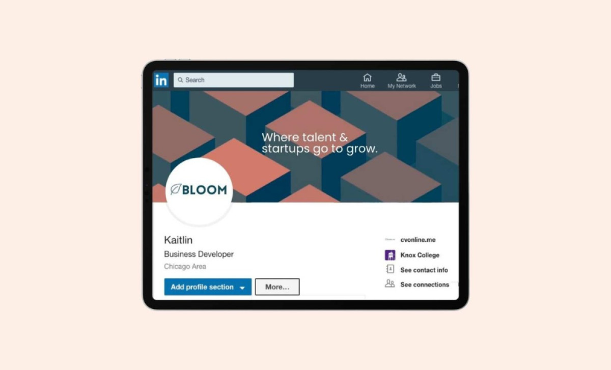
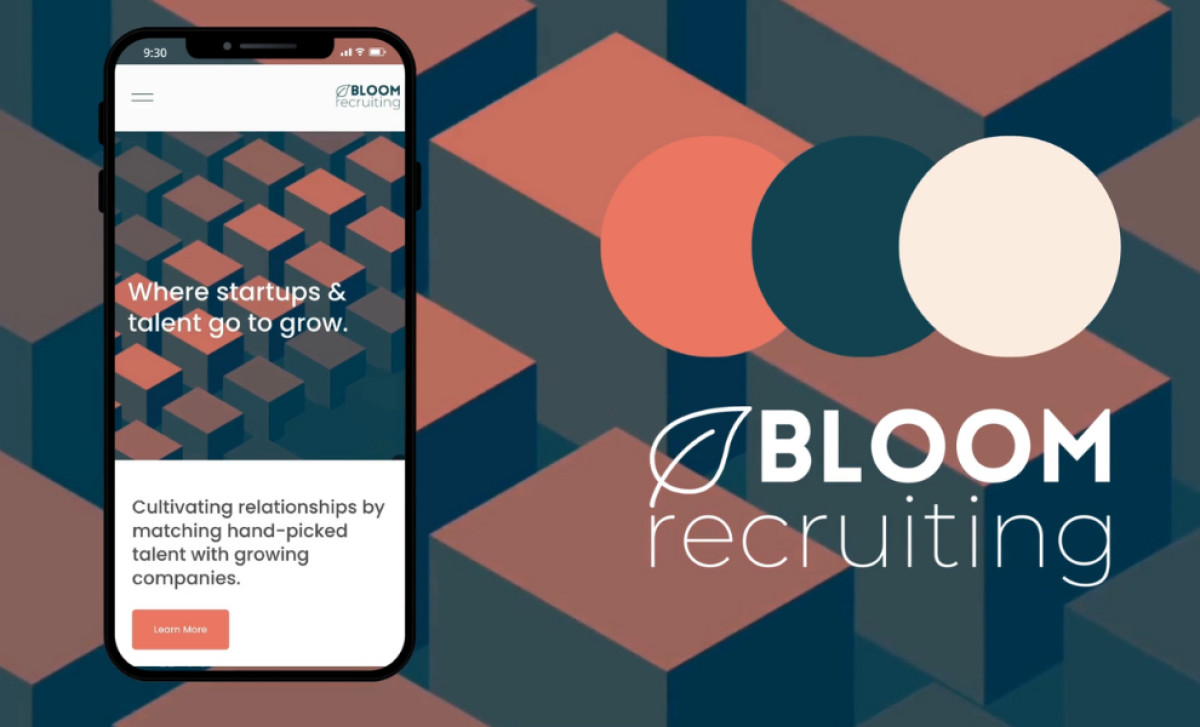
The logo is frequently rendered in white against a coral-colored background, giving it a warm and inviting look. But the color palette is also adaptable, and you can see how it's used effectively in different contexts, like on mobile phones and LinkedIn profiles, where it still looks great against different backgrounds and design elements.
Overall, this professional services logo's simplicity and adaptability serve as a constant reminder that recruitment, at its best, is about nurturing potential and building lasting connections — just like tending to a seed often leads to it blossoming.