Standout Features:
- Elegant serif and script typeface pairing
- Visual hierarchy via scale and weight
- Timeless blue and cream color scheme
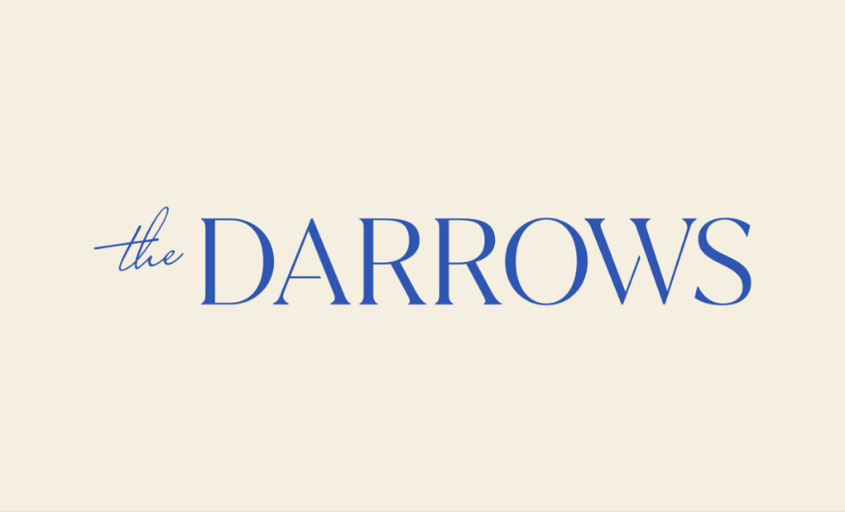
When a name is the brand, typography does all the heavy lifting. That’s the case for The Darrows — a consultancy that exudes grace and intelligence. Designer Jill Darrow LLC crafted a wordmark that positions the brand with clarity and poise through subtle font contrasts and timeless styling.
The logo features a smart juxtaposition: the word “the” in a delicate, flowing script rests above the bold and upright serif “DARROWS.” This contrast creates a rhythm that is both soft and grounded. The script adds personality and warmth, while the serif establishes structure and credibility.
Typography alone doesn’t define the logo’s success, hierarchy does. Jill Darrow skillfully varies size and stroke weight to make the brand name the clear hero, while the preface “the” plays a supporting role. This subtle hierarchy enhances readability and brand recognition, especially in contexts where scale and clarity are non-negotiable, like digital avatars or signage.
The brand’s blue color points to trust and intelligence, hallmarks of professional service sectors, while the cream background adds warmth and approachability. This palette feels classic and versatile — easily adapted to print, web, and branded materials without losing impact. Together, the tones emphasize the dual message: confidence and connection.
The Darrows logo is proof that simplicity, when intentional, can become striking. Jill Darrow’s restrained yet expressive typographic approach offers a timeless mark that communicates both prestige and humanity.