- Agency: White Spider Design Inc.
- Client: Casa Colibrí
- Category: Logo Design — Hospitality
- Location: Mission, British Columbia, Canada
- Project Brief: Create a distinctive logo and supporting visual system for a rural vacation rental that communicates calm, comfort, and a strong connection to nature across physical spaces, amenities, and guest touchpoints.
Hospitality logo design within natural settings often struggles to balance professional polish with the organic textures of the environment.
Casa Colibrí resolves this tension by leading with an illustrative aesthetic that favors personal connection and handcrafted charm over the sterile efficiency of traditional commercial marks.
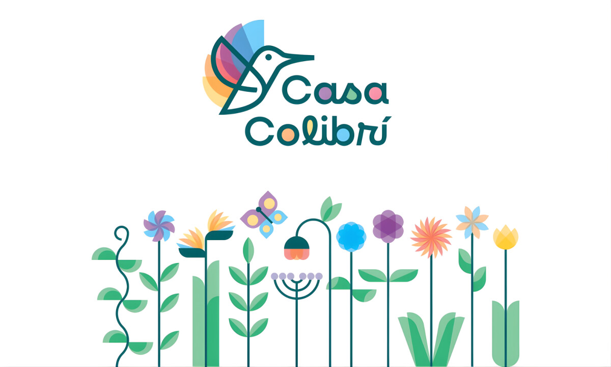
- Symbol & Brand Mark: The hummingbird icon anchors the logo with a sense of lightness and motion, referencing both nature and attentive hospitality. I believe its simplified form keeps the mark legible while remaining expressive enough to feel like a unique signature.
- Color & Emotional Tone: The palette draws from natural hues like forest greens and soft floral accents to create an immediate sense of calm. I think this approach is effective in reinforcing relaxation without leaning into the clichés of standard eco-branding.
- Typography & Personality: Rounded, friendly letterforms balance clarity with charm to support the welcoming tone of the mark. I appreciate how the intentionally informal typography aligns with the personal, home-like experience the property offers its guests.
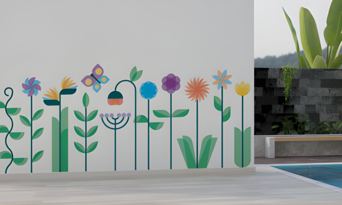
- Flexibility & Application: The visuals extend naturally into murals and guest amenities without losing their core recognition. I believe this flexibility allows the logo to live within the space, reinforcing the guest experience through subtle environmental cues rather than overt signage.
What Brands & Designers Can Learn from Casa Colibrí
1. Use Illustration to Build Emotional Connection
The hummingbird icon brings movement, warmth, and personality to the brand. Illustrative symbols can feel more human and welcoming than rigid commercial marks.
2. Let Color Set the Emotional Pace
Nature-inspired greens and floral tones immediately signal calm and restfulness. Thoughtful palettes can evoke atmosphere without relying on predictable eco-brand clichés.
3. Design for Living Environments, Not Just Logos
The mark extends naturally into murals, amenities, and on-site details. When a logo is designed to live within a space, it strengthens the overall guest experience through presence rather than prominence.