Standout Features:
- Circular and interconnected design
- Minimalist and modern typography
- Vibrant color contrast
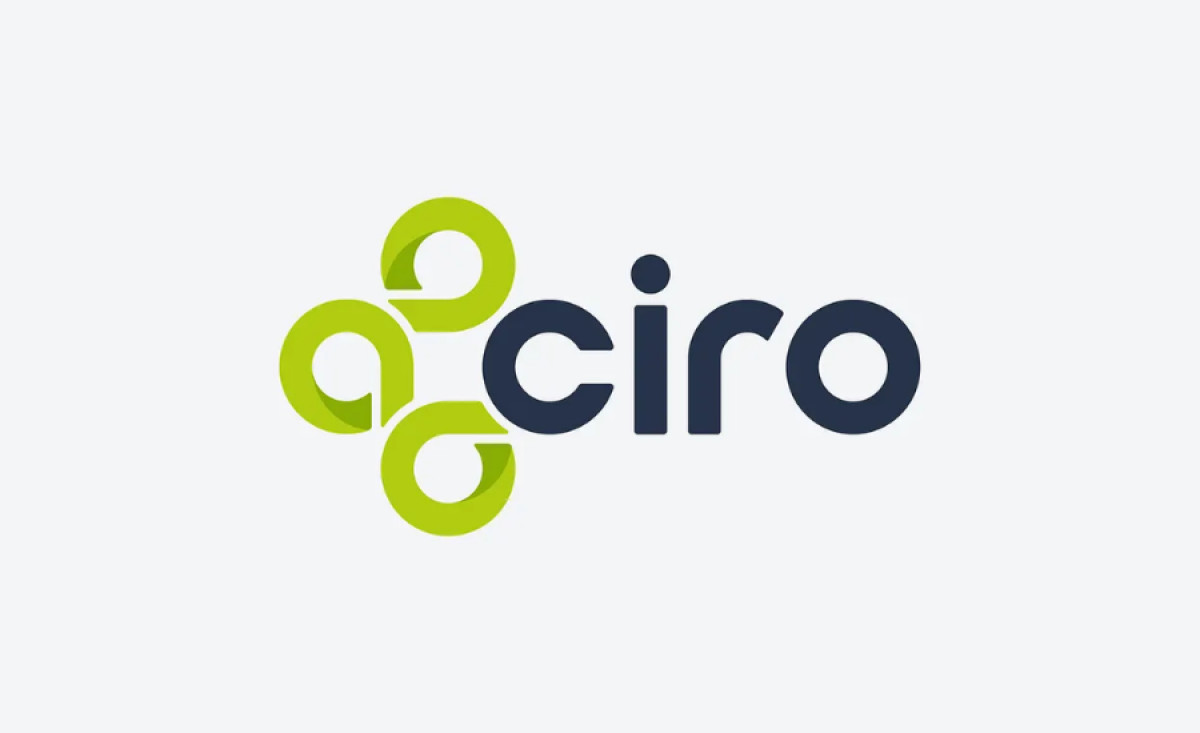
Ciro, a cutting-edge SaaS solution streamlining healthcare staffing, needed a logo that represented its modern, efficient, and professional services. The logo, designed by Brian M. Peters, accomplishes this by combining clean lines, modern typography, and strategic symbolism.
The first standout feature of the logo is its use of interconnected circular elements. These shapes symbolize collaboration, connection, and the efficient flow of information — qualities that are at the core of Ciro’s software. The circles link together, visually conveying how the company’s product connects the different components of healthcare staffing.
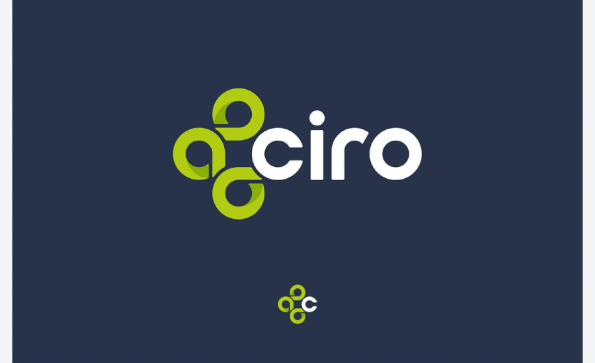
Brian M. Peters chose a bold, sans-serif typeface that enhances the clean, modern feel of the design. This ensures readability across various platforms and sizes. The straightforwardness of the typography contrasts well with the organic, flowing shapes of the circular elements, helping to balance the overall composition of the logo.
Lastly, the bright green and dark blue combination creates a strong contrast that is both vibrant and professional. The green evokes a sense of health, growth, and innovation. Meanwhile, the dark blue reinforces trust and professionalism, making the logo appropriate for a SaaS product in the healthcare sector.
The Ciro logo by Brian M. Peters successfully captures the brand's core values through its modern and thoughtful design. This logo exemplifies the best professional services logo design for a SaaS healthcare brand, ensuring that Ciro stands out in a competitive industry while remaining true to its mission of streamlining healthcare staffing.