- Agency: loyalkaspar
- Client: Perlick
- Category: Logo Design — Distribution
- Location: New York City, New York, United States
- Project Brief: Create a logo conveying Perlick’s legacy and innovation through modern typography for stronger brand recognition.
A legacy brand entering its second century faces one question: how to modernize without erasing the thing that made it worth preserving. Loyalkaspar's work for Perlick solves that by treating the archive as a starting point rather than a constraint.
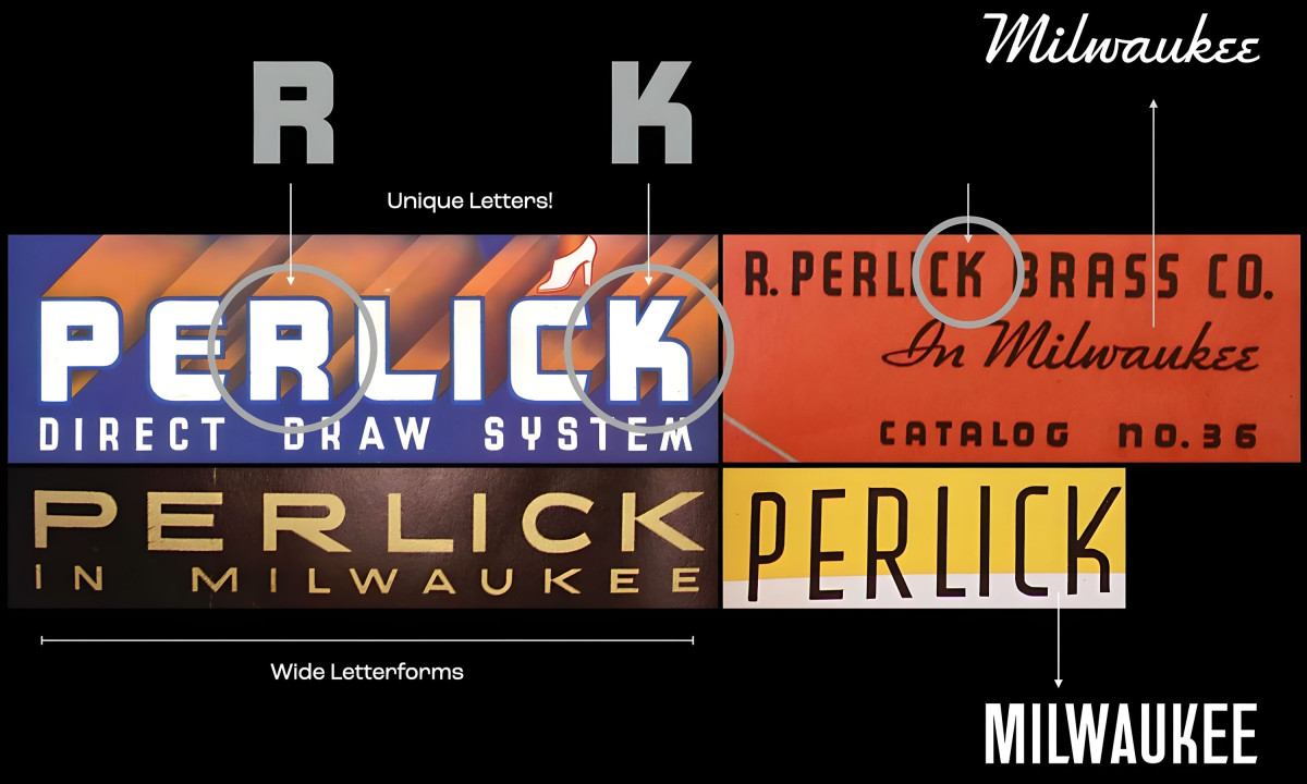
The archival research clearly shows its influence. The wide, extended letterforms that appear across decades of Perlick's printed materials informed the proportions of the new wordmark.
The R and K carry distinctive cuts that nod to mid-century industrial lettering without reproducing it. The result reads as contemporary but earns its confidence from a specific source.
The shield and stylized P mark pair with the wordmark to give the brand a symbol that works independently at small sizes, on equipment badges, and on product plaques where the full wordmark can't fit.
For a beverage distribution company whose products live on commercial equipment and bar counters, scalability across physical touchpoints matters as much as how it looks in a brand presentation.
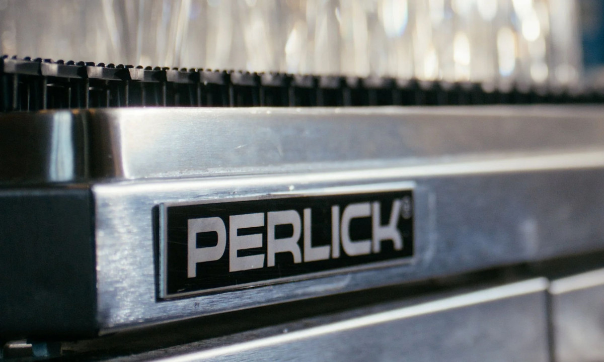
The typeface falls within a condensed, geometric sans-serif style, with tight spacing and strong stroke contrast. It photographs cleanly on stainless steel, holds up on black badge labels at small sizes, and carries the weight that a manufacturer with over a century of American production history needs to project.
What loyalkaspar built is an identity rooted in one company's actual history, not a general interpretation of what an American manufacturer should look like. The difference shows.