The Columbus Crew logo has long been a symbol of grit, unity, and progression. As one of Major League Soccer’s founding clubs, the Crew has carried the spirit of a working-class city onto the pitch since 1996.
The Columbus Crew crest has evolved through distinct phases, mirroring shifts in cultural relevance, design trends, and the expectations of an increasingly design-savvy fanbase. Let’s explore the story told through each transformation and uncover what these strategic design shifts can teach brands about evolving their own visual identity.
Columbus Crew Logo Design Details
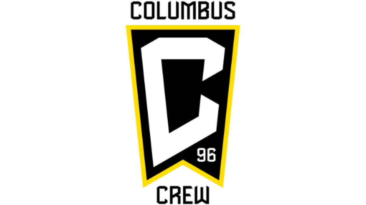
The Columbus Crew’s current logo centers on a bold, angular “C” outlined in yellow — a clean, modern mark that signals strength and motion. Framed within a shield inspired by the Ohio state flag, it subtly ties the club to its Columbus roots while projecting broader ambition. The sharp geometry ensures clarity and versatility across all brand touchpoints.
Beneath the “C” sits a discreet “96,” honoring the club’s founding year and legacy within MLS. Combined with the iconic black and gold palette, the crest balances heritage and modernity. It’s a design that reinforces identity, commands attention, and scales effortlessly across platforms.
Columbus Crew Logo History
1996: The Original Industrial Identity
The inaugural badge featured three construction workers wearing hard hats, framed by a black shield with “THE CREW” in bold orange. This literal depiction embodied Columbus’ working-class ethos and connected deeply with local fans. It was bold, authentic, and unapologetically grounded in its time. Check out best graphic design logos that nail clarity without sacrificing meaning.
2014–2021: A Modernized Heritage Mark
After years of refinement, the club introduced a circular badge that ditched character imagery for geometric symbolism.
Checkerboard patterns hinted at Columbus’ racing history, while “96” and the black-and-yellow scheme were retained. The typography and layout brought a Euro-style structure to the badge: cleaner, more balanced, and globally resonant.
2021: The Controversial Rebrand and Fan Backlash
The 2021 rebrand renaming the club "Columbus SC," introduced a triangular pennant-like crest with a massive stylized “C.” The visual and verbal shift was meant to position the team for broader recognition, yet it was received as a break from legacy. Though conceptually sound, removing the word “Crew” from the visual and verbal brand alienated core supporters. The fan response was swift and vocal, a clear reminder that brand equity cannot ignore emotional equity. Learn more about this balance in our guide on how to choose a logo for your business.
2021 – Today: Compromise and Clarity
Just over a week later, the team reversed its decision. In response to fan feedback, the club reinstated “Crew” and added “96” to the badge. The new logo preserved the shield structure, streamlined the composition, and embraced a minimalist monogram in an attempt to balance modern aesthetics with community values.
Planning a visual evolution of your own? Check out these insights on how to outsource logo design.
Columbus Crew Logo: Branding That Listens, Evolves, Endures
Columbus Crew’s logo has matured from a gritty depiction of workers into a stylized, future-ready badge with unmistakable impact. While the branding has seen its share of controversy, the club’s willingness to evolve and to listen speaks volumes. The current Columbus Crew emblem is a symbol of thoughtful evolution. It reflects a broader trend in sports design, where storytelling, symbolism, and brand utility converge. With its angular “C,” Ohio-rooted form, and nod to founding traditions, the logo encapsulates where the club has been and where it’s headed.
For businesses, the Crew's branding journey offers several key takeaways:
- Simplify with intent: Strip away visual clutter while preserving the identity core
- Honor heritage: Subtle callbacks (like “96”) bridge past and future
- Listen to your audience: The Crew’s course correction post-2021 is a model in stakeholder engagement
- Design for flexibility: Today’s logos must scale seamlessly across merchandise, digital, and media