- Designer: Sato Mateus
- Client: Council of Architecture and Urbanism of Brazil (CAU/BR)
- Category: Logo Design — Architecture Logo
- Location: Serra do Cipó, Brazil
- Project Brief: Create a new visual identity for the Council of Architecture and Urbanism of Brazil that honors the legacy of Brazilian modernism while establishing a timeless, cohesive brand system inspired by Oscar Niemeyer's iconic architectural forms.
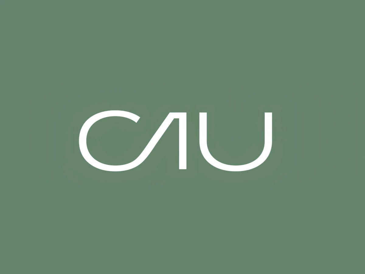
A logo for a national architecture council could lean on blueprints or buildings, but this one for CAU/BR reaches for a single curve instead. The wordmark traces its letterforms from Oscar Niemeyer's sweeping lines, so a thin, continuous stroke does the work that a literal building icon usually would. Juror Andrea Owsinek-Brucker read the result the way the stroke intends: an "elegant, minimalist, and flowing design that connects."
The letter construction hides the reference in plain sight. The "A" drops its crossbar into a smooth arc and the "U" opens into an unbroken loop, giving "CAU" the fluid, hand-drawn quality of a Niemeyer sketch while staying perfectly legible.
Juror Phoebe Person's three-word verdict lands on exactly this craft: "simple, typographic, & elegant."
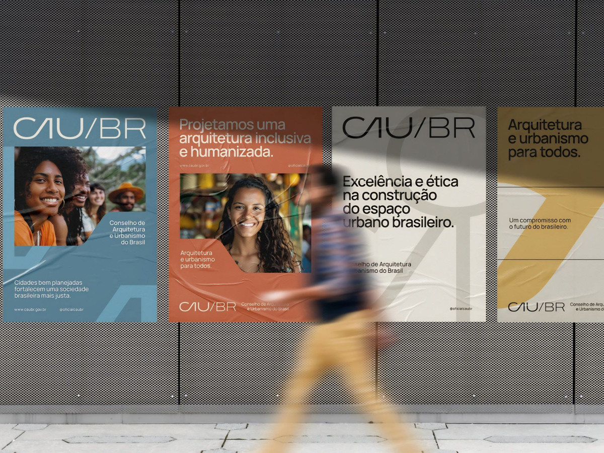
The color palette keeps the nod to Brazil quiet. Earth ochre, vegetation green, and a muted sky blue pull from the country's natural tones without waving a flag, so the identity reads as national without turning literal.
The system scales from tiny to architectural. The thin line holds up embossed on a business card, printed small on letterhead, and blown up as a faint watermark behind street posters, proving a hairline mark can still command a wall.