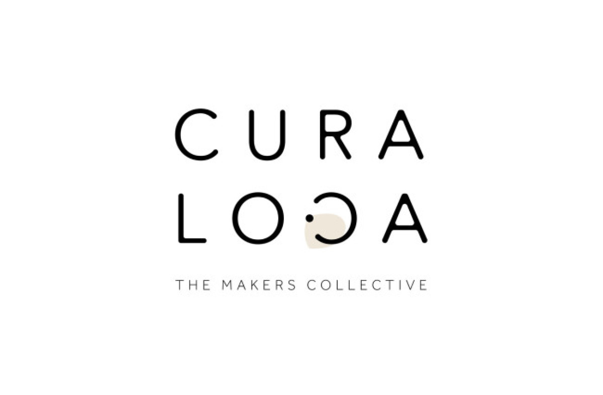
CuraLoca
- Logo designed by Little Bird Creative
- 139

Article by Mladen Milosevic

Last Updated: January 07, 2025
Standout Features:
- Inverted C on LOCA
- Colored half-circle
- Thin sans-serif fonts
CuraLoca's simple logo design by the Little Bird Creative features an inverted C on "Loca,” with a dot on top and a colored half-circle underneath.
The inverted letter is also a subtle yet impactful touch to the design. It highlights the brand's mission to "Curate locally," as its name suggests.
And if we look with a more playful perspective, it also accentuates the word "Loca," which means "crazy" in Spanish — a nod to the brand's roots. The thin sans-serif font logo design is also perfect because it allows the viewer to read the brand name easily and focus on what it offers.
Get a chance to become the next Design Award winner.
SUBMIT YOUR DESIGN- Logo designed by Little Bird Creative
- 139
- Tags:Simple
Mladen Milosevic’s passion for all forms of art fuels his ability to create content that seamlessly blends creativity with informative depth. With five years of experience in content creation and copywriting, his close collaboration with a design team as an editor for private school websites in Serbia has sharpened his keen sense for design. His artistic insight is a valuable asset in crafting engaging textual content that captures the essence of various design types. Mladen now channels this expertise into writing insightful articles on logo, print, and packaging designs for DesignRush.