Standout Features:
- Nature-inspired logo with clean, modern aesthetics
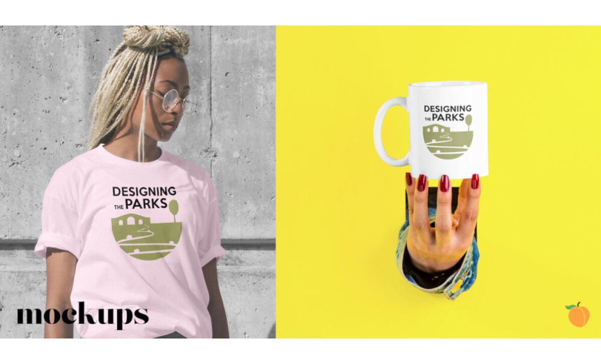
- Versatility in application across merchandise and collateral
- Playful, approachable typography
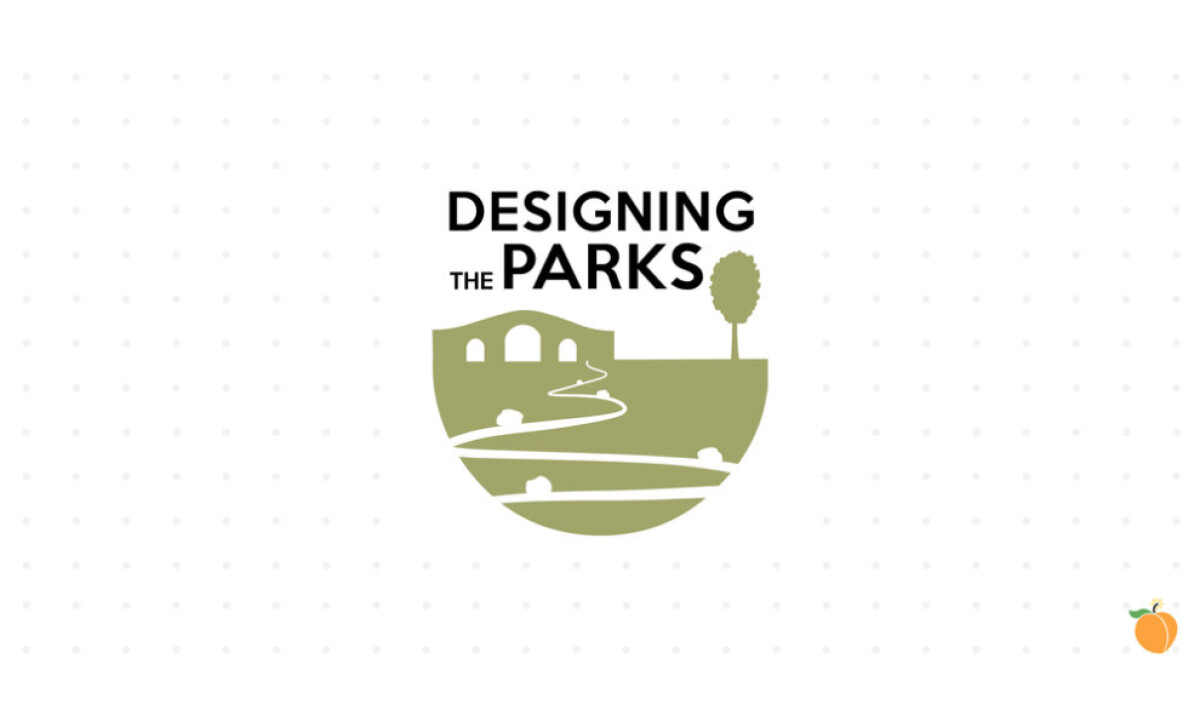
How can a logo appeal to young, diverse students while representing a national institution and the great outdoors? The Designing the Parks program finds its answer in its visual identity. Peach Bomb Creative designed a logo that blends modern appeal with natural elements, aiming to spark interest in NPS careers in a fresh, inviting way.
The program's identity centers on its nature-inspired logo. There’s a stylized park landscape, complete with rolling paths, a tree, and an abstract structure, all neatly enclosed within a semi-circle. Its soft green palette and neutral tones also help bring about a sense of calm and a direct connection to the natural world.
One can also appreciate the logo’s versatility. Its clean and simple design translates effectively onto items like t-shirts and mugs, as seen in the mockups. This adaptability ensures consistent branding whether on physical products or digital platforms — and helps make the program feel accessible and part of a student's personal expression.
The design also features playful, approachable typography. The word “the” appears in a smaller sans-serif font in between the more prominent, uppercase “Designing” and “Parks.” This contrast draws attention to the core focus — Parks— while maintaining a youthful, modern feel.
The Designing the Parks logo successfully captures the program's aim to inspire. Its fresh, nature-focused design directly appeals to a new generation. For similar educational initiatives, this highlights how a well-crafted education program logo design can embody mission and attract passionate young individuals to important career paths.