Look at the app icons on your phone. The ones that belong to major tech platforms almost always follow the same logic: a shape, an initial, an abstracted gesture toward what the product does.
Spotify gives you audio waves. Slack gives you a rotated grid. Twitter/X gave you a bird and then, when the bird became inconvenient, swapped it for a letter.
Geometric marks. Ownable, scalable, safe.
Discord gave you a face.
Not a mascot tucked into the corner of a landing page — the face is the logo.
While every other major platform races toward abstraction, Discord made the opposite bet: lean into a character. Its official name is Clyde, though most users don't know that.
Discord's own design team noted that people called it everything from a game controller to Mickey Mouse's pants before they ever learned it had a proper name.
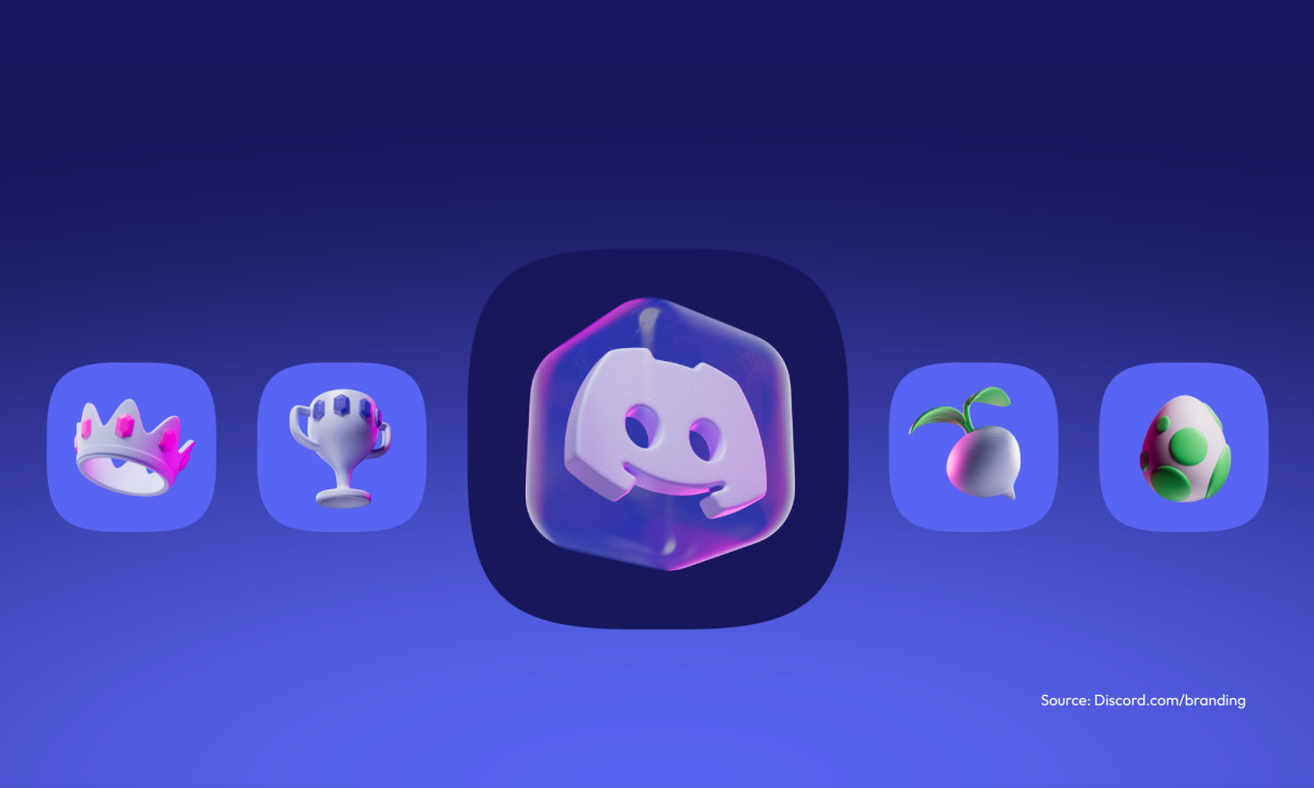
And yet Clyde shows up in fan-made emotes, custom server icons, unofficial merch, and reportedly tattoos that Discord had no hand in producing.
That volume of unsolicited reproduction is rare for any brand mark, let alone one attached to a chat app. It's what character IP does that geometric IP cannot: it makes people want to participate.
The interesting question isn't why Discord went with something approachable. It's what they built into the geometry that made people want to keep drawing it.
What Clyde Actually Is — A Design Analysis
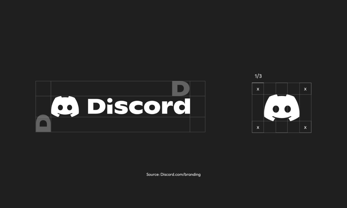
Strip the Discord logo down to its physical parts and here's what you see: a rounded square holding two circular eyes, a simplified nasal cutout, and two bumps at the top that read all at once as game controller joysticks, satellite antennae, and the ears of something alien and faintly prehistoric.
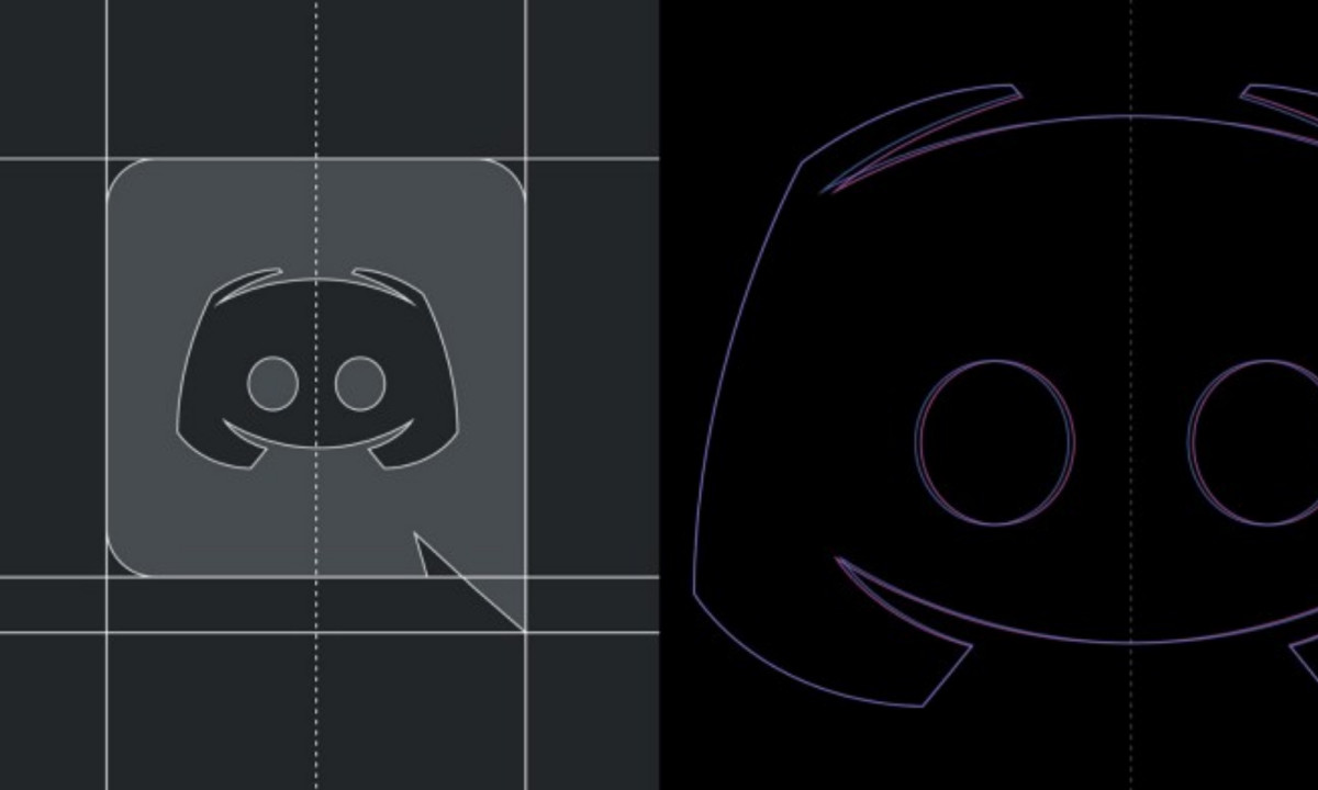
Discord's design team has described the evolution as moving from circular shapes to what was basically a smiley face, then iterating toward the squared-off form you see today.
The design process was extensive — hundreds of explorations, animated tests, and a recognition that they couldn't land somewhere unrecognizable. As the team put it, you can't have people wake up to "something weird like a banana as our icon."
One technical detail worth flagging: Clyde's head isn't a standard rounded rectangle. It's a squircle, or superellipse.
Standard rounded corners have a sharp break where the straight edge meets the arc (G1 continuity), but a squircle transitions continuously with no break at all (G2), which makes it feel softer and more resolved without ever reading as a circle.
Apple's app icon grid uses the same geometry. It's a sub-perceptual decision that lands without anyone being able to say why.
The face Clyde makes is expressionless in a precise way. It isn't aggressive, which would've shut the door on every non-gamer who landed in a book club server or a late-night study group.
And it isn't cartoonishly happy, which would've read as manufactured approachability — the visual equivalent of a brand that drops exclamation points into error messages.
What Clyde communicates sits closer to open waiting: curious, a little dumb in an endearing way, asking nothing of you.
That register is hard to hit on purpose. It needs consistent stroke weights with no sharp angles to generate tension, and eyes proportioned to feel observational rather than expressive.
Compare that with the gaming-adjacent logos that filled the same space when Discord launched — Razer, ASUS ROG, and Twitch's glitch icon. These brands lean on aggressive geometry: hard cuts, acute angles, the visual vocabulary of competition and speed.
Discord made the opposite call. Soft strokes in a space dominated by hard edges. The bet was that approachability would scale further than aggression, and that a platform built for voice and text between strangers needed a mark that wouldn't confront people before the conversation started.
So what holds at 16×16 pixels? At favicon scale, most character-based logos fall apart because the detail that makes them read as characters, like the specific curve of a lip, a brow angle, or a precise highlight, is the first thing to disappear.
Clyde dodges that because the mark is built from primitives: circles, a simplified rounded rectangle, two symmetric bumps. At small sizes, you lose the nasal cutout and the eye granularity.
But the silhouette survives, and the silhouette is distinctive enough to carry the recognition on its own. That's what happens when structural geometry does the work that detail is usually asked to do.
Designed for Dark Mode First
Here's the most underreported constraint that shaped everything about Clyde: Discord designed for dark backgrounds first and let light become the exception.
Almost every major tech brand operates the opposite way. Apple, Google, and Meta design for light surfaces first and treat dark mode as an adaptation.
Discord's primary interface defaults to near-black backgrounds, Charcoal (#23272A) and Dark Slate (#2C2F33), which means Clyde lives against darkness by default. That isn't a detail — it's the entire geometry brief.
The white Clyde on a dark background, which is the version most users actually see, depends entirely on the negative space inside the mark for legibility.
The nasal void isn't decorative. Against a dark field, it's what tells your eye where the face ends and the background begins — without it, the mark collapses into an indistinct pale shape.
There's also a phenomenon worth naming here: haloing.
When a light-colored logo sits against a very dark background, screen glow causes edges to appear slightly blurred or luminous, making a logo feel soft in the wrong way, like a photocopy of itself.
Clyde's thick strokes and generous negative space are calibrated to hold their edges under that condition, and the eyes, which might read as slightly oversized in isolation, are sized for an environment with ambient glow and reduced contrast at small sizes.
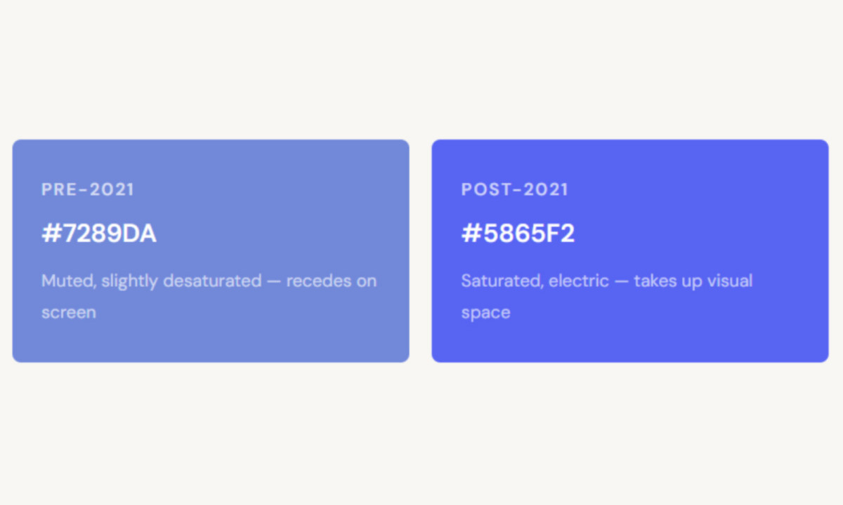
Then there's the purple. Discord's brand color was #7289DA in its original form and got updated to #5865F2 in 2021. It's one of the few primary tech brand colors that isn't blue, red, or black.
Purple at screen resolution holds a specific tension. It feels electric without being aggressive; it carries associations with niche enthusiasm and gaming culture, and it keeps visual weight against dark interfaces without going harsh.
The original blurple was more desaturated, which let it sit quietly within the app. Whether that was deliberate restraint or a hedge against something bolder is one of the questions the 2021 rebrand answered.
The 2021 Rebrand — Discord Got Louder
Most corporate rebrands move toward subtlety. Discord's went the other direction, and it did not go quietly.
The shift from #7289DA to #5865F2 pushes toward blue and toward saturation. The old purple sat between blue and violet, muted enough to feel almost apologetic by 2021. The new one sits closer to indigo.
It's electric, takes up more visual space, and is harder to ignore. Discord's design team described the change as bringing "more energy" by "brightening up the colors to be more bold and playful."
The community's word for it, across Discord's own support forums, was eyestrain. Change.org petitions were filed. The ratio of defenders to critics was not close.
The wordmark changed alongside it. The old typeface was built on Uni Sans Heavy: sharp, uppercase, recognizable. The new wordmark uses a custom typeface based on Ginto, designed by Studio Koto and sourced from Dinamo type foundry.
The letterforms are wider. Title case replaced all caps. There's more horizontal mass to the whole thing. As Discord explained, they agonized over that capitalization choice and weighed whether to keep all caps or move to "Discord" as a proper name.
Title case won. The effect is less "gaming utility" and more "tech platform trying to become a proper noun in your life."
That was the explicit goal. CEO Jason Citron publicly framed the rebrand as addressing the platform's dominant misconception, which was that it was only for gamers. The rebrand was meant to signal universality. And the timing carried context past brand positioning.
In April 2021, Discord turned down a $12 billion acquisition bid from Microsoft and signaled it was going after an IPO instead. A company preparing for public markets doesn't stay "the gaming app." The rebrand and the pivot were the same message.
One detail from the backlash is worth flagging. Nobody petitioned to restore Clyde's shape. The community mourned the blurple and the font, but Clyde itself wasn't contested.
The face had built up enough goodwill to survive a transformation that changed almost everything around it. That's exactly the kind of brand resilience character-based marks are worth the investment for.
Clyde also gained something new in the 2021 update. Discord officially freed Clyde from the chat bubble he had always lived inside, what the design team called being "stuck in his bubble like a hamster in a rolling ball."
The new Clyde stands freely and has more expressive range. The design team also noted that fan art had long drawn Clyde with emotions, and the rebrand officially licensed that range.
Why Character Logos Survive User-Generated Reproduction
The unofficial measure of a brand mark's success isn't how it looks in the style guide. It's what happens when your users become the publishers.
Discord's users are always the publishers. Every custom server icon, every emote, every piece of fan art floating across Reddit, Twitter, and Twitch is brand exposure Discord didn't pay for.
That kind of reproduction has a precondition. The mark has to be simple enough to draw from memory, and expressive enough to be worth drawing.
Clyde clears both bars because it's built from the same primitives as a rough sketch: circles, a rounded rectangle, two bumps. A character that takes reference material to reproduce is a character that doesn't get reproduced.
Compare the trajectories. Twitter's Larry the Bird was specific enough to have a name, but it kept getting simplified until it disappeared into the X rebrand. Detail becomes a liability when the platform changes faster than the mark can adapt.
Reddit's Snoo survives by the same logic as Clyde: open expression, minimal geometry, easy to redraw.
The characters that persist in fan culture are the ones built from the code of handwriting — a few strokes that carry the whole meaning, with enough ambiguity left for the reader to bring themselves to the mark.
There's a practical design principle buried in this. A logo designed only for controlled official use, like app store icons, style guide PDFs, and conference signage, will read as sterile in community contexts.
Discord's users move fluidly between those official contexts and the unofficial ones where the brand actually lives day to day. Clyde was built, intentionally or by instinct, for a product where the community generates most of the brand surface area.
Every server icon, custom emote, and piece of fan merchandise is distribution that costs Discord nothing. That only works when the mark can survive being drawn badly by someone who hasn't touched a vector tool in their life.
What Brand Managers Can Take From Discord
Four things:
- Characters carry an effect that symbols can't: A face activates recognition and attachment differently than a geometric mark does. Clyde creates a relationship the moment you see it. Slack's grid just describes a function. Those aren't equal instruments for building community.
- Design for where your logo actually lives: Discord's users carry Clyde on phone home screens, drop him into server icons, and reproduce him in places Discord never mapped out. The mark was built to hold its identity through all that reproduction. If your logo only looks right in the brand PDF, you've designed for the wrong context.
- Bold rebrands need something stable at the center: Discord could change the color and typeface in 2021 because Clyde didn't move. The character absorbed the community's sense of continuity while everything around it shifted. Without that stable core, the backlash has nowhere to land except against the whole identity.
- Dark mode is infrastructure, not a skin: If most of your users live inside dark interfaces, and Discord's do, design for dark first. Stroke weights, negative space, color saturation: all of it performs differently against dark backgrounds. A mark optimized for light-on-white is fighting its own environment every time the app opens.
