- Agency: Simansons Design
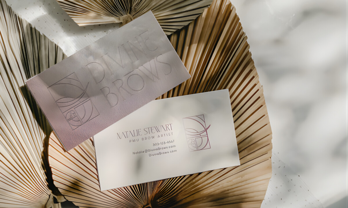
- Client: Divine Brows
- Category: Logo Design — Modern
- Location: Denver, Colorado, United States
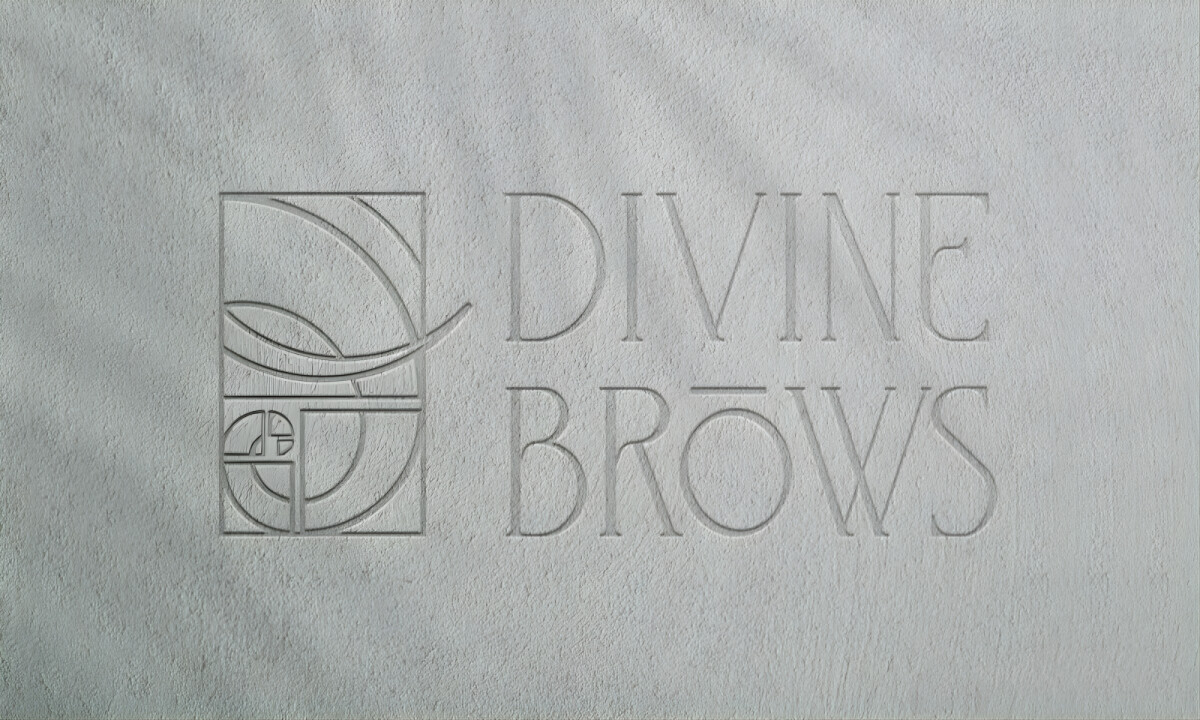
- Project Brief: Rebrand Divine Brows with a logo system that reflects technical mastery in brow shaping while honoring the client’s Vedic spirituality through symbolic, geometric form.
Modern logo design should distill complex values into a singular, balanced form that remains functional across all scales.
Divine Brows achieves this by utilizing the golden ratio as a silent architect, aligning the brand with both biological symmetry and spiritual heritage.
- Sacred Geometry & Proportional Structure: I like how the mark utilizes sacred geometry and the golden ratio to communicate intentional balance. This mathematical foundation mirrors the exactness required in brow artistry, ensuring the design appears as disciplined as it is beautiful.
- Symbolism & Spiritual Narrative: The subtle elephant reference successfully introduces layers of wisdom and strength tied to Vedic spirituality. This integration ensures the brand stays personal and elevated without relying on literal or decorative clichés.
- Visual Flow & Technical Logic: I appreciate how the golden ratio curves create a natural rhythm that echoes facial symmetry and shaping techniques. This connection reinforces the technical expertise of the brand through a clear and sophisticated visual logic.
- Refined Minimalism & Scalability: I like the clean line work that allows the logo to translate seamlessly across embossed materials and digital platforms. This restrained approach ensures the brand maintains its elegance and recognition across every touchpoint without unnecessary noise.
What Brands & Designers Can Learn from Divine Brows
1. Use Proportion as a Silent Brand Signal
Golden ratio geometry communicates balance, precision, and intention without explanation. Mathematical structure can subtly reinforce expertise and care.
2. Embed Symbolism Without Literal Imagery
The abstract elephant reference adds cultural depth and meaning without becoming illustrative or cliché. Subtle symbolism keeps luxury and spiritual brands elevated.
3. Design Minimal Forms for Maximum Scalability
Clean line work ensures the logo performs across embossing, print, and digital use. Minimalism rooted in logic preserves elegance at every size.