Standout Features:
- Monogram icon
- Refined use of orange in medical branding
- Rounded sans-serif typography
We are looking at a design that had to communicate calm competence. For patients seeking facial surgery, Dr. Juan Peña Lares' branding needed to be reassuring and trustworthy.
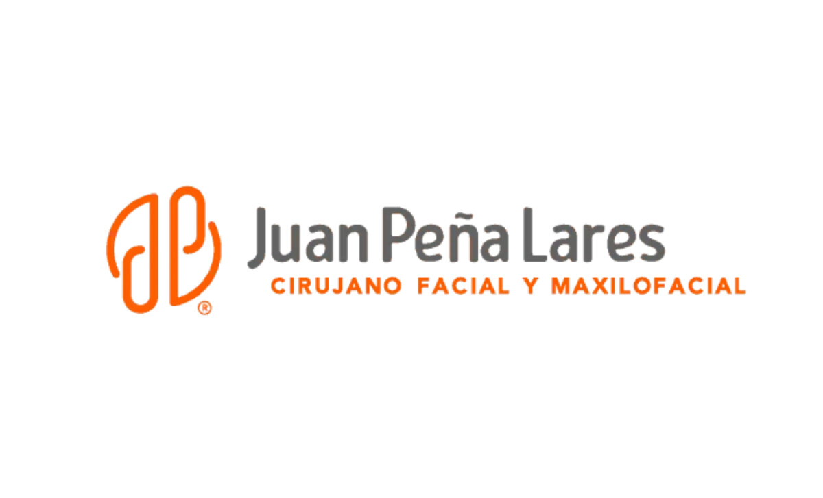
At the heart of the logo is a monogram formed from the initials “JP.” They are stylized with continuous, soft contours that create an abstracted symmetrical shape. This gives the mark a very clean, fluid, and modern feel.

We like that the circle logo design uses orange, which is an unconventional color in clinical identities. This choice is strategic and helps the brand stand out.
It evokes a sense of energy and vitality, as color psychology studies often associate orange with enthusiasm, creativity, and determination. These are ideal qualities for a surgeon.

The typographic hierarchy is very clear. The doctor’s name is set in small caps, while the tagline below it is in fully capitalized orange letters.
The design by Marcus Rosanegra proves that you don't need complex graphics to be effective. A clever idea and a clean execution are all you need to build a powerful brand.
For any medical professional, the logo has a difficult job — it needs to feel both reassuringly calm and highly competent at the same time.
That's why brands turn to expert partners, and our team has ranked the best agencies worldwide to make finding them simple.
Visit our Agency Directory for the Top Logo Design Companies, as well as:
Our design experts also recognize the most innovative design projects across the globe. Visit our Awards section to see the best & latest in logo design.

-preview.jpg)

