CAD LAB Logo Design Is a Masterclass in Robust Elegance
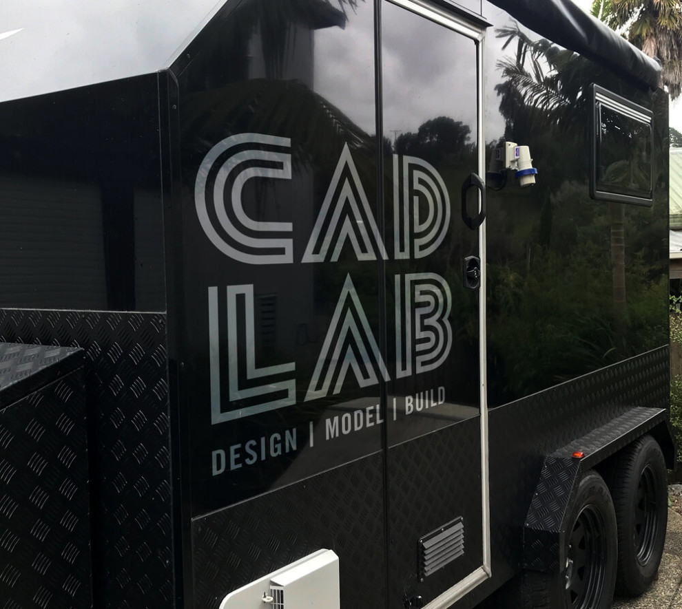
Put shortly, CAD LAB is a 3D printing and design business run by Brendon Sweeney, based in Auckland, New Zealand.
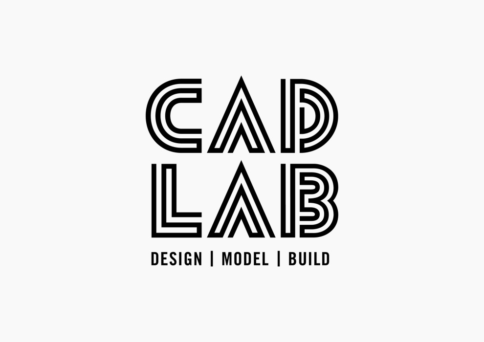
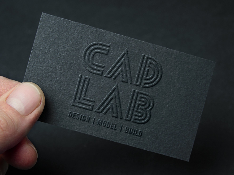
CAD LAB logo design, masterfully designed by Amanda Chetwynd, also relies on brevity, however, a second glance at it opens up a multitude of meanings or rather symbolic layers.
The first and most obvious one would be simplistic, albeit elegant aesthetics evoking the art deco style, but without tapping into vintage appeal since CAD LAB is all about looking forward to the future.
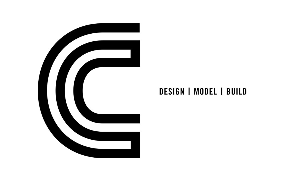
The second one is the brand's primary mission, or more precisely, its creative routine/potential. Since 3D printers, well, print precise, continuous lines, back and forth on top of each other, creating a precis form, the logo has to reflect it as well.
As Brendon Sweeney himself puts it:
“Amanda went above and beyond to create our custom type logo. We love the simplicity of the lines used to create the lettering that represents our 3D company.”
Looking at this (dare we say hypnotic) process, it only makes sense that logo design should mimic it from a 2D perspective. The result is this custom lettering built using a continuous line forming the letter by running back on itself.
The Union of Two Different Font Styles Reveals the Refined Efficiency and a High-End Nature of the Brand
As mentioned, there is a certain air of elegance and refinement to the simplicity of CAD LAB logo design. While we usually associate high elegance with something delicate, this logo is anything but. You can’t mistake the intricacy of the 3D printing process hidden in the logo for something flimsy or floaty. In fact, it’s robust, meant to last, just like CAD LAB’s creations.
Aside from their craft, this wordmark(s) helps to solidify the brand’s own prominence and (upcoming) prestige. It’s a venture committed to making sure your ideas come to life and solidify. Literally.
Most logo designers understand the power of simplicity and use it to create impactful designs. The wordmark for this brand is no exception, as it employs a basic sans-serif font, a monochromatic palette, and bold lines to showcase the brand's name. In some instances, you'll see a short tagline that demonstrates utility and efficiency (with flying colors): "Design. Model. Build."
CAD LAB is a masculine brand, run solely by Brendon Sweeney out of a large (and impressive) black printing trailer. The solid clean lines, and simple black and white color palette reflect this approach perfectly.
CAD LAB Logo Design Offers a Recognizable Brand Identity Both Online and In-Person
Although Brandon Sweeney enjoys working “on the road”, CAD LAB’s dynamic nature transcends the printing trailer where the magic happens.
The most interesting part of the CAD LAB’s logo design is the faux-mirror effect in the wordmark. What makes it so effective and memorable is that it translates easily to different environments, both (3D) printed and digital.
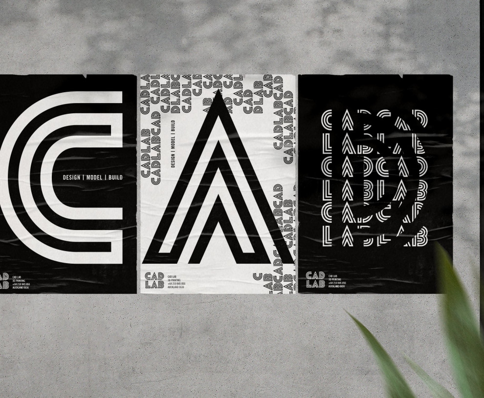
As a part of the brand’s overall brand identity development, Amanda Chetwynd’s creation is flexible enough and easily maneuverable. You can effortlessly create several icon variations depending on the purpose, whether it’s a social media page, merchandise or a seal of approval.
A recognizable logo is key for instilling trust and a sense of reliability. The logo sits extremely well atop any physical or digital platform as evidenced by CAD LAB’s many creations, that beside vanity projects, include 3D parts for the movie industry, concepts for boat building projects and more recently during the pandemic when CAD LAB printed mask parts for workers on the front lines.
This is an excellent example of how branding agencies can create a logo design that captures the essence of a company and effectively communicates its wide range of expertise and offerings.
Making Your Ideas a Reality Is the Key Proposal When ”Entering” CAD LAB’s Maze-like Logo Design
Every design starts with an idea and to get from an idea to the final product you need to trudge a long labyrinth. Not for obstacles' sake, mind you, but to sift them, until only the gold remains.
CAD LAB helps you trudge that maze and offers you the means to reach your goal, i.e., make your “dreams come true”.
With its custom decorative font, CAD LAB has the possibility to play with the multiline concept to create endless overlapping geometric creations,
Besides its visual appeal, the CAD LAB wordmark represents said maze and embodies the tagline, or rather a journey through it that starts with an idea with the following steps being – DESIGN – MODEL – BUILD.
CAD LAB Logo Design Is a Contemporary Fusion of Visuals That Is Bound to Boost Brand Visibility
CAD LAB logo design is different and memorable, but more importantly, it is extremely well-aligned with the brand’s purpose.
Since the global market is also jumping on the bandwagon of 3D printing and the process has long stopped being a novelty, the logo is well-suited to help CAD LAB stand out with a well-defined visual identity.
A logo is a first and most crucial step toward a recognizable business. By having a uniquely designed logo, the company is on a solid path to better brand visibility and customer retention.
CAD LAB logo design is future-proof, in 21st century and beyond which is why it deserves the DesignRush Best Design Award.

-preview.jpg)