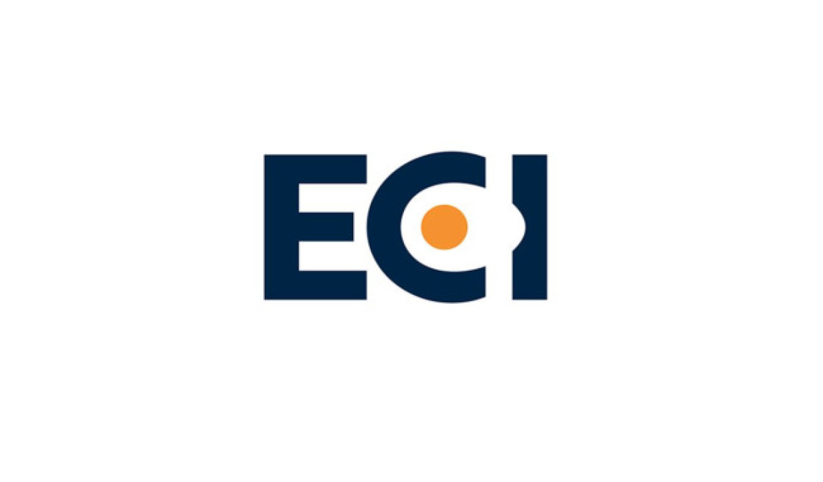
Standout Features:
- Handwritten typeface
- Versatile logo design
- Unique take on eggs
Logo designer Jordan Fretz redesigned the logo for ECI and simplified the complex handwritten typeface without sacrificing the brand's signature personality and whimsy. In his own words:
"Simple. It’s the goal of every logo I design. Simple stands the test of time. Simple stands out amongst the chaos. Simple is remembered."
And the ECI's new logo definitely embodies that credo. Being known as ECI already and recognized in their market, the description text wasn’t really necessary. The final logo seamlessly integrated "the egg"; it's responsive and versatile in the sense that if there is a purpose or need for the full name to be included, it could be in both horizontal or vertical applications, even in a badge or other visual assets and marketing collateral.