Team Behind the Design
Logo Design Analysis
When I evaluate a logo, I look for the following:
- how clearly the idea comes across
- how the typography supports it
- how well it performs across sizes, and
- how it translates into real-world use.
That’s the lens I used when reviewing Rapid Transit.
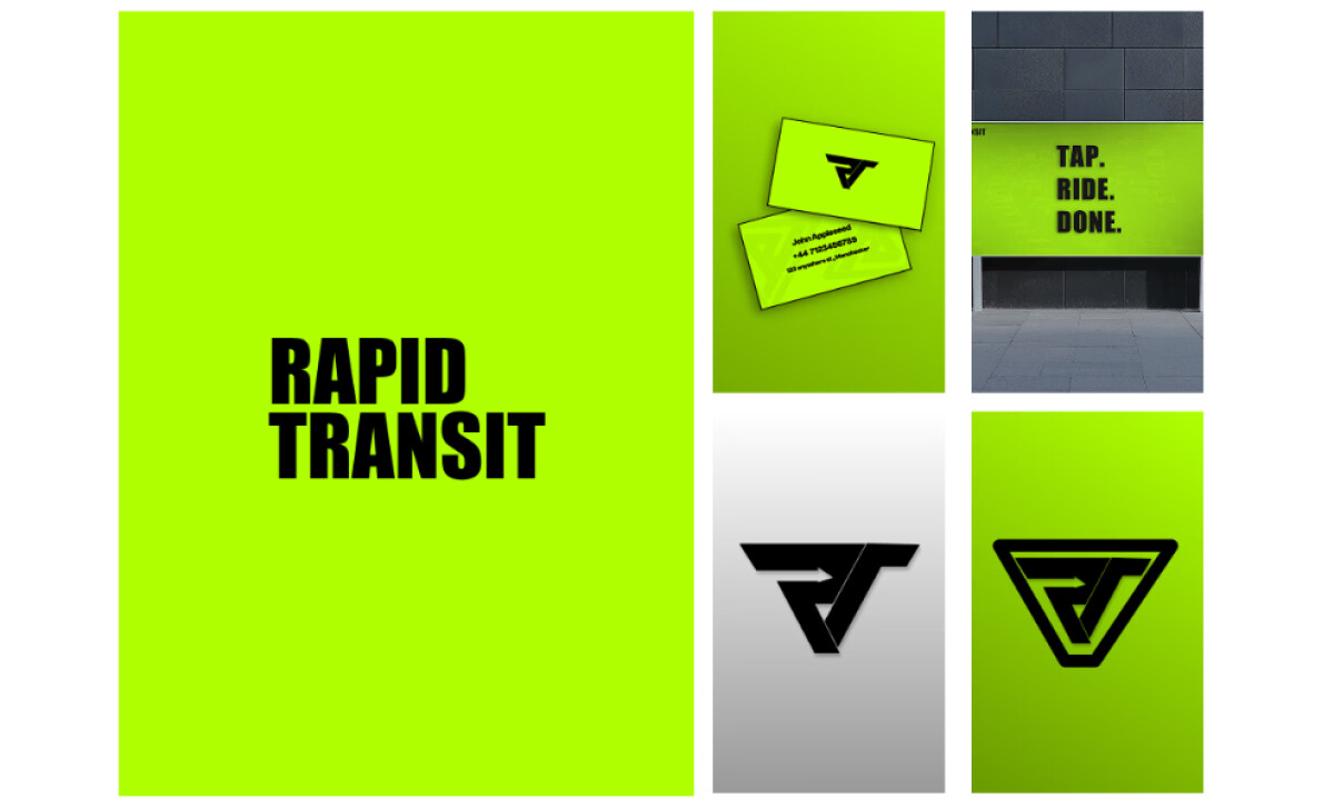
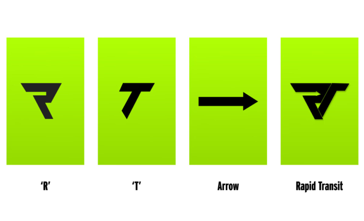
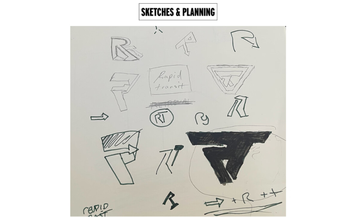
- Concept: The merged R and T form an abstract arrow that conveys direction and momentum. I love how this subtle detail adds meaning without complicating the design.
- Typography: The wordmark employs clean, geometric letterforms that convey a sense of assertiveness and contemporary style. It supports the mark without competing for attention.
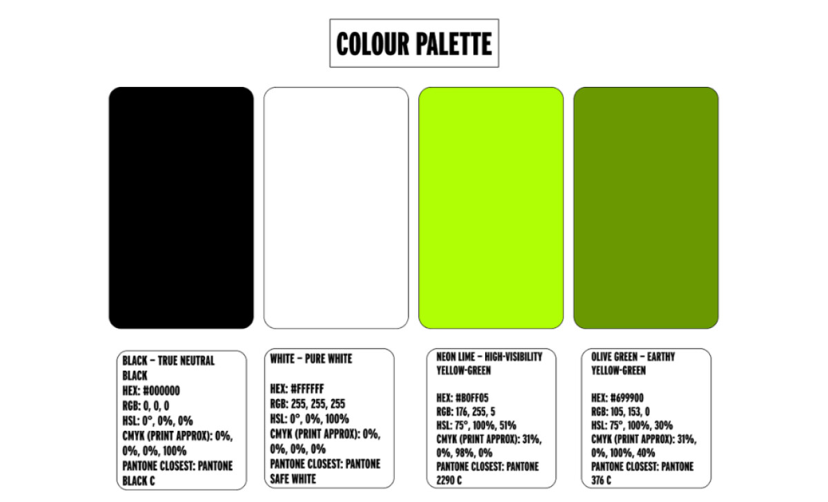
- Color System: The mix of black, olive green, and neon lime creates contrast and personality. The palette feels confident and grounded by darker tones and energized through the lime accent.
- Applications: The logo adapts easily across platforms, from app icons to vehicle decals. I appreciate how it maintains clarity and presence in every format.
What Brands & Agencies Can Learn from Rapid Transit
Rapid Transit’s logo shows how a few precise design choices can express energy, direction, and reliability without unnecessary detail.
1. Create Meaning Through Form
Merge shapes and letters in a way that conveys movement or purpose. When geometry carries symbolism, the logo tells a story before words are read.
2. Keep Typography Confident and Clear
Use letterforms that feel structured and assertive so the wordmark supports the icon rather than competing with it. Strong typography grounds a logo in professionalism.
3. Use Color to Signal Motion
Pair stable tones with a vivid accent to represent energy and momentum. A well-considered palette helps the mark stand out while keeping it practical across real-world applications.
About DesignRush Featured Designs
At DesignRush, we review hundreds of agency projects every month. Standout designs like Rapid Transit’s logo are recognized for clarity, adaptability, and concept strength.
The most compelling projects often advance to our Monthly Design Awards, celebrating creativity across industries.
Logo design in the mobility sector often reflects innovation and precision through simple visual language. Explore more creative projects here:
- Best Logo Designs
- Best Website Designs
- Best App Designs
- Best Print Designs
- Best Packaging Designs
- Best Video Designs
For a full list of design agencies and related services, see our Agency Directory.

-preview.jpg)
