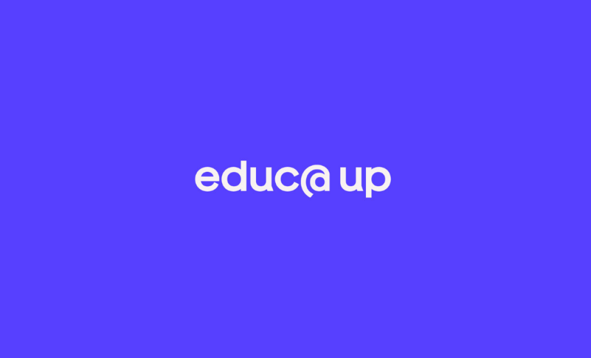
Standout Features:
- Symbol inspired by growth and knowledge
- Golden ratio design for balance
- Dual representation of education and empowerment
Educa Up is a company focused on advancing educators’ professional development. By providing transformative learning opportunities, it empowers educators to foster student growth. Nicole Groff’s logo captures this mission, blending creativity and symbolism to reflect the brand's commitment to nurturing knowledge and growth.
The logo symbol of a young bird in a nest illustrates educators nurturing students. It metaphorically represents the growth process, with the bird eventually flying to signify the power of education in creating opportunities and broadening horizons.

The “@” symbol resembles the golden ratio, which brings balance and harmony to the design. Known for its natural beauty, this mathematical principle lends the logo a refined, elegant appearance. Its proportionate structure reflects the precision and high standards that Educa Up upholds in its mission.
The dual symbolism of the logo, resembling both a bird and an open book, represents the educational journey. The bird’s shape also evokes a magnifying glass, emphasizing the role of learning and discovery in personal growth, further reinforcing the company's mission to expand knowledge.
In conclusion, the Educa Up logo perfectly aligns with the company’s goal of empowering educators. Its blend of functionality and symbolism makes it one of the best professional services logo designs in education. It beautifully represents a brand dedicated to growth and opportunity.