- Article by
- Branko Dimitrijević

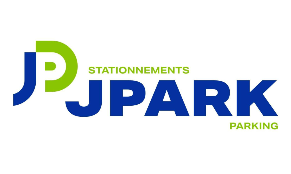
This website uses a colour palette of 4 colours
#8AC600 #FFFFFF #3558A9 #1840A5
Technologies & Tools
Description
Team Behind the Design
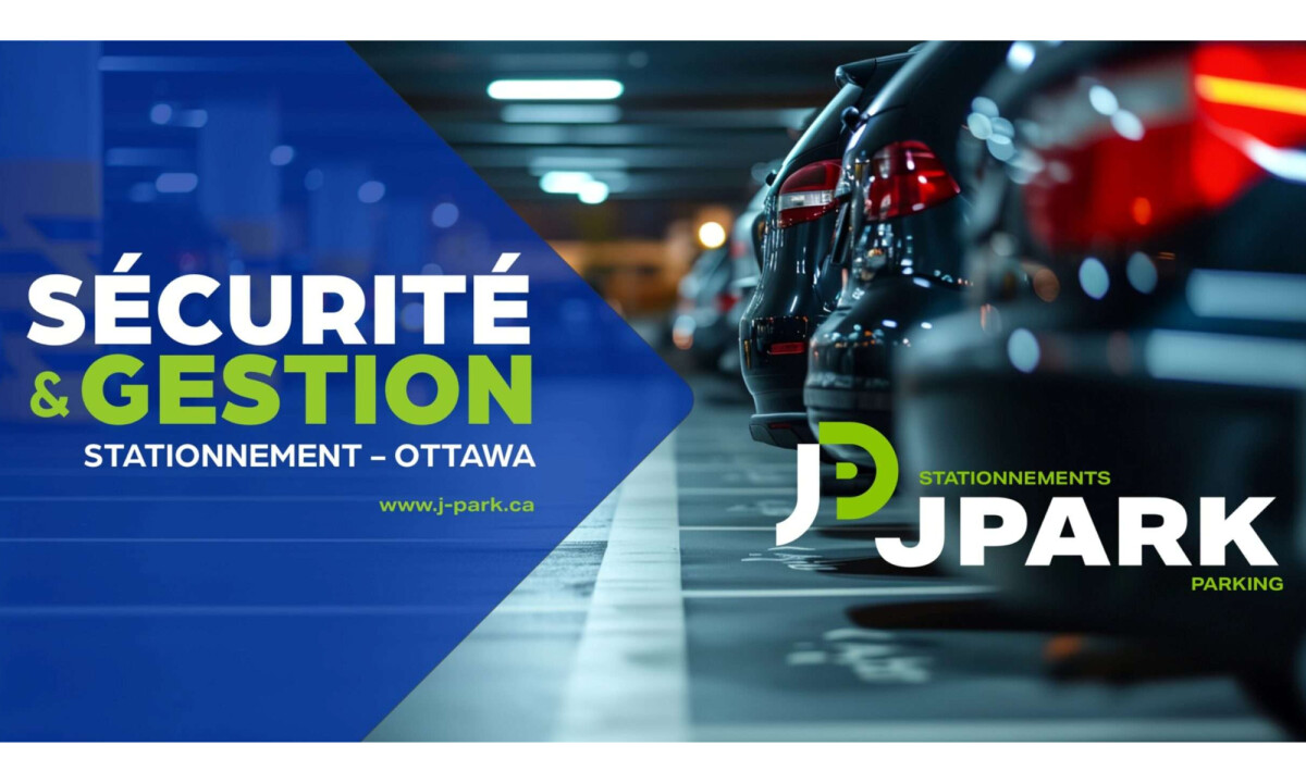
- Agency: Barbaresso Inc
- Client: JPARK
- Category: Logo – Professional Services
- Location: L’Ancienne-Lorette, Canada
- Project Brief: Design a clear, adaptable logo for a public parking manager that prioritizes visibility, legibility, and consistency across physical and digital environments.
When I review professional services logo design like this, I look closely at whether the mark can survive distance, scale, and repetition in functional environments.
The JPARK logo succeeds because every decision is grounded in performance rather than decoration.
- Concept: I appreciate how the identity centers on a compact “JP” monogram that feels engineered rather than expressive. Consistent stroke weight and rounded geometry give the mark balance and stability, while the interlocking structure keeps it efficient and instantly recognizable. This is exactly what a public-facing parking brand needs.
- Color: The blue-and-green palette is practical and restrained. Blue establishes trust and institutional credibility, while green introduces visibility and motion without tipping into urgency. I like how limited the palette remains, reinforcing consistency and helping the logo hold up amid visual noise and changing light conditions.
- Typography: The bold sans-serif wordmark stays supportive instead of competitive. Wide, confident letterforms prioritize legibility and authority, while secondary descriptors remain clearly subordinate. This hierarchy makes the system easy to scan in high-traffic or multilingual contexts.
- Scalability: This is where the identity proves its strength. The monogram maintains clarity at small sizes and reads cleanly from a distance, whether applied to signage, tickets, decals, or digital interfaces. I find the range of lockups, including icon-only, full wordmark, and reversed versions, thoughtfully prepared for operational use.
What Brands & Agencies Can Learn from JPARK
1. Design for Environment First
Infrastructure brands benefit from logos that prioritize visibility, distance readability, and repetition over expressive styling.
2. Let Geometry Do the Work
Strong construction and consistent stroke logic create marks that scale cleanly and remain recognizable across countless applications.
3. Limit Color to Increase Impact
A restrained palette improves clarity, reinforces consistency, and ensures performance in real-world conditions.

Rickenbacker Marina Park
Apax Architecture
Coral Marketing
View All BestLogo Designs