Standout Features:
- Minimalist design
- Sharp and on-brand
- Elegant typography
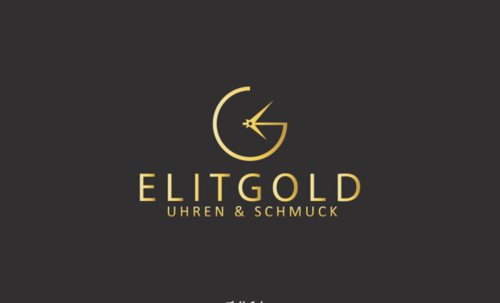
ElitGold features a sleek and modern logo that effectively conveys the brand’s commitment to quality and attention to detail. It is the opposite of over the top. The typography is concise and easy to read. The font used throughout is minimalistic and embraces ElitGold’s philosophies. Using the clock logo immediately tells you what the company is all about - watchmaking with a touch of elegance to the overall aesthetic.
The color palette is white, gray, black, or a variation of gold. A limited color scheme strengthens the brand’s focus on simplicity and sophistication. It easily stands out in a sea of watch manufacturers around.
SCR Enter hits the nail on the head here. They created a consistent and cohesive logo design, providing positive components to the brand’s image of quality and refinement.
Overall, ElitGold’s logo exudes luxury and nothing less.