- Handcrafted typography strengthens emotional connection and approachability.
- Compact emblem structure supports recall across apparel and digital touchpoints.
- Expressive color choices increase engagement and brand distinction.
Industry Insight: 94% of first impressions are design-related. Brands like Crab Sand rely on strong logo aesthetics to convert casual glances into lasting recognition.
Bright Coastal Colors Amplify Emotional Impact
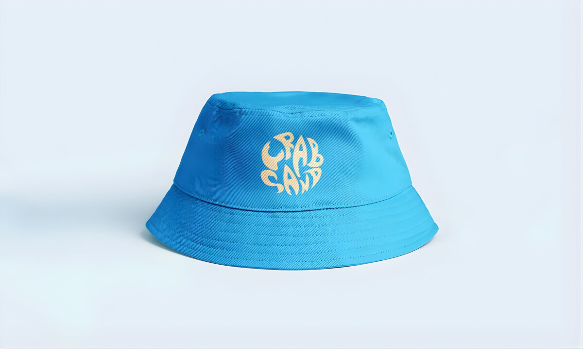
The color palette of electric turquoise and sun-washed orange captures the vibrancy of summer. Heat, water, and energy are distilled into two signature tones.
Not only do these hues align with beach culture, but they also work well in embroidery, hang tags, and digital banners alike.
“Playful and fun, easily identifiable and invokes a sense of warmth of beach culture.”
— Andrea Owsinek-Brucker, DesignRush Awards Jury
Color matters. A study cited by HelpScout found that 90% of quick product decisions are based on color alone. Crab Sand’s hyper-chromatic strategy instantly elevates appeal and communicates mood.
Learn how color psychology shapes your brand identity by guiding more intentional and strategic color choices.
Intentional Imperfection Brings Human Warmth
Alana Washington’s design for Crab Sand leans into imperfection in the best way. The hand-drawn letterforms echo the spontaneity of tide pools and sun-faded signage, emphasizing a visual style that feels lived-in rather than polished. This grounds the brand in approachability rather than performance-driven bravado often seen in the surfwear category.
This handmade vibe reflects a broader trend. Designers are increasingly ditching corporate gloss in favor of grit, texture, and DIY charm. According to The Branding Journal, 2026 design trends show a return to zine-inspired, human-centric visuals that feel emotionally genuine.
Compact Emblem Supports Brand Recognition
Rather than relying on a horizontal logotype or isolated icon, the mark condenses its curved wordmark into a circular structure ideal for tags, patches, and social avatars. This tight composition also increases visibility and recall across digital and physical surfaces.
This reflects the “Rule of Seven” in branding. Consumers must encounter a brand five to seven times before they remember it. A strong, repeated emblem like Crab Sand’s makes those touchpoints more consistent and effective.
Organic Forms Evoke Surf Without Stereotype
While many beachwear logos default to waves, boards, or shell motifs, Crab Sand communicates “ocean” through fluidity, not literalism. Its sinuous curves resemble shifting sand or ripple patterns, creating a more symbolic and sophisticated sense of place.
Shape is a strategic choice in logo design. The brain processes form faster than color or text, assigning meaning almost instantly. Rounded shapes, like those in Crab Sand’s logo, convey comfort and warmth, which supports the brand’s laid-back identity.
Browse the best clothing brand logos to see how organic shapes and custom typography build a memorable brand presence.
What Brands & Designers Can Learn from Crab Sand
1. Embrace Imperfection to Feel Approachable
Hand-drawn forms and relaxed construction create emotional accessibility. Human irregularity can be a strength when a brand is rooted in everyday lifestyle rather than elite performance.
2. Let Typography Carry the Personality
Rounded, interlocking letterforms give the mark movement and character without relying on symbols. Strong typographic construction can function as both logo and emblem across small and large applications.
3. Suggest Culture Through Abstraction, Not Icons
Organic curves evoke coastal energy without literal beach imagery. Abstract references often feel more timeless and emotionally resonant than obvious symbols.