Standout Features:
- Heart and cross symbolism
- Elegant, flowing linework
- Clear, bold typography
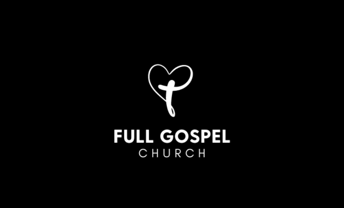
With the goal of fostering stronger community engagement, Haeberlee provided Full Gospel Church in St. Catharines with a contemporary rebranding, complete with a compelling new logo. Though simple in its design, it does more than enough to articulate the church's foundational values and mission of love and acceptance.
The logo's strength lies in its symbolic power, combining a heart and cross to represent love and faith. Of course, a pairing so universally recognized and deeply rooted in Christian tradition is a strong symbol that serves to resonate with its congregation and spread the church's spiritual message.
Additionally, the elegant, flowing linework of the heart and cross heightens the design even more. One could see how the continuous line from cross to heart symbolizes the unity of faith and love within the community. The logomark tells everything it needs to, and in a simple, memorable way too.
Furthermore, the clear, bold typography of the wordmark provides a strong foundation for the logo. The simple, sans-serif font offers the religious institution some modernity and legibility, while the all-caps look provides prominence to the location’s name.
Haeberlee was smart to communicate the church’s guiding principles through a universally understood form. From this non-profit logo design alone, it helps establish a visual identity that could resonate across generations and lay a strong foundation for outreach and engagement today.
