Team Behind the Design
Logo Design Analysis
When I first saw The Paul Canoville Foundation logo, it immediately felt personal. It honors its founder’s story while projecting strength and purpose.
Memo Designs managed to create a visual identity that feels both professional and deeply human.
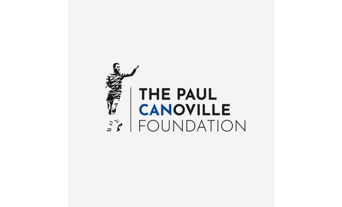
- Concept: The silhouette of Paul Canoville inside the letter “C” is powerful. It connects the foundation’s purpose to the man who inspired it, turning the logo into both a symbol and a tribute.
- Typography: The clean, modern typeface gives the logo a grounded feel. I like how the thicker “PAUL CANOVILLE” contrasts with the lighter “FOUNDATION,” adding hierarchy and readability.
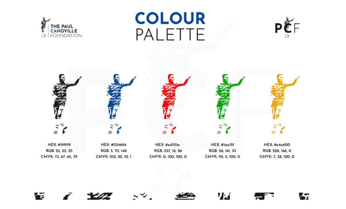
- Color Palette: The choice of blue leads the palette with confidence, symbolizing trust and resilience. I appreciate how the extended set of red, green, and yellow allows flexibility while referencing diversity and unity.
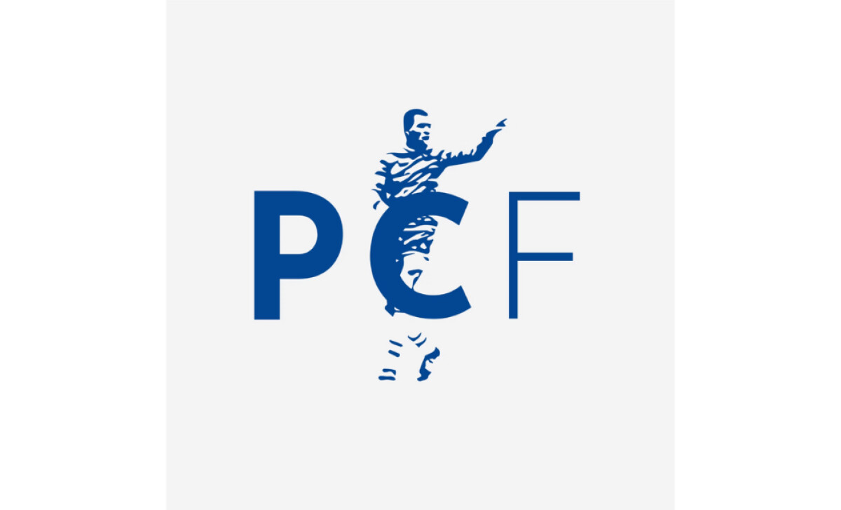
- Applications: The logo works well across variations, from the full wordmark to the “PCF” monogram. It maintains clarity in print, web, and monochrome formats, which shows careful attention to adaptability.
What Brands & Agencies Can Learn from The Paul Canoville Foundation
The Paul Canoville Foundation’s logo shows how authenticity and empathy can guide a visual identity that stands for both legacy and progress.
1. Anchor the Story in the Symbol
Design marks that reflect real people or lived experiences. The silhouette within the “C” connects the foundation’s mission directly to its founder, turning the logo into a personal narrative.
2. Balance Strength With Warmth
Use typography that feels confident yet approachable. Weight contrast and spacing can communicate stability while keeping the tone human and inclusive.
3. Let Color Carry the Message
Choose a palette that reinforces the brand’s values. Blue conveys trust and hope, while the supporting colors represent diversity and optimism throughout different touchpoints.
About DesignRush Featured Designs
At DesignRush, we review hundreds of agency projects each month. The featured designs stand out for creativity, relevance, and execution. Many go on to be recognized as winners of our Monthly Design Awards.
Discover more examples here:
- Best Logo Designs
- Best Website Designs
- Best App Designs
- Best Print Designs
- Best Packaging Designs
- Best Video Designs
For a full list of design agencies and related services, see our Agency Directory.