Standout features:
- Soft font style
- Clever color choices
- A clear vision for the brand
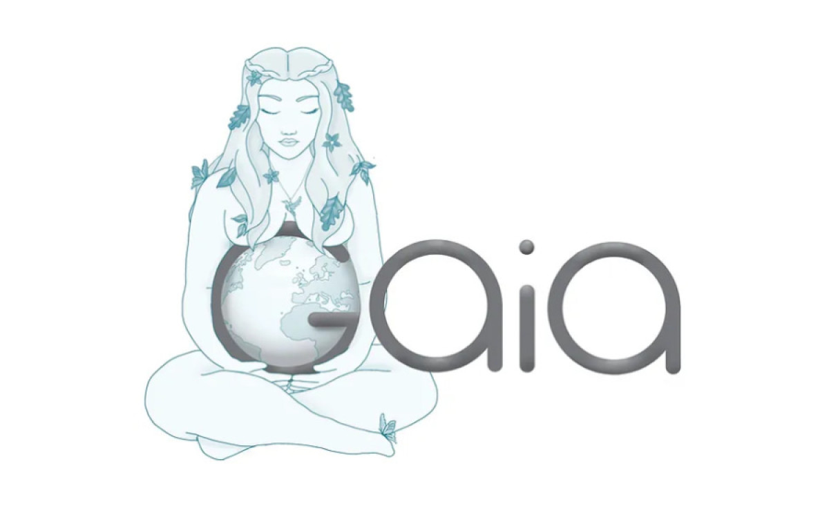
Named after the Greek goddess of the Earth, Gaia is a jewelry brand that specializes in pieces that are high quality and exquisitely done for their customers. Through their products, they empower their customers to channel their inner goddesses.
The logo design courtesy of Bee More Design highlighted the goddess-like qualities of the brand: beauty, art, and care for the environment. The logo might look too simple, but it perfectly reflects the brand's aesthetics.
The typography used in the logo has thicker lines compared to the other inclusions in this list. Still, these lines show Gaia's motherly love for everyone here on Earth as the mother of all creatures.
The designer used various shades of turquoise in executing the whole logo design, which was a smart move on their part. We all know that the waters and the sky are colored blue, with the most transparent parts of the oceans colored turquoise.
Of course, we cannot forget how Mother Gaia is hugging the Earth placed on the G of the Gaia logo. The artistic rendition of the famed Greek goddess has lent a winsome and whimsical aspect to the whole visual aesthetic.


-preview.jpg)
