
The Tocatì logo, designed by Notorious, embodies the brand’s mission of sustainability and circular fashion for children. Rooted in the idea of reconditioning used clothes to reduce textile waste, Tocatì's identity balances environmental consciousness with a playful, child-friendly aesthetic. The logo’s color palette, typography, and composition work together to create a brand that feels inviting, warm, and purpose-driven.
Key Insights for Brands:
- Use typography to reinforce brand personality and messaging
- A thoughtful color palette can communicate both sustainability and playfulness
- A well-structured layout ensures versatility across different brand applications
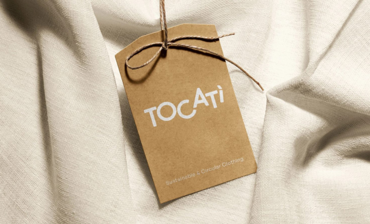
Tocatì Features a Playful Yet Meaningful Typography Choice

Notorious helped Tocatì find the right brand name for its business. Derived from the Venetian phrase “tocca a te” (“it’s your turn”), it reinforces the idea of collective responsibility and action toward sustainability.
The Tocatì logo features a custom typography style that is both engaging and meaningful. The rounded, soft letterforms convey approachability and warmth, which help align with the brand’s focus on children. The unique character arrangement, particularly the tilted “A,” adds an element of dynamism and movement, reinforcing the idea of playfulness.
The typography also plays a crucial role in reflecting Tocatì’s sustainable mission. Unlike rigid, corporate fonts, the hand-crafted feel of the letters suggests a more organic and human-centered approach. By avoiding overly structured typefaces, Notorious’ logo remains inviting — ideal for a brand centered around giving garments a second life.
A Soft, Earthy Color Palette That Speaks to Sustainability

Notorious understood the importance of selecting the perfect brand colors. The Tocatì logo blends muted yet inviting tones that align with both eco-conscious values and a child-friendly identity. The combination of warm orange, soft olive green, pastel blue, and peach creates a visual balance between nature-inspired hues and playful energy.
The orange represents enthusiasm, creativity, and warmth, making the brand feel vibrant and engaging. On the other hand, the green subtly reinforces the sustainability message, while the pastel blue and soft peach add a gentle, comforting presence, making the brand feel approachable for families.
This earthy yet playful palette sets Tocatì apart from conventional children’s brands that often use overly bright primary colors. Instead, the tones feel modern, responsible, and conscious. The colors also work well across different mediums, from product tags to digital applications, ensuring brand consistency.
A Minimalist Yet Impactful Logo Composition
Tocatì embraces a minimalist logo design approach while maintaining distinctive. The spacing between letters allows the design to breathe, making it versatile for different branding materials. Whether printed on recycled paper tags, digital screens, or product packaging, the logo remains clean and legible, ensuring clarity in all contexts.
Additionally, the secondary tagline, “Sustainable & Circular Clothing,” is placed in a soft, neutral typeface, ensuring it complements rather than competes with the main logo.
By prioritizing simplicity, clarity, and adaptability, Notorious has crafted a logo that remains timeless while allowing for brand growth. It successfully blends modern aesthetics with meaningful messaging, positioning Tocatì as one of the best clothing brand logo designs.
Notorious Ensures Scalability and Versatility Across Media
Another key aspect of the Tocatì logo is its scalability and versatility, which can be maximized by partnering with top logo design companies. The simplicity of the design makes it adaptable across different platforms and products, whether it is scaled down on a clothing tag or displayed as a large graphic on a website.
Additionally, the color palette and typography are bold enough to be effective in both monochrome and full-color applications, ensuring that the brand’s identity remains recognizable in a variety of contexts. This adaptability is crucial for building brand recognition across multiple touchpoints, from physical products to social media, marketing campaigns, and beyond.
The Tocatì logo’s clean and simple design guarantees it will remain impactful and timeless as the brand evolves and expands into new areas. Whether in a retail setting, online store, or promotional materials, this logo will consistently deliver a strong and coherent brand message — earning it a spot as one of our best logo designs.
By combining organic typography, an earthy color palette, and minimalist composition, Notorious has created a brand identity that feels both joyful and responsible. The logo not only reflects Tocatì’s mission of sustainability but also resonates emotionally with its audience, making sustainability an inviting and engaging concept for families, and securing its place as a Design Awards winner.


