Standout Features:
- Custom letterform with stylized serif plays
- Sophisticated, low-contrast color palette
- Modular branding system with versatile logo lockups
Ouye Design crafted the brand identity for Galante, a beauty salon that needed to reflect elegance, style, and a unique character. The design of a logo is a crucial element in shaping these perceptions, given that 42% of consumers believe it communicates a brand's personality and 39% say it indicates its quality.
The resulting visual system achieves this by utilizing unique font characters with an artisanal quality.
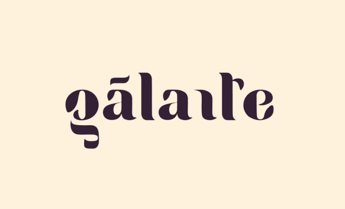
This beauty logo design features a bespoke typographic treatment that turns traditional serifs into ornamental, sculptural forms. The letters have exaggerated terminals and custom ligatures. The tilde over the “á”, plus the negative space “n” make for a highly unique logo mark that’s surprisingly still very readable.
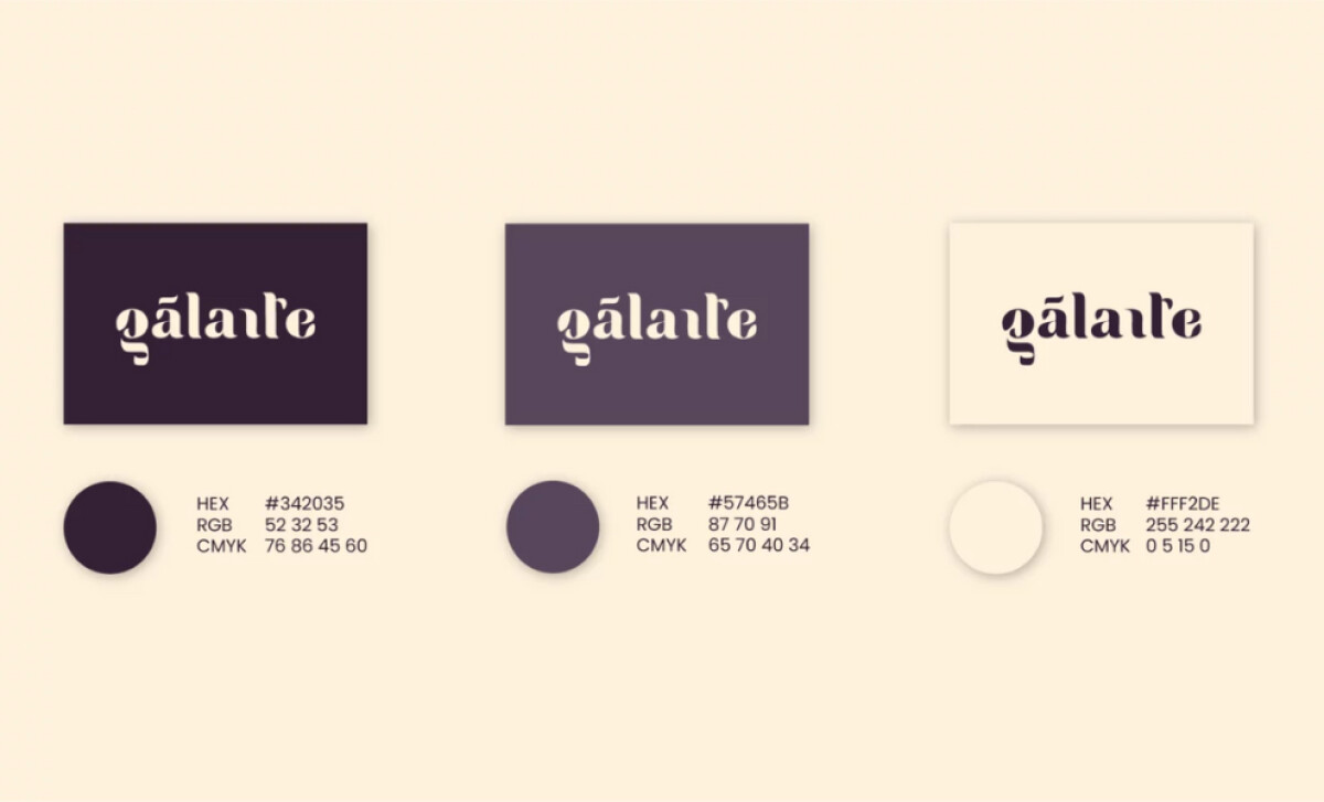
The color scheme is built on a sophisticated trio of muted tones: deep eggplant purple, desaturated mauve, and a buttery cream. This palette is used in various logo treatments for flexibility. The color choices are timeless and seasonless, aligning with classic fashion sensibilities and the brand’s B2B service orientation.
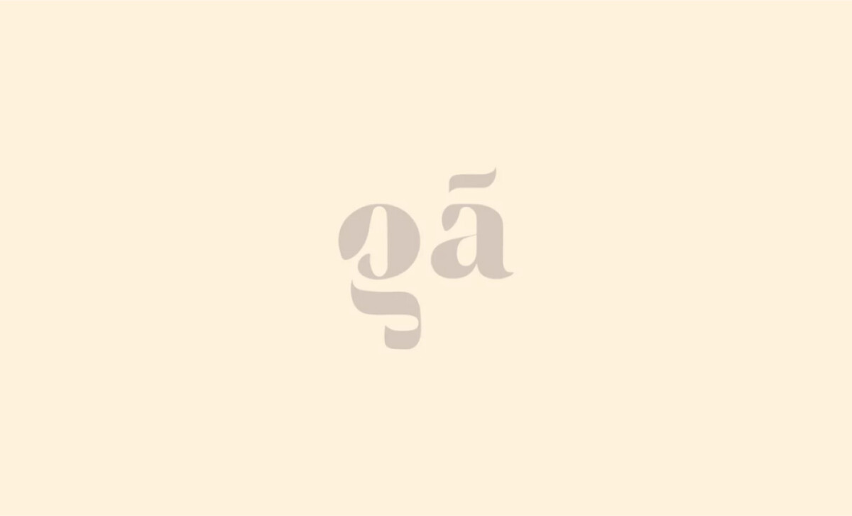
A modular branding system with versatile lockups is a key feature. The design includes different logo treatments, such as a monogram version. This shorthand “gá” mark would be applicable for small-scale applications like social media avatars or packaging stamps. This approach reflects modern branding best practices.
Galante underscores that a successful luxury brand identity is built on a foundation of detail and intentionality. The bespoke typography specifically helps the brand embody grace and beauty in every visual touchpoint.