- Agency: Tegusu
- Client: Hachi Green & Garden
- Category: Logo Design — Geometric Logo
- Location: Yokohama, Japan
- Project Brief: Design a geometric logo that reflects Hachi Green & Garden’s identity by interpreting the dual meaning of “Hachi” through a versatile visual system inspired by plant pots, nature, and craftsmanship.
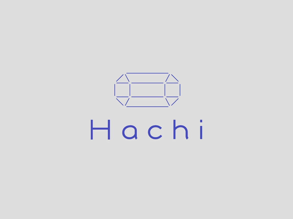
A geometric logo does its best work when a single shape carries more than one meaning at once. Hachi turns an octagon into exactly that, using the eight-sided form to nod to both the Japanese word for "pot" and the number eight it also names.
The mark reads as a gemstone in outline. Thin blue lines trace the facets of a cut jewel, framing the shop's plants and artisan pots as treasures rather than garden-center stock, which matches the "treasure box" concept behind the brand.
The system flexes without losing its core. The same faceted octagon stretches, widens, and shifts into different pot silhouettes across a pink, blue, and gray palette, letting one shape stand in for the diversity of plants the shop sells.
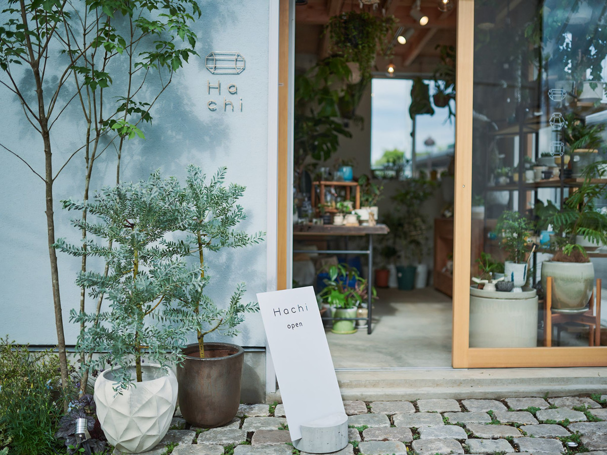
The identity carries cleanly from screen to storefront. Rendered small in metal on the shop's exterior wall, the delicate line-work holds up beside real foliage, proving the mark works as signage and not just a logo lockup.