Standout Features:
- Sleek brand transformation
- An industry-inspired logo design
- Modern, fintech typography
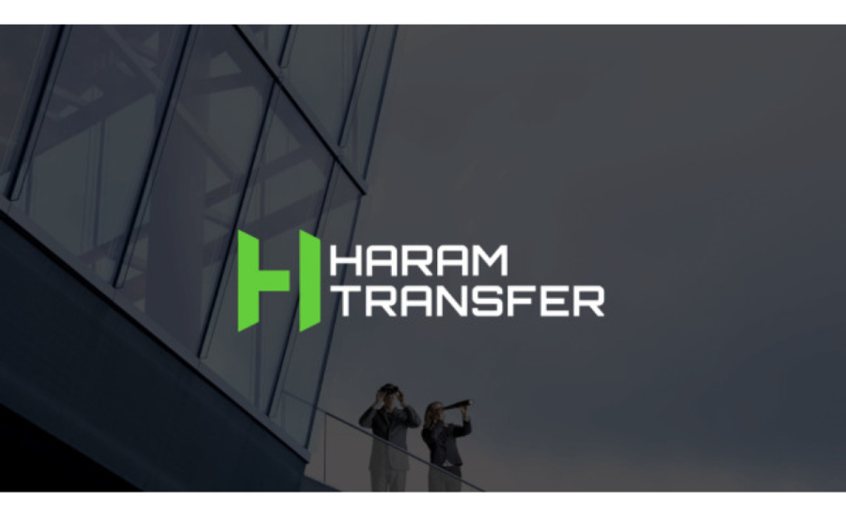
Haram Transfer is one of the leading financial service providers with over 170 branches in Syria. Their growth demanded a fresh, new visual identity. Focal X agency embraced the challenge and devised a modern solution that adds a unique glow to the previous appeal.
Their sleek brand transformation includes its new, contemporary, industry-representative logo design. The bright green emblem stands next to the Orbitron Bold font, quite a suitable fit for modern fintech typography.
The green emblem doesn’t only symbolize “H” for “Haram.” The left side of the sign represents a rotated “T.” But there’s more to it: the logo also presents a financial pyramid that stems from the left and narrows down to the top (the central part of the right green line).
The color choice is not coincidental - green is known for being the second most visually pleasing color, and it’s prevalent in nature, so it’s associated with healing and calming. It gives the brand a needed note of accessibility.