- Article by
- Jermaine Dela Cruz


#865326 #9E8167 #FFFFFF #0B2451
- Agency: Chance
- Client: Rickenbacker Marina Park
- Category: Logo Design — Recreation
- Location: Córdoba, Argentina
- Project Brief: Create a logo and destination identity that strengthens Rickenbacker Marina Park’s presence as a community-focused waterfront destination.
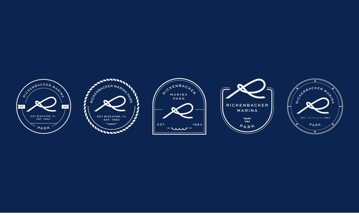
A recreation logo works when it feels like it belongs to the place rather than a design studio. The Rickenbacker Marina Park mark gets there by building the R directly from a rope knot, which means the identity is made of the same material as the dock it represents.
The knot is not decorative. It functions as a letterform that also describes what happens at a marina, which is a tighter brief than most logo concepts manage to satisfy simultaneously.
The badge system extends the mark across five container shapes without the logo ever changing. Circular frames, arched panels, and rope-border variations all hold the same R, which gives the identity flexibility without losing the one thing that makes it recognizable.
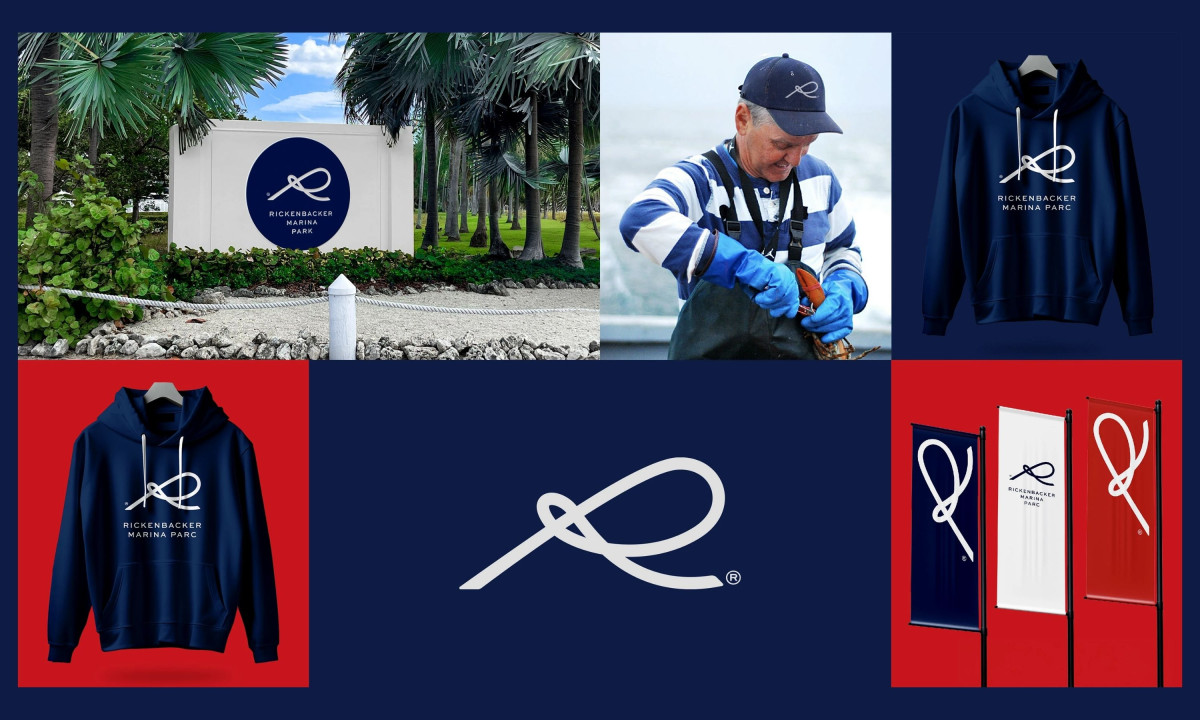
Navy and white do the rest. The color system keeps the mark readable across signage, apparel and environmental applications without requiring a complex set of rules, which is exactly what a public recreation destination needs.

Rickenbacker Marina Park
Apax Architecture