- Agency: Axion
- Client: HEXA
- Category: Logo Design — Technology
- Location: New York City, New York, United States
- Project Brief: Create a technology logo design for HEXA that conveys digital security and connection through an interlocking geometric mark and a scalable identity system spanning digital and physical touchpoints.
A good technology logo gives an invisible product something you can almost hold. Axion's HEXA mark does that with two hexagons, cut open and locked into each other.
Read one way, the shape is a link in a chain, and read another way, it's a closed loop. Both ideas fit a company that guards digital assets for institutions.
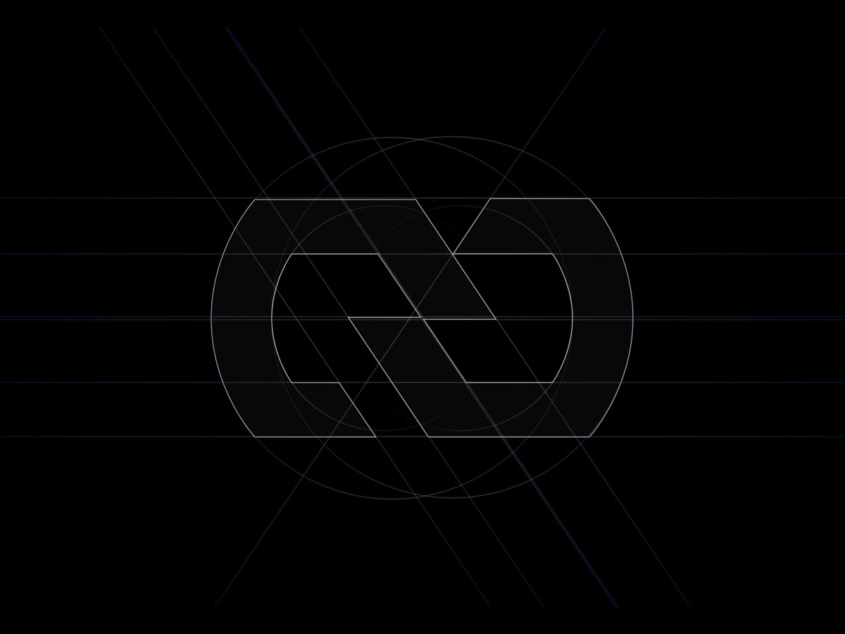
The construction grid shows how carefully the angles were set, with parallel diagonals and overlapping circles guiding every cut. Those same angles then shape the icons, merch, and motion across the brand.
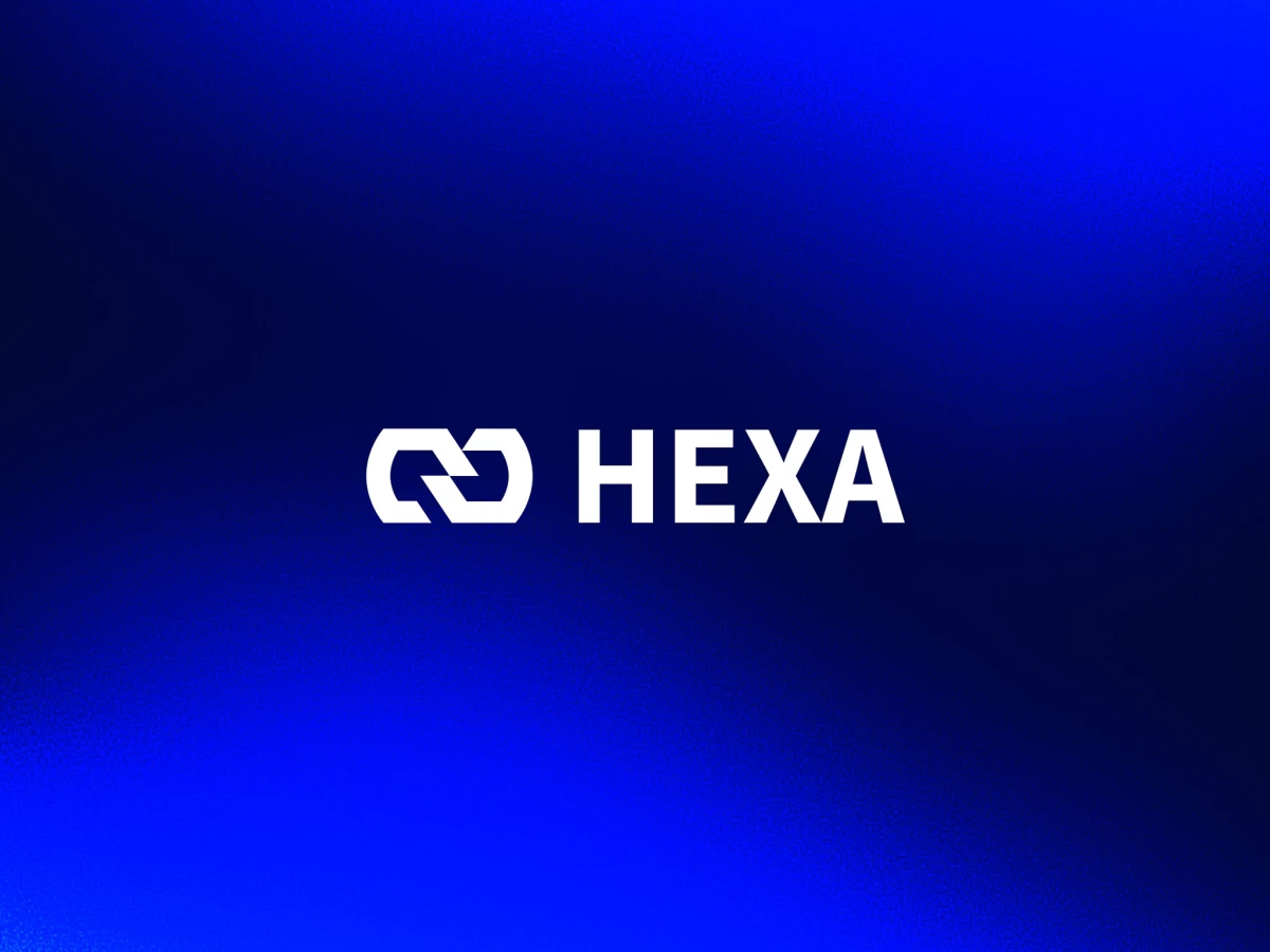
Beside the symbol, the HEXA wordmark sits in a heavy, squared-off sans that matches its weight. On a bus shelter poster, a cropped outline of the mark glows against deep blue and still reads at a glance.