Standout Features:
- Playful & fun
- Minimalist
- Cutesy Visual
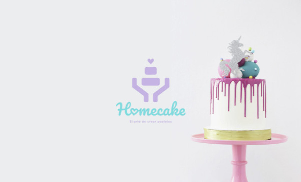
Cooking doesn’t have to be a chore. It can also be a fun activity where you experiment with friends and family. Homecake’s logo reminds you of that overlooked fact. With its playful colors and cutesy art style, you just want to enter the premises and see what delicious treats they came up with.
Roverts aimed to give this bakery a dynamic graphic identity, indicating that the best pastry and sweets are born out of passion. This minimalist logo design includes drawn hands holding a cake and a youthful inscription surrounding the emblem. The pastel colors used are there to convey the harmony and sweetness of the food coming out of the oven (Explore the cool logo designs here).
Through an extensive menu of creative confectionery, Homecake’s logo design helps them reach more potential customers. The design itself serves as a perfect ID card – it showcases their dedication to decoration!