- Agency: Self-titled
- Client: Hoopla
- Category: Logo Design — Recreation
- Location: Prahran, Australia
- Project Brief: Create a recreation logo design that captures Hoopla’s family-focused entertainment experience and broad range of interactive attractions.
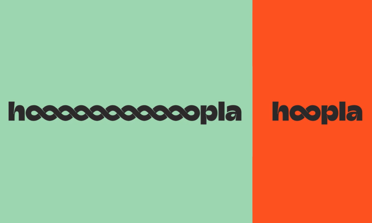
A recreation logo design holds a destination together when the identity works as hard as the space does. Self-titled's system for Hoopla bridges toddler play zones, high-octane older kid activities and premium adult hospitality under a single visual language — a harder brief than it sounds when all three need to feel like they belong to the same place.
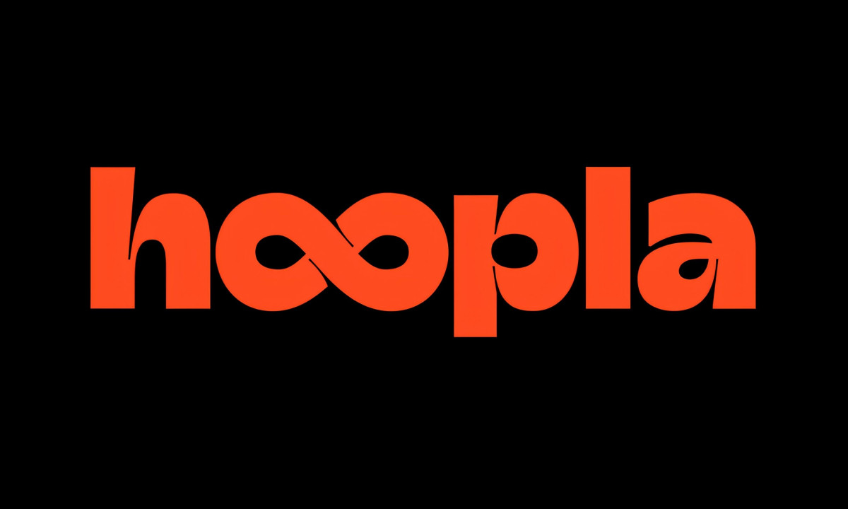
Bouncy, geometric typography carries the physical energy of the environment into the lettering itself. Terracotta red, chocolate brown and mint green form a palette grounded enough to feel welcoming and energetic enough to match what's happening inside.
Meanwhile, fluid looping character lines keep the system from ever settling into something static; each curve drawn to suggest a body in motion rather than a mark at rest.
Hoopla gets a logo that holds its character whether it's printed on a cup or filling the side of a building. Self-titled builds a system that feels grown from the place rather than dropped onto it.