Logo Designed by
Ben Eshleman Ben Eshleman

House of Honk!

House of Honk! Logo Design by Ben Eshleman
House of Honk!’s logo design transforms a New York City building into a bold “H,” creating a playful, place-based mark rooted in local culture. The flexible logo system and vibrant color palette ensure consistency across merchandise, print, and digital platforms while capturing the energy of street bands and live performance.
NYC architecture shapes iconic letterform
Playful typography energizes brand expression
This website uses a colour palette of 4 colours
  • #085C66
  • #DC6718
  • #EDC23F
  • #EEEADE
Technologies & Tools
Description
Team Behind the Design
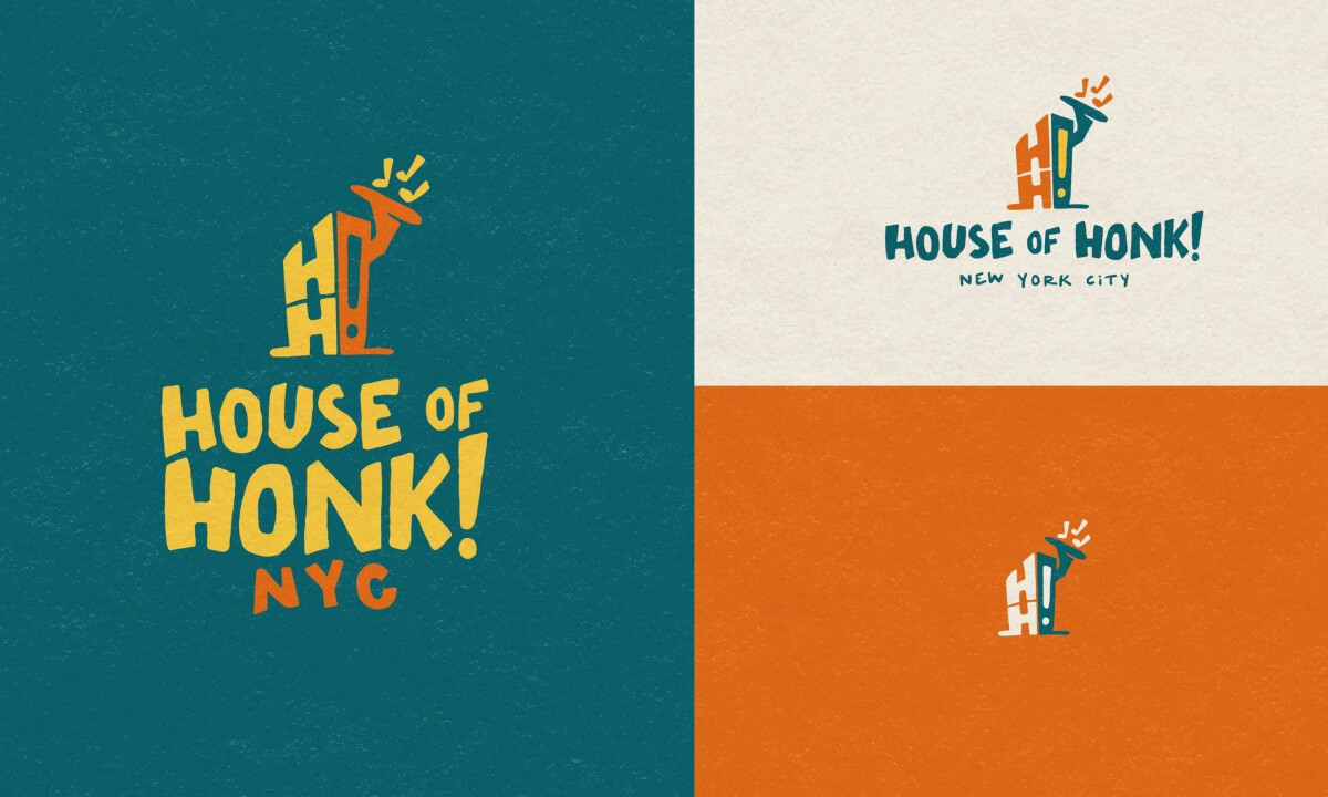
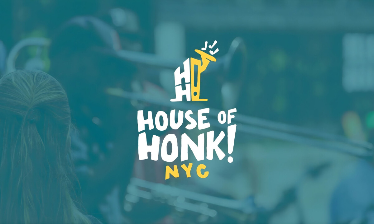
  • Designer: Ben Eshleman
  • Client: House of Honk!
  • Category: Logo Design — Non-Profit
  • Location: New York City, New York, United States
  • Project Brief: Create a non-profit logo that reflects House of Honk!’s identity as a home for street bands and merrymakers while ensuring versatility across platforms, merchandise, and event materials.

In community-driven spaces, a non-profit logo should capture both spirit and place. House of Honk!’s identity draws directly from New York City’s architecture, transforming the idea of “home” into a bold, adaptable mark for street bands and cultural events.

Ready to elevate your designs?