Standout Features:
- Geometry based design
- Prominent in color
- Standard typographical blend
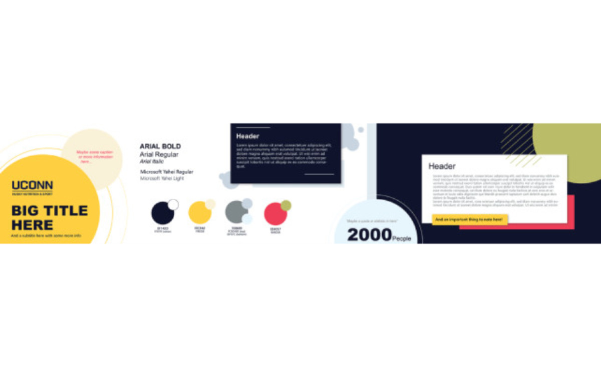
Husky Nutrition and Sport’s rebranding was built by Paula Guerrero, who focused on elementary geometrical shapes, primarily circles and rectangles.
This project relies on various colors that indicate the diversity of disciplines and inclusive nature of the brand, including yellow, dark blue, and shades of grey that either complement or contrast the primary two.
The large circles are usually placed in the corners of the visual field, designed to draw attention to powerful and vital headline messages. The rectangular elements are reserved for descriptive content blocks, providing a nice touch to the importance of information-laden text.
The standard typographical blend ensures readability and places comprehensiveness above stylistic features, with Arial for the headlines and Microsoft Yahei for the body content.
The design encompasses many other visual elements that add a distinctive appeal while focusing the viewer’s attention on the most critical content bits, like concentric lines that follow a circular element or a “shadow” of the rectangular content block.