Team Behind the Design
Agency: IDEA Estudio
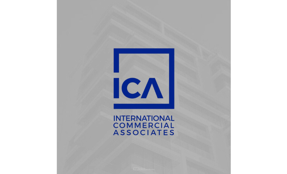
Client: International Commercial Associates
Category: Logo Design (Real Estate)
Location: Yaritagua, Venezuela
Project Brief: Create a logo conveying real estate expertise with structural framing and clean typography for brand recognition.
Logo Design Analysis
When I review a logo, I often focus on concept, typography, scalability, and applications.
Here’s how ICA's logo, designed by IDEA Estudio, stands out in real estate:
- Concept Clarity: The square frame suggests buildings and structures, directly tying into real estate. I like how the form feels modern yet stable.
- Typography Choice: The angular “A” works as a visual anchor. It adds a sense of precision and professionalism that fits the industry.
- Scalability: The clean lines and simple geometry make this logo adaptable across signage, digital platforms, and print. Strong contrast helps readability.
- Applications: The design works well in both standalone icon and full lockup formats. It helps enhance trust when applied to corporate materials.
Get connected with the right logo design agency for your project.
GET STARTEDAbout DesignRush Featured Designs
At DesignRush, we review hundreds of agency projects each month. The featured works represent some of the most compelling examples of creativity, relevance, and execution.
The best of these advance to become Monthly Design Awards winners, earning industry recognition.
Looking for more design inspirations for real estate logo designs? Check out these categories:
- Best Logo Designs
- Best Website Designs
- Best App Designs
- Best Print Designs
- Best Packaging Designs
- Best Video Designs
For a full list of design agencies and related services, see our Agency Directory.
Get a chance to become the next Design Awards winner.
SUBMIT YOUR DESIGN


