- Agency: Thought & Found
- Client: Imogen Oke
- Category: Logo Design — Professional Services
- Location: Melbourne, Australia
- Project Brief: Create a professional services logo that connects Imogen Oke’s initials with architectural forms through a refined, adaptable monogram system.
A professional services logo works hardest when it feels personal and systematic at once. Imogen Oke, an interior stylist branded by Thought & Found, gets both from a monogram that folds her initials into a shape borrowed from architectural drawings.
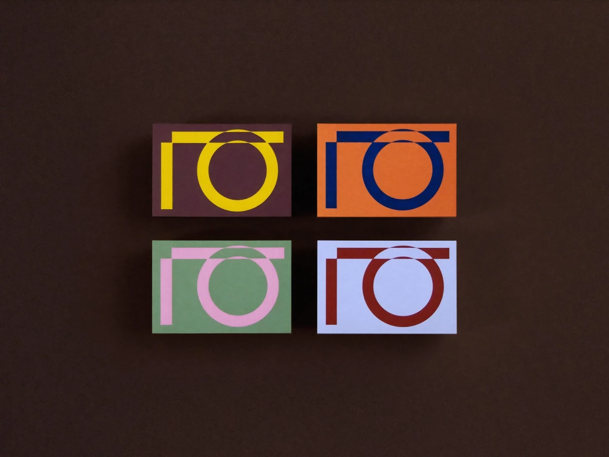
The mark sets a squared bracket against an open circle, reading as I and O while echoing a floor plan's lines and arcs. It stays legible whether the circle sits behind the bracket or crosses in front, so the same two parts can shuffle without losing the name.
Color does the heavy lifting across the system, running the monogram in yellow on plum, blue on orange, pink on green, and rust on pale blue. The pairings feel pulled from fabric swatches rather than a screen palette, which ties the identity straight back to a stylist's material work.
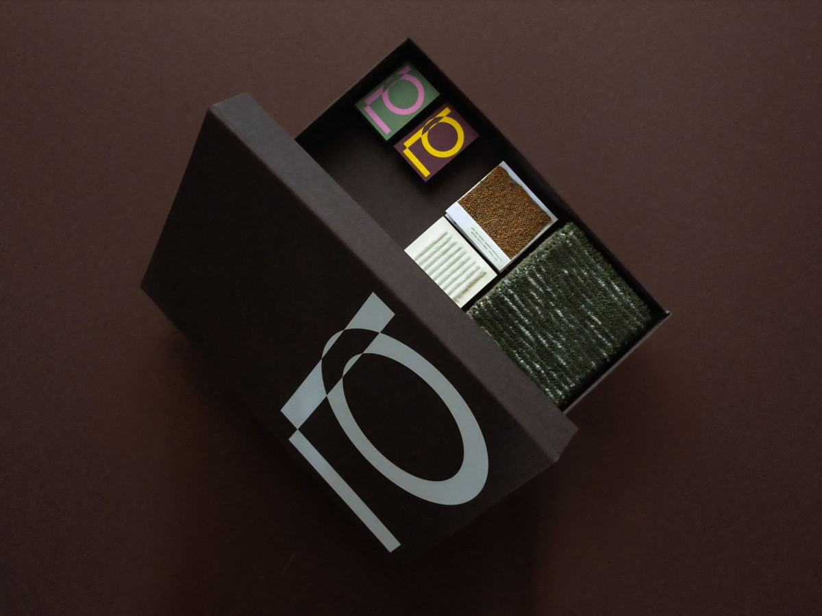
The rollout proves the system in the tactile pieces, from the deboss on a dark keepsake box to the carpet and textile samples tucked inside. The one risk is legibility, since a viewer who does not catch the IO first can read the mark as a camera or an abstract fitting before the initials land.