Standout Features:
- Negative space with typographic symbolism
- Comma and speech bubble integration
- High-contrast red palette
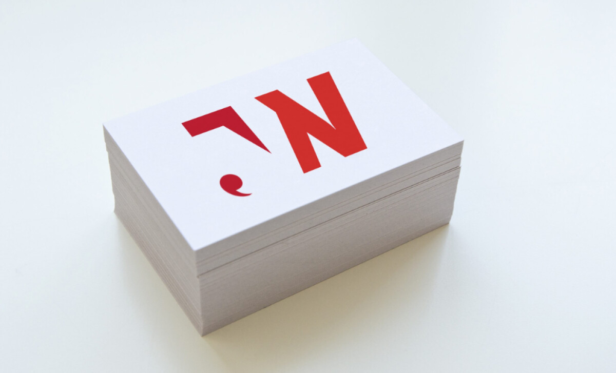
Charlotte Delmonte Design created a single mark that expresses voice, punctuation, and personality all at once exactly in this logo for copywriter Jody Williams. Chosen from three presented options, the final concept turns basic letterforms into powerful metaphors for language and communication.
The logo builds on the interaction between negative and positive space to reveal the initials "J" and "W" in a way that's both minimal and meaningful. This subtle construction invites a second look, rewarding viewers with typographic finesse. It’s the kind of design that speaks volumes with very little — a nod to Jody’s precise copywriting expertise.
What makes this logo stand out isn’t just its form — but the symbolism embedded into it. The descender of the "J" becomes a comma, while the arm of the character doubles as a speech bubble — two motifs deeply tied to writing and conversation. These visual cues instantly connect the logo to the core values of storytelling, clarity, and expression.
The entire identity is cast in a vibrant red palette. This not only adds visual interest but also emphasizes the comma and speech bubble elements through color contrast. Red, often associated with passion and urgency, reinforces the idea of a bold voice in a crowded space — a fitting color choice for a communicator looking to make an impact.
Charlotte Delmonte’s professional services logo design for Jody Williams proves that thoughtful minimalism can deliver maximum impact. By fusing typographic creativity with meaningful visual metaphors, the mark embodies Jody’s work with elegance and wit.