Standout Features:
- Bold and modern typeface
- Meaningful keyhole symbol
- Authoritative color palette
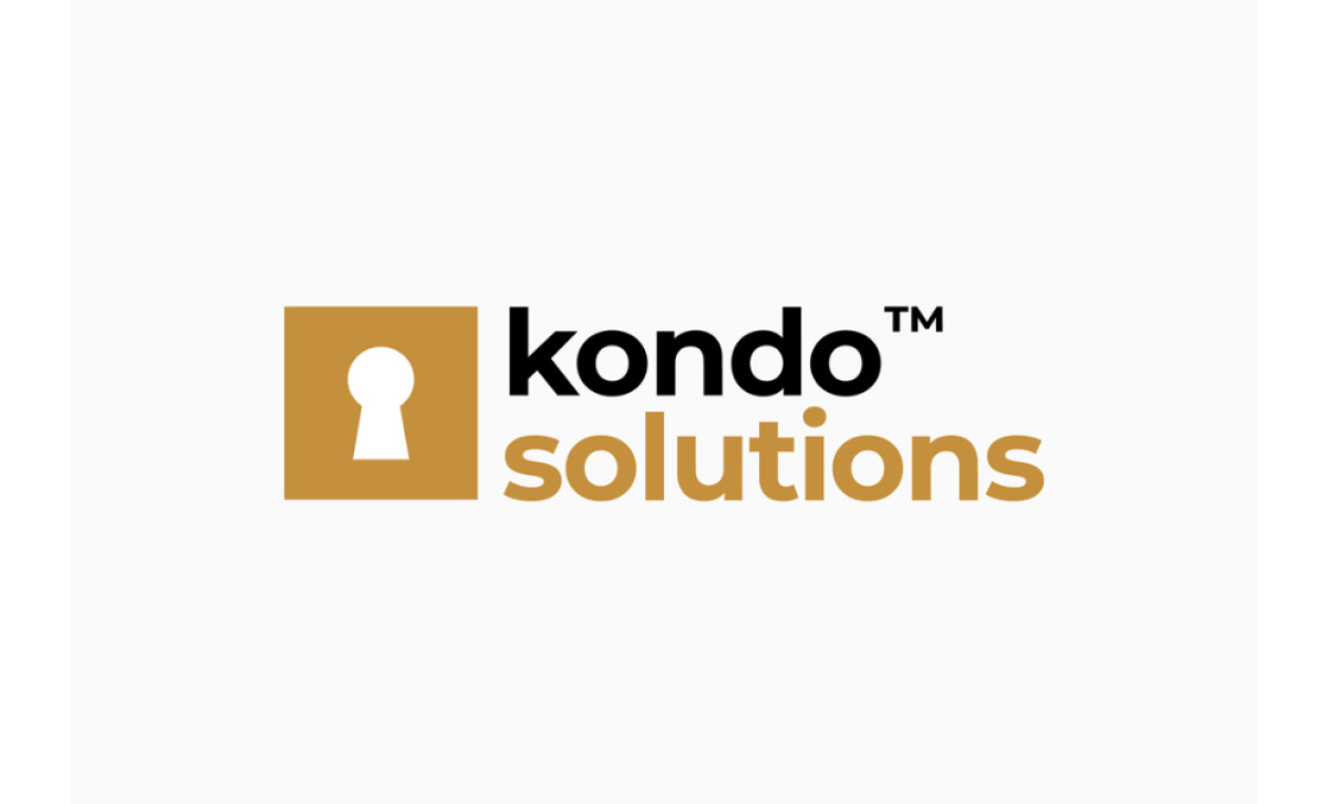
The Creative Dept. developed a sleek and modern primary logo for Kondo Solutions, designed to reflect the company's innovative approach within the property management and accounting industry. The logo effectively communicates key values such as security, trust, structure, and organization through its thoughtful design elements.
The Kondo Solutions logo’s bold and modern typeface is what immediately stands out. The strong, contemporary font gives the logo a clean and professional look, suggesting efficiency and competence. This typeface does a great job in helping establish Kondo Solutions as a forward-thinking and reliable company in its field.

The logo also incorporates a meaningful keyhole symbol. In the property management and accounting industry, security and trust are crucial, and the keyhole effectively represents these qualities. The symbol communicates that Kondo Solutions provides secure and trustworthy services, assuring clients that their assets and information are in safe hands.
An authoritative color palette further enhances the logo's impact. The warm and approachable yet authoritative colors create a balanced and confident image. This carefully selected color scheme conveys professionalism and reliability while still maintaining that warm, inviting feel.

This logo is a strong example of professional services logo design, where conveying confidence and reliability is paramount. In conclusion, by combining a strong typeface, meaningful symbolism, and an authoritative color palette, designers can create logos that build trust and project competence.