Standout Features:
- Custom logotype with unique 'K' letterform
- Adaptable diamond icon
- Green and ochre color combination
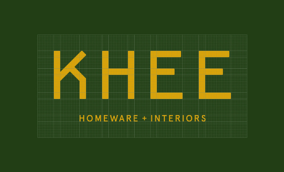
KHEE Homeware + Interiors focuses on offering stylish, carefully curated pieces designed to make homes look great. So, they worked together with Gavin Reid Design specifically to create a logo system that gives the identity a design-conscious and very distinct feel.
The core visual identity lies firmly in the "KHEE" logotype, set in a custom-made geometric sans-serif. Its standout feature is the unique way the first 'K' is built, giving it an ownable, uniquely-theirs quality. This modern typographic style presents KHEE as design-conscious too — which, of course, does wonders for positioning a home furnishing service.
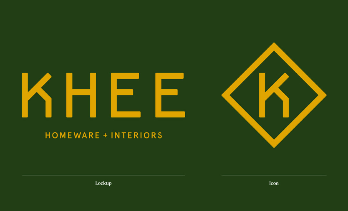
Working alongside the main logotype is a versatile standalone icon. It cleverly isolates that unique 'K' shape from the name and frames it neatly within a diamond, creating a compact symbol. Its adaptability shows through color inversion and fill details, as seen in the other logo variations. Having a compact, easily readable icon works great for digital use too.
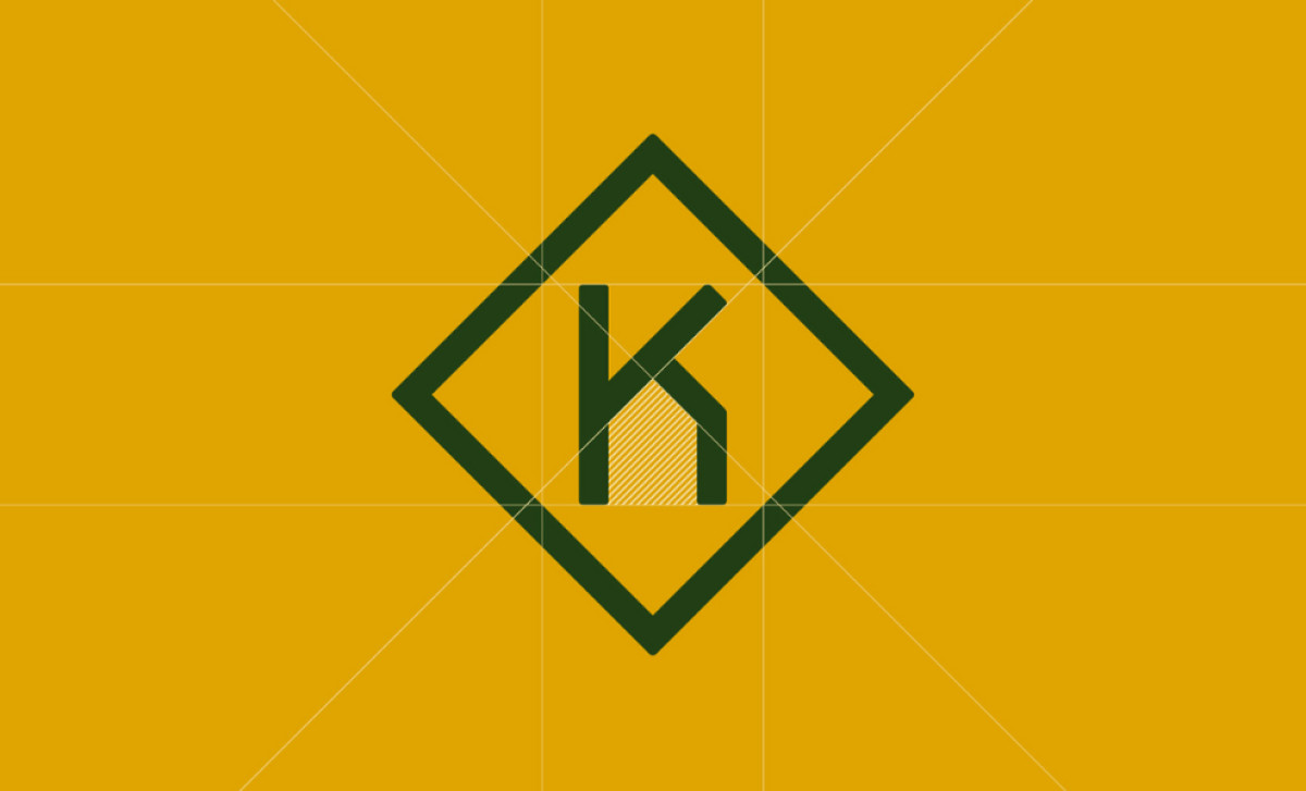
Color-wise, this professional services logo design consistently use a classy, earthy palette featuring deep forest green nicely paired with warm golden yellow or ochre. This pairing evokes a feeling that's both natural and sophisticated, different from standard corporate colors often seen today.
The strategy of developing a unique core element (the custom 'K' design integrated here into both the main logotype and the standalone icon) is game-changing when building brand recognition over time. Coupled with custom type and a slightly unconventional color scheme? That’s a formula for sticking more readily in consumers' minds.