Team Behind the Design
Logo Design Analysis
When evaluating logo systems for faith-based or cultural organizations, I look for how symbolism is suggested rather than spelled out.
Fresh Wine Records succeeds by building meaning through structure, proportion, and material awareness.
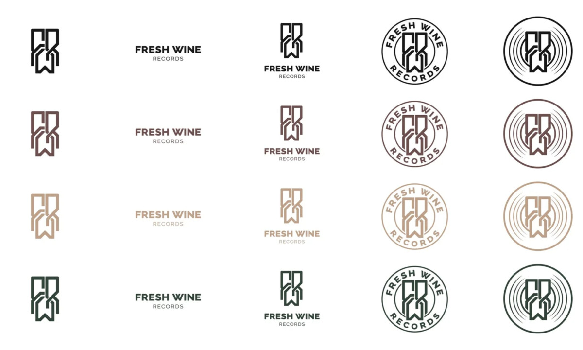
- Monogram Structure: The custom “FWR” monogram is compact, angular, and vertically symmetrical. I like how the interlocking forms suggest balance and unity without relying on obvious religious symbols.
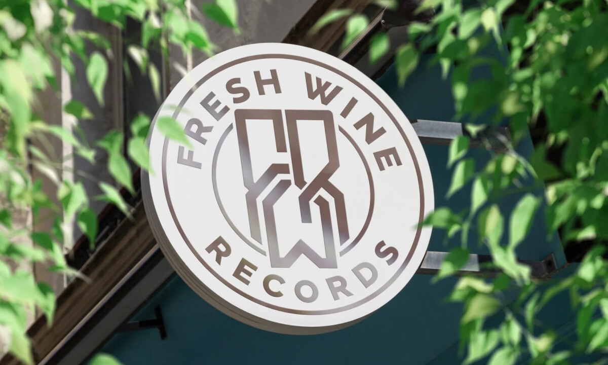
- Badge Variations: Encasing the monogram within circular seals adds institutional weight. I find the concentric rings especially effective, as they quietly reference both sound waves and vinyl records, connecting faith and music without forcing the metaphor.
- Color Palette: Deep wine reds, forest greens, sand neutrals, and near-black tones give the logo warmth and maturity. These hues feel grounded and spiritual, softening the sharp geometry while reinforcing the brand name’s meaning.
- Typography: The pairing of Raleway and Big Caslon strikes a thoughtful balance. The sans-serif keeps the system current, while the serif introduces editorial gravity and tradition. I appreciate how this combination allows flexibility across print and digital contexts.
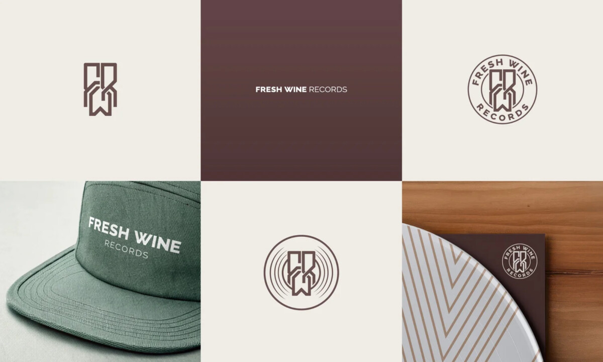
- System & Scalability: The range of lockups, from monogram-only to circular seals and horizontal wordmarks, shows clear foresight. This works as a system rather than a single mark, scaling smoothly across album art, merchandise, signage, and digital platforms.
What Brands & Agencies Can Learn from Fresh Wine Records
1. Implied Symbolism Often Feels More Timeless Than Literal Icons
This logo shows how faith-based brands can communicate spirituality through structure and balance rather than explicit imagery. Abstraction allows broader cultural relevance and longer visual lifespan.
2. Design Systems Matter More Than Single Marks
By developing multiple logo configurations from one core idea, the brand gains flexibility without dilution. This is especially valuable for music labels operating across physical, digital, and merchandise channels.
3. Restraint Builds Credibility in Value-Driven Brands
The muted palette and disciplined geometry prove that confidence doesn’t require visual noise. In categories rooted in belief or purpose, calm clarity often communicates trust more effectively than bold spectacle.
About DesignRush Featured Designs
At DesignRush, we spotlight agency projects that push creative boundaries. The designs we feature reflect expert execution and highlight the trends shaping branding today.
Some of these standout projects later earn recognition in the Monthly Design Awards.
Check out more standout work across categories:
- Best Logo Designs
- Best Website Designs
- Best App Designs
- Best Print Designs
- Best Packaging Designs
- Best Video Designs
For a full list of design agencies and related services, visit our Agency Directory.