- Agency: Ashish Antony
- Client: Kulhar & Bean
- Category: Logo – Hospitality
- Location: London, Ontario, Canada
- Project Brief: Create a hospitality logo for a café brand that blends Indian heritage with contemporary café aesthetics to feel warm, welcoming, and globally relevant.
In assessing hospitality logo design, I pay close attention to whether a mark can carry cultural meaning while staying practical across menus, packaging, and physical spaces.
The Kulhar & Bean logo succeeds by translating heritage and coffee culture into a single, compact symbol that feels expressive and easy to use.
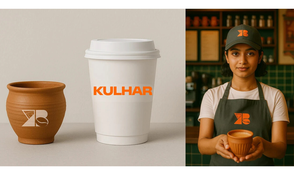
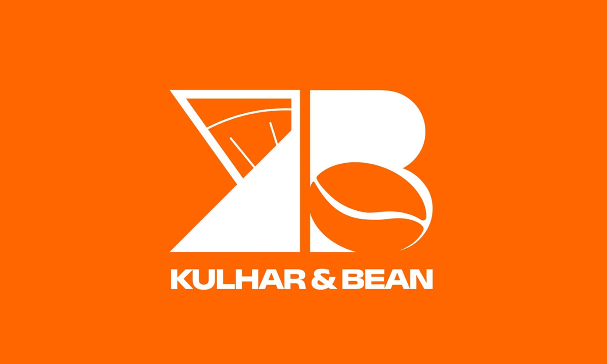
- Concept & Symbolism: I like how the monogram brings the K and B together into one cohesive form. An angular reference to a traditional kulhar on one side and a rounded coffee-bean shape on the other clearly communicates origin and offering, without relying on literal illustration.
- Form & Structure: The contrast between sharp geometry and smooth curves adds visual rhythm while reinforcing the brand’s positioning — where tradition meets modern café culture. The vertical balance helps the mark feel stable and intentional.
- Typography: A bold, modern sans-serif supports the icon without competing with it. I appreciate how the restraint in the wordmark keeps everything grounded and legible, allowing the symbol to remain the focal point.
- Color Strategy: Vibrant orange brings warmth and a sense of hospitality into the system. I find the color choice energetic and culturally resonant, helping the brand stand out in busy food and beverage settings.
What Brands and Agencies Can Learn from Kulhar & Bean
1. Fuse Cultural Storytelling Into Simple Forms
Kulhar & Bean shows how heritage references can be abstracted into clean geometry, creating logos that feel meaningful without becoming ornate or literal.
2. Balance Sharp and Soft Shapes to Express Brand Duality
Combining angular and rounded forms can visually communicate contrast while keeping the identity cohesive.
3. Design Symbols That Work Independently of Wordmarks
A strong standalone icon improves flexibility across packaging, signage, and digital touchpoints, especially for hospitality brands with physical presence.