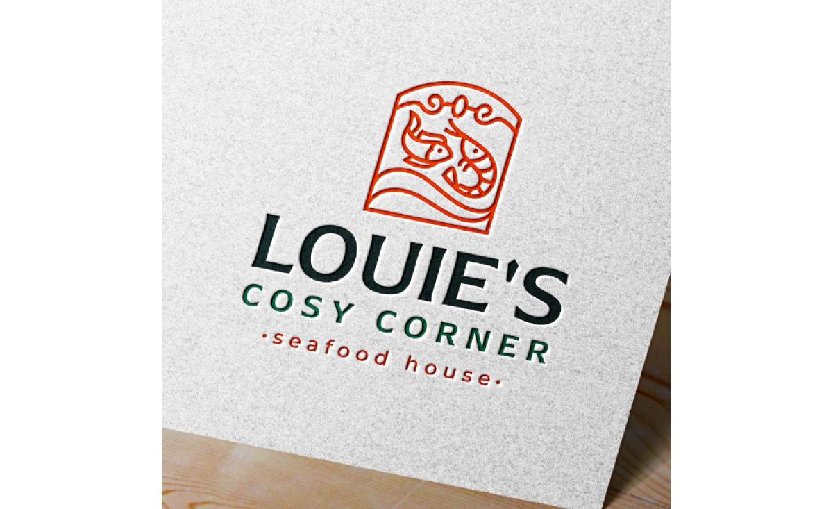
Standout Features:
- Nautical-inspired line art emblem
- Warm and inviting typography
- Harmonious use of red and green tones
Louie’s Cosy Corner, a seafood house known for its welcoming atmosphere and fresh maritime cuisine, now boasts a logo designed by James Gaudet that encapsulates its unique charm. The design conveys a sense of warmth and tradition, aligning perfectly with the restaurant’s identity as a neighborhood favorite.
The centerpiece of the logo is the nautical-inspired emblem featuring elegant line art of seafood and waves. This design element beautifully reflects the brand’s maritime focus while introducing a touch of artistic flair. The curves and flowing lines evoke the ocean’s rhythm, making it a perfect visual representation of Louie’s seafood offerings.
Below the emblem, the typography stands out with a blend of bold and refined styles. The name “Louie’s” is presented in strong, confident lettering, conveying reliability and quality, while “Cosy Corner” features a softer, friendlier font in green. This combination strikes a balance between professionalism and approachability, inviting diners to feel at home.
The use of red and green tones adds an additional layer of harmony to the logo. Red symbolizes energy and passion, evoking the vibrancy of the restaurant’s fresh dishes, while green represents freshness and a calm, coastal vibe. These colors work seamlessly together, enhancing the logo’s visual appeal and making it memorable.
In summary, James Gaudet has delivered a logo design in the hospitality industry that captures the essence of Louie’s Cosy Corner. With its nautical motif, inviting typography, and thoughtful color palette, the design creates a lasting impression that reflects the warmth and quality of this beloved seafood house.