Airbnb is an online marketplace that offers homestays across several countries and regions. This mission, along with the brand's values of inclusivity and community, is personified through the iconic Airbnb logo. The logo features a unique symbol, bold colors, and a modern sans-serif typeface, delivering a versatile and memorable mark to the homestay market.
Key Insights for Brands:
- Open-ended symbols invite users to make deeper connections with the brand
- A warm color palette stands out in the online environment dominated by cold and muted tones
- Utilizing a unique or customized typography makes a logo distinctive
Airbnb Logo Design Reflects the Company’s Core Values With a Flexible and Inclusive Emblem
Airbnb's visual identity centers around connection, exploration, and shared experiences. The company sought to develop a logo that would capture these core principles while being approachable. This effort led to the creation of a brand symbol synonymous with a global network of travelers and hosts.
Beyond its design, the logo signifies Airbnb's evolution from a simple platform to a global brand, bringing people together around the globe. It reflects the brand's mission to inspire adventure while fostering a sense of home, no matter where users find themselves.
The Logo's Unique Symbol Embodies Fluidity and Adaptability

At the core of Airbnb's logo is a distinctive, fluid symbol that embodies the brand's identity. This minimalist shape represents four essential elements: People, Places, Love, and the brand itself. Its simple layout allows users to interpret the icon based on their experiences.
By keeping the logo intentionally open-ended, professional logo designers invite users to make a deeper, more personal connection with the brand. The continuous lines signify how Airbnb's community and services are interconnected. Each curve and angle convey movement, personifying the journey, connections, and shared moments that define the Airbnb experience.
Moreover, this abstract design is highly adaptable, effortlessly fitting into different contexts while retaining its distinctive identity. This versatility makes the logo universally recognizable as a symbol of adventure, freedom, and belonging.
The Bold Color Palette Infuses Energy Into the Airbnb Brand

Airbnb's primary color, Rausch, is a vibrant shade of pink with the HEX code #FF5A5F. The color choice represents openness, creativity, and inclusivity, reinforcing the idea of a welcoming global community.
The bright pink exudes warmth, echoing the human-centered approach that Airbnb champions. In an online environment where cold or muted tones often dominate, the vibrant hue helps Airbnb maintain a unique presence that is immediately recognizable and emotionally resonant.
Some of the best logo designs often use bold colors to exude positivity and joy. Plus, they capture attention quickly, making the brand memorable and visually stimulating!
The Design Marries Modernity and Simplicity Through the Modified LL Brown Typeface
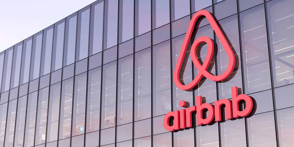
The typography in Airbnb's logo features a slightly altered version of the LL Brown typeface, a clean and modern sans-serif font that exudes clarity and functionality. In addition, the subtle modifications to the typeface provide a distinct touch, ensuring harmony with the fluidity of the logo's emblem.
Choosing a sans-serif font highlights Airbnb's commitment to simplicity and ease of use. The typeface also plays a crucial role in enhancing the logo's scalability, making it work as effectively on a mobile app as on large billboards. This versatility ensures that Airbnb's message remains consistent across all digital and physical mediums.
Combined, a unique fluid symbol, a bold color palette, and modified sans-serif typography forge an eye-catching yet intriguing brand identity that resonates deeply with travelers worldwide. This identity embodies Airbnb's commitment to connection, discovery, and community.