Standout Features:
- Creative use of negative space
- Vibrant color palette
- Simple, sans-serif typography
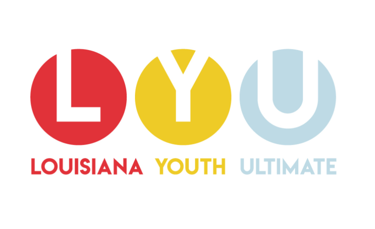
Outside In Design Studio’s logo design for Louisiana Youth Ultimate (LYU) is a striking blend of creativity and functionality, representing the organization's dynamic spirit.
The organization’s initials appear in the negative spaces of three circles. This creative approach ensures the logo remains consistent and recognizable across different backgrounds. It creates a cohesive brand identity that adapts well to other contexts. Plus, it elevates the LYU abbreviation beyond simple lettering, making it look like a unified visual representation!
Vibrant red, yellow, and blue colors reflect the brand’s energetic and lively identity. These colors also provide structure, with each word and its corresponding circle color-coded to create a clear and organized visual hierarchy.
Last but not least, sans-serif typography contributes to the logo's modern and sharp aesthetic. The clean lines convey straightforwardness and clarity, appealing to youth and the broader community.