

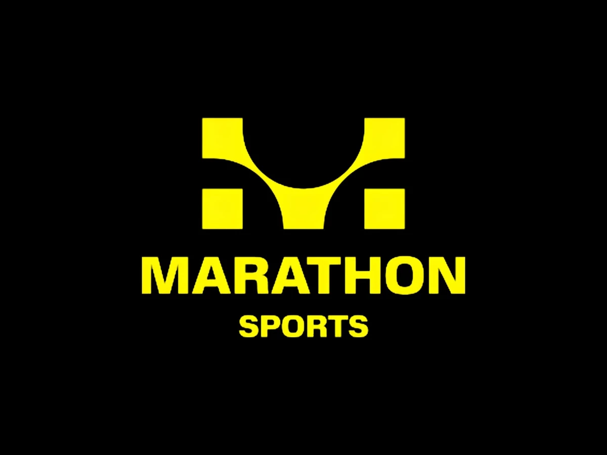
Logo Designed by
Upstatement Upstatement

Marathon Sports

Marathon Sports Logo Design by Upstatement
Upstatement rebranded Marathon Sports to reflect its evolution from a local Boston run shop into a broader symbol of running culture and community. The project positions the brand as more than a retailer, highlighting its deep ties to local races, run clubs, and athletes while creating an identity rooted in authenticity, discovery, and the shared experience of running.
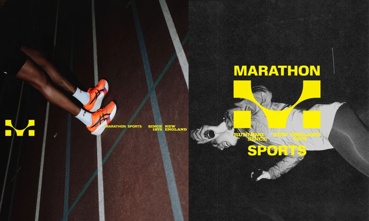
Promotional images display athletes with the new brand logo.
Split graphic features runners and bold yellow logos
Shopping bags feature the brand logo and pin graphics.
Brown paper bags display black logos and safety pins
This website uses a colour palette of 4 colours
  • #FEF804
  • #000000
  • #2D2B28
  • #606060
Technologies & Tools
Description
Team Behind the Design
  • Agency: Upstatement
  • Client: Marathon Sports
  • Category: Logo Design — Sports
  • Location: New York City, New York, United States
  • Project Brief: Create a sports logo identity that reflects Marathon Sports’ role in running culture, community engagement, and modern athletic retail.

A sports logo design for a running retailer has to clear two hurdles. It has to read at race-bib scale, and it has to mean something to people who actually run.

Upstatement's mark for Marathon Sports answers both. The M is a digital race clock, with the hour and minute dots forming the letter's pillars.

A gestural figure breaking the finish-line tape sits between those pillars, a callback to the 1975 original mark. That detail carries 50 years of history without leaning on nostalgia.

Yellow on black runs the whole identity at full saturation. A heavy condensed sans handles the MARATHON SPORTS wordmark, with "Running since 1975, New England" set tight beneath in the same yellow.

Safety pins act as the system's second signature graphic. Runners know the pin as what holds a race bib in place, and Upstatement leans on its punk and DIY associations to push the brand past athletic-retail conventions.

On the kraft shopping bag, the logo prints in solid black and pairs with three oversized safety pins on the opposite face. The treatment reads as merch rather than retail packaging.

Vote for the best design in this year's Design Awards and help decide which projects deserve top recognition. Every vote contributes to celebrating creativity and craftsmanship across categories like web, branding, product, and digital design.
Marathon Sports Logo Design by Upstatement

Marathon Sports

Designed byUpstatement
Russells Logo Design by Yago Ferreira

Russells

Designed byYago Ferreira
CROWNED Logo Design by OLVR Studios

CROWNED

Designed byOLVR Studios
Aperture Capital Logo Design by Numinous

Aperture Capital

Designed byNuminous
AXIA Energia Logo Design by Tátil Design

AXIA Energia

Designed byTátil Design
Athelo Logo Design by Senu Studio

Athelo

Designed bySenu Studio
Balance Logo Design by Studio AIO

Balance

Designed byStudio AIO
Wellington Educated Logo Design by Stanley Street

Wellington Educated

Designed byStanley Street
La Famiglia - Gucci Logo Design by Affaire

La Famiglia - Gucci

Designed byAFFAIRE
View All BestLogo Designs

Ready to elevate your designs?